
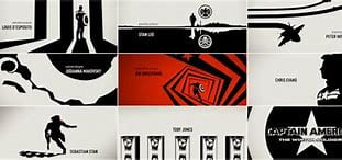
A title sequence is a way of introducing a show: its name, brand, content, cast and crew. Title sequences are made to be iconic and memorable so that they stick in the viewers head and they not only easily recognize the show but are more likely to be drawn to it, and will watch it more. They can also be a way to call back previous events or foreshadow elements, as well as using aspects of the show to create identity.

Closing sequences can be just as important and visually stunning and stimulating, hiding content like after credit scenes, which is a signature move with the MCU. A lot of animated films have little animations to keep their viewers watching, whilst tv shows usually opt for a more simplistic approach knowing that their viewers will be back for the next episode. However, in some instances, we can also see scenes of characters from the tv show pop up, to showcase the cinematography, art style or character design and show all of the hard work that the crew put in for the series.


There are of course certain things that are done with most title sequences to ensure that they serve their purpose as best as possible and keep the viewer entertained.
Conventions
- Show the cast: There is usually text to accompany the visual aspects of a title sequence, containing all of the top billing actors and crew, as well as the production company.
- Recap the story: Events shown in the title sequence often explain key plot points for the new viewers and cover context that might no be shown in the content itself.
- Theme music: A memorable, unique and relevant theme song is important for the show, and helps to build up its reputation, popularity and identity.
- Show change: For long-running content, it is sometimes best to signify to the audience when there is a change in the world, characters or how an this can be done through changing the title sequence or creating a new one altogether.
- Hidden icons: Sometimes, content that foreshadows or calls ack on events can be embedded into a title sequence using hidden imagery and metaphors.
Techniques
- Transitions: Using transitions can help to tell a story, set the mood or simply progress onto the next shot artistically. Things like fades, wipes, zooms or using shapes, lines and movement.
- Text and font: The format, scale, font and position of the text can vary from conventional to unstereotypical and often reflects the genre or tone of the tv show. It is important to make design choices with the text that suit the style of the show.
- Colour palette: Generally, the colour palette of the media is also used for the title sequence and it is only ever opposed for a good reason such as to misguide the audience on purpose or to evoke a certain emotion in them.
- Editing techniques: These can also help express a certain mood, genre or feeling. Things like slow fades, jump cuts, wipes, match cuts, one-shots and the speed of it all, matter and can be used to direct the vision of the viewer or set the tone.
- Method/style: Titles are often made to mirror the content or establish the genre. Their overall style differs depending on the show or the vision of the director.


Titles within anime are considered to be their own category, but do share traits with traditional westerns, like text and framing. The main differences are:
- Music – most anime intros have their own music, with songs written and created specifically for the show. The edits of the sequence often revolve around the beats of the music, making most intros dynamic and engaging.
- Content – anime title sequences can be extremely long (relative to the content), to show characters and clips from previous and future episodes.
In groups, we were asked to analyse a title sequence or closing sequence using the information we had learned. Our group had the closing sequence of a show called the Queen’s Gambit, which I am fortunate to have watched. Here is our slide:

My group worked well, but we all struggled a bit to combine our ideas. I find that, with the limited time, people often prefer to do research and write up their parts individually, as talking through everything takes longer. Because of that, the info we gathered was a bit scattered, and some parts of our explanations were repeated once or twice, but overall I believe we all understood the general idea behind the sequence. The black and white colour palette and use of geometric shapes gave the impression that the show was not for children: that it dealt with mature themes and is quite serious. The editing techniques weren’t very fast or dynamic either, and it a simple, clean ending to the show.
I didn’t go too into depth explaining what we did because now I’ll be doing some analysis of my own. I’ve chosen a Netflix original fantasy show that in my opinion, has an amazing intro and can be looked at in-depth.
First, a quick introduction as to what the show is:
Cursed is described as “a re-imagining of the Arthurian legend, told through the eyes of Nimue, a young heroine with a mysterious gift who is destined to become the powerful (and tragic) Lady of the Lake. After her mother’s death, she finds an unexpected partner in Arthur, a young mercenary, in a quest to find Merlin and deliver an ancient sword. Over the course of her journey, Nimue will become a symbol of courage and rebellion against the terrifying Red Paladins, and their complicit King Uther.” In another piece on that site, Andreeva calls the show “a coming-of-age story whose themes are familiar to our own time: the obliteration of the natural world, religious terror, senseless war, and finding the courage to lead in the face of the impossible”
Looking at the title sequence, we can see that quite a lot of the conventions are used. The sequence recaps the story by showing the key moments of Nimue’s life and the story surrounding her and the time period. Things like the little girl running through the woods with a bear in the background or a woman standing on a rock holding up the sword very clearly reflect real moments that happened in the show. We have epic theme music playing throughout which not only puts the audience in the mood for fantasy but also acts as a structure for the content to progress with. For example, when the red paladins appear, the music changes to an exotic, ominous drumbeat that signifies danger. We also have more vocals towards the end when the content speeds up or gets more dramatic, to show that more important events are being shown. This also mirrors the story, as later on in the series, more dramatic and important events occur, making the audience subconsciously want to watch until the end.
We can see a lot of hidden imagery and symbolism in the sequence as well, such as the trees spinning in oval shapes, which make an eye, which could mean good/evil, knowledge, secrecy and mystery, all prominent themes in the story. The trees link to nature but are thin, curling and unnatural which could mean corruption and supernatural power (bending nature), and in the centre of the eye, what at first looked like the pupil was actually a crow, the bird that symbolises death. This not only foreshadows that there will be a lot of death, but it also shows that revealing the truth will cost many lives, as the bird was what we were heading for, in the middle of the eye, i.e death is the answer. The red of the cloaks of the paladins, contrasting with the dark horses and snow, remind us of blood and death, and we can recognise that they are evil just from this scene. Further on, we zoom out from a crown, to show a king within layers and layer of castle walls. Here the meaning is clear, a man is trapped by the crown, in his own castle. We can imply that there are corrupted royals in the show, and that power is often tantalising and dangerous (truth. Many of the leaders in Cursed are power-hungry and selfish). We also have a silhouette of Merlin seemingly exploding or dissipating as he holds a sword, which indicates that the sword of power is his undoing and he will die trying to hold on to it. The skeletons against the red background fading into the wendigo skull both symbolise death and terror, and we can predict that there is a larger enemy at hand, some force that isn’t human but perhaps works through them and corrupts them. Furthermore, the spiky bones coming from the skeleton remind us of spiders, which are also a part of the series. Messages of temptation, bloodshed and darkness are shown. There are a lot of thorns, and we see people tangled up in them as they spread across the screen; this is Nimue’s power, her connection to the ‘Hidden’ which allow her to control the nature around her in her favour. It also shows the true power of nature and how no human can truly win against it, again more death. The final shot we see is just the sword of power being lifted by a hand. The fact that there is no body or face to accompany it shows that whoever is wielding the sword is irrelevant and that it has a mind of its own. We understand that the sword is the cause of all of the suffering and war, and it is the most powerful object in the series, spinning everyone around it with its control.
All of these messages become clearer and clearer the more you watch the series and it is made this way to hook the audience in and make them want to understand what it all means. Everything from the awesome fantasy music, from which we feel longing, sadness, suffering and hope, to the content, all draws the viewer in and makes them excited for what the episode holds.
Let’s view some of the techniques used. The first things that jumps out at me is the beautiful style and transitions. The whole sequence is like a watercolour painting brought to life and we see a lot of inky transitions and blended imagery. I think that this style was chosen to show the fragility and changeability of life. Nothing is set in stone like we sometimes believe, and events bleed from one to the next, all intertwined and ever-shifting, like Nimue’s thorns and like real life. It makes us believe that the series is more complex than it seems, that we should expect the unexpected, and that everything is linked. It’s also beautiful to look at and satisfying, as our eyes naturally flow from one scene to the one after. As for the colour palette, we have black and white for most of the foreground elements and red, blue and green for most of the back, although this does fluctuate and change, and sometimes we get almost an optical illusion with the colours switching from monochromatic to striking red or blue through overlapping shapes. It is meant to confuse us a little and there is always something to look at, making the sequence seem like a mystifying hallucination. Clearly, we get the impression of supernatural power, as most of the time, things feel like they are thrown into chaos, and nothing is orderly or right. We get the sense that Nimue’s powers are the very reason she is cursed and that perhaps from the start, she was destined to find the sword (which is confirmed as she is Merlin’s daughter). Green pops up here and there, but overall, we see mostly red and blue, almost as if they are at war with each other but linked with the black and white imagery. It gives us the impression of good vs evil, nature vs mankind and the classic red and blue signification, tears (sorrow) and blood (death). So, it is obvious that the series does not have a lot of happiness and is a weighty, life-and-death retelling of Camelot.
Cursed successfully prepares and excited the viewer for the series through their intro. All of the symbolism and design choices suit the show and create a dark, fantastical atmosphere from the very start. I personally, wanted to know what all of the content in the title meant after watching it because the style and music were unique and bewildering, making me curious about all of the characters and the story. The whole sequence gives off very fantasy-like vibes, and the transitions are what enhance it even further, because you don’t really know where to look, and you have to watch it a couple times to really absorb everything.