Bauhaus is a design principle that originated from the Bauhaus Art School in Berlin, operational from 1919 to 1933 that combined crafts and the fine arts. It was shut down by the Nazis as the school was deemed too liberal, but the school still became famous for its approach to design, with the Bauhaus style eventually becoming one of the most influential currents in modern design, modernist architecture and art, design, and architectural education. Their ethos is that you can bring art to functional designs and environments, which has allowed it to survive as a design style.
There are five key characteristics of the Bauhaus graphic design style:
- Form Follows Function – Design that focuses on functionality, conveying what is essential and also being cohesive and aesthetically pleasing.
- Minimalism – Less is more! A simplistic approach that encompasses the necessary aspects of a design without overloading it with additional information.
- Typography – Text and font are a key part of Bauhaus. Typically only sans-serif fonts are used and can be both uppercase and lower case. Creative experimentation is encouraged, as things like rearranging, stretching and distorting often add to the feel of the design.
- Geometry – Bauhaus designs are built upon a foundation of geometry. Simple shapes like rectangles, circles and triangles construct the designs, and adding or subtracting shapes using the Boolean operations is also seen quite a lot.
- Primary Colours – Whilst other colours are also incorporated, reds, yellows, and blues make up the main colour palette of Bauhaus. Otherwise, analogous or triadic harmonies are also used.
For our lesson, we focused on how the Bauhaus design is applied to logos. All of these characteristics are excellent for making or redesigning logos, and the style has a really cool effect, which also makes it quite recognisable. Here are some of the hundred examples you can find on the internet.
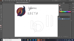
It was then our tasks to take all of the knowledge of Bauhaus and create a logo using the style. By this point, I was already thinking up of an idea using the first logo I created. So, once I began to design, I added in my original logo as a reference. When I created the first logo, I tried to add in aspects that I believe make up my personality or at least things that I like, or am passionate about. The text is, therefore, my name in Bulgarian, to represent my roots. The wing in front of the circle is several things – my love for birds and all they stand for, freedom, perseverance and elegance. I also love cursive and my design is entirely made up of curving lines to show this. With Bauhaus, I had to go to the other end of the scale and completely transform the design, whilst still using it as a starting point.
To begin, I took the first letter of my name in Bulgarian and drew it out in the font/style Bauhaus text usually is, in Illustrator. I decided, since it was only one letter, and it isn’t in English, that it could also be seen as an icon, so I made sure to use interesting shapes and vary the edges (some are curving, some are straight and the bottom is diagonal).
I wanted to ensure that my design was very geometric, but still, look like, and can be recognised as my original design. I used the big circle at the back to be the base, where I could layer other shapes on top, and I took the two strips on the wing and made them a circle to go ontop. It overlaps with the letter so the two colours can still be added, in the two separate sections. I also started thinking about how I was going to add the wing. My initial idea was to just redraw it with straight lines and sharper edges, but I felt that it would overcrowd the design. I went back to the characteristics of Bauhaus, reminding myself that their ethos is functionality, and minimalism is a key part of that. So, I simplified the wing to just basic, long shapes, starting with a rectangle, and reshaping the edges to make it more interesting.
Once I had everything put together and the design of the logo was complete, I went onto thinking about colours. To help me, I brought in the colour palette of my other logo and I found that all of the primary colours were actually there, and all I needed to do was change the hue and saturation of each one slightly. Once I did this, I had the bright, fun combination of red, blue, yellow and pink – so all of the primary colours plus one extra to link back to my design and be a kind of final touch by me. Once I had all of my colours ready, I began to experiment with where to place each one and how I could combine them differently with the shapes. After going through a lot of swapping and rearranging, I settled with three options that I liked the best. Only one could make it till the end, and it was difficult because they each have their own advantages and drawbacks. For example, I like the one with the yellow letter, because it links back to my other logo, but the yellow isn’t shown that well against a white background. And I like the one with the red circle at the back because it makes the blue letter pop, but the pink circle in the middle isn’t seen as well because of the similar colour. Keeping all of this in mind, I went with the third option; all the colours work well together and it stands out well.
So, here are the final designs! I’m so pleased with how the logo turned out. It was really fun learning about and trying a new style, and since I generally don’t like geometric design that much, it was surprising to see how fun it was to think up of a logo within that style and work with it, trying to incorporate elements from another design. In my opinion, the logo looks simple, aesthetically pleasing, eye-catching and fun to look at, so I think that using all of the characteristics of Bauhaus is definitely a good way to create a logo and it is an amazing style to draw inspiration from.


