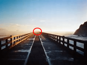
After doing a lesson on an easy method on doing character design, next, we moved onto environment design, to learn about some tips and methods on creating settings for our animations. Firstly, we went back to basics and recapped perspective. Perspective is incredibly important when creating any sort of setting, especially 3D ones. Even if an image is 2D however, perspective makes it possible to see it in a 3D space, because of the vanishing point, which is the point when all of the perspective lines within an image intersect. The name is fitting because, at that point, we cannot see any further into the distance, but we can imagine that there is more to be seen because of the illusion of things vanishing in the distance.

To get a better sense of this, we were sent an image to practise with. The task was to locate the vanishing point and add perspective lines pointing towards it. My first thought when looking at the image was that I should just follow the furniture since it was very obviously pointing towards the point, but because of this, I thought it was too easy and I started to overcomplicate it, using parallel lines to the furniture but changing them slightly to be more in line towards the window. I think I was quite close but I confused myself.
The lines were practically already there, and all I had to do was draw on top of the tabletops and chairs. Then, once I felt that enough lines were drawn, I would be able to see where they all intersect, and that would be the vanishing point. I haven’t drawn all that many settings throughout my life, but whenever I have, I didn’t consider perspective. I think this method, of having a vanishing point and perspective lines, is much more accurate and acts as a good guide for how to structure a room or landscape.
It turns out, that it is possible to do this in photoshop. I was aware that there would probably be guides and grids available, but I never imagined that there was an actual tool to help with creating a vanishing point.
Demo
1) In photoshop, draw a straight line somewhere on the canvas for the horizon. Ideally, it should be somewhere in the middle so that there is enough space in the sky, and on the ground, but it depends on the perspective.
2) Create a new layer and name it perspective. Then change to the polygon tool, which is a little cog icon at the top. Select the star.
3) Indent the sides by 99% and change the slides to 100. Now draw out the star to make automatic perspective lines! There could be as many of these as necessary (I added two to fill up the whole space.) Keep in mind, the more vanishing points, the more confusing it gets.
4) In a new layer, using the paint tool, things can be added on top. Make sure the brush size is small, and the hardness and opacity are at 100%. Then draw whatever you like! Anything from buildings to bushes, as long as they follow the perspective lines. That way, everything is pointing towards the vanishing point, and the image is cohesive and realistic.
I started out with a simple cube to see what it would be like to place a building on the grid, and then just for fun, I added some plant life and a person. It was purely for practice but If there was more time, a lot could be done with this method, and I imagine almost any sort of setting could be created.
Learning about how to do this in photoshop has added yet another method of creating settings fast, even if you are not a skilled artist. I think this will really benefit me because I am not experienced in creating landscapes, albeit accurate ones, so I can’t wait to try this out when I start doing some concept art for my fantasy world. However, I’ve found that there is a disadvantage to this method. It can be difficult to make it look natural and organic since there is a grid in the background, and often the things drawn/placed on top look a little mechanic and synthetic. So, for the next tutorial of the lesson, we created some digital art and went through how this could be done in terms of landscapes.
We looked at landscape theory, which states that all environment images are made up using a basic composition. This composition is:
- Horizon
- Foreground
- Midground
- Background
Essentially, using this, a setting can be created. I always find things like this helpful, because broken down, a task always seems less monumental and daunting. When I look at artwork of environments, I’m always impressed, but also scared. How could I ever do something that looks so complex and detailed? But looking back, all of the art I have seen follow these four steps, and there are simply variants in colour, order, perspective and level of detail.
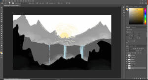
So, following this method, we went back into Photoshop and created a new composition. I was really excited and tried to relax and be loose with my drawing as I followed the instructions. I find that when we worry over something too much, we focus on the little details and flaws, and then end up having to go back and change things, eventually falling behind and becoming even more stressed. So, I told myself to relax, and just have fun with it. It didn’t have to be something super accurate like the first one, this was an experimental piece of art to try out a new composition style.
First, I began by creating the foreground. The foreground of a piece is everything that is closest to the front, which we can tell from the size and position. Often, the objects are larger and a bit more cut off, to indicate that they are closest, but this depends on the piece, (with my fantasy animation Rise, for one of the settings, I only had small rocks in the front, but you could still tell they were in the foreground because they were in front of everything else). For this comp, the idea was for it to be super simple and a way to work with the landscape theory we just found out about. So there were no great expectations for loads of detail, and even so, we did end up building up quite a bit of detail.
The first thing we drew were some rocks at the front. This was the foreground layer, and we used almost black because things nearer look darker and more in focus than things further away. I think the rocks could be designed however we wanted, depending on what effect we were after. For example, for a landscape that is more welcoming, mystical, wonderous – the rocks could be drawn a bit softer and more stylised. I did mine quite jagged and spikey because those are the first types of rocks that popped into my head. Knowing how the artwork turned out in the end, I’d say that these rocks work well as the foreground and I don’t regret drawing them in a loose manner.
The next part of the drawing was the midground, which is the middle section of a landscape. I created a new layer and, keeping with the simple style, I drew more rocks (or more of a mountain), but with fewer ridges, and a lighter shade, as it is further away. Once I was satisfied, I put this layer underneath the first because the midground is behind the foreground.
Now it was time for the background and some details. By this point, I had gotten the gist of the art piece, and what kind of landscape and effect we were doing. As predicted, the background was mountains – so in a lighter grey and on a new layer, I drew a few mountains, similarly to the foreground and midground, they rise at the edges and dip slightly in the middle. This is to make clear where the vanishing point is, and where exactly the viewer is supposed to look. I then added the sun at the dip, where the focal point is. It was up to us to decide how big to make the sun, and I wanted it to be quite small so that as your eyes travel over the rest of the art, there isn’t a distractingly big yellow circle, but rather, a small and pale yellow ball where your eyes can settle on at the end, or start out with at the beginning. I’m really pleased with the colour I chose, since it works well with the desaturated colour palette, and adds some colour and pop, whilst not being too striking. The sun contrasts very well with the rocks.
The landscape was really starting to come together at this point, but it was still a little bland. It was time for some details and embellishments to give it some more personality. Firstly, in a new layer, using a similar, or even brighter colour to the sun, I added highlights to the mountains and edges of the rocks, where the light spills. Since the sun was just rising, not a lot of light escaped, but enough to illuminate the surrounding area. I used the highlights as a way to show some more of the mountains, and work some detail into the background and sky. Since my sun was quite small, the effect had to be subtle, but I think that it still works quite well, and there is a very tranquil atmosphere thanks to the light.
Another super easy detail was adding a waterfall or two. I went for a light blue, which really popped against the grey and adding a much more fantastical quality to the piece. We even found out how to create the effect of mist/evaporating water around the waterfalls, using the no. 30 paintbrush. Since the size, hardness, flow, opacity and even slant, can be edited, you could really experiment and use the brush for all sorts of things. I decided on just adding some white mist around the waterfalls, and behind the midground, to show signs of the weather and make the piece more natural. I was careful not to overdo this since it’s really easy to go crazy when you have a texture brush. I think this was a massive improvement!
For the sun, I wanted to add almost a glow, but also to show the streakiness in the sky. I added lines in a circular motion around it with various shades of yellow and I think this helps with showing it is morning sun, and with the feeling of newness and freshness that the art animates.
To finish the piece off, I changed to the darkest colour once more and drew a tower and a wizard or sorcerer-type figure. It was to show that it is a fantasy world, and makes the piece more mysterious. These weren’t necessary and the landscape would be fine left as it is, but it was fun to add some more fantastical elements.
I was so surprised and happy with the result – I really wasn’t expecting something like that to come out of just a few simples shapes and steps! I enjoyed the process so much and I think the method of breaking the landscape down into the different parts was extremely helpful. It’s giving me an effective method to work with in the future, and I’m grateful I’ve learned this skill. I’m also super excited to use it for my fantasy brief backgrounds and perhaps experiment with some more colour.


