
Included in this post:
Character (sketches + finals + CU)
Environments (Initial ideas + thumbnails + digital pieces)
Pre-Pro/ Pre-vis (First attempt + actual storyboard + animatic)
Sketches for still media products (poster, illustrations)
Character
When first thinking of my character, I wanted to experiment with body type and style. I didn’t know whether I wanted to have a simple little cartoon girl or some mystical angelic painter boy and these initial sketches show how I was trying to decide. However, a consistent image of hair blowing in the wind, and a beret kept popping up in my mind, and I realised I was drawn to the female silhouette, and french girl aesthetic. I struggled a lot with choosing gender, however, as I really want some more male representation in the French aesthetic culture. I did decide on a female despite this though, because of my research on VICE and their audiences and my own personal experiences relating to France and how I, as a girl, relate to my chosen culture.
After making this first decision and trying to piece together her rough appearance, I moved on to sketching digitally, where I experimented with the different background characters I would have in my animation, any possible body types/styles for my character, and face types too. As you can see, this part was still just ideas, so I kept my sketches loose and messy, to get more done quickly.

Pinterest is always a great source of inspiration for me, and without it, I can guarantee the work that I have done throughout my life would not be to the standard that I have tried my best to uphold. Here is the mood board of images I used to spark ideas and create my character.


I wasn’t sure what style I wanted, so I added a large variety of character designs and artwork, all of which have either a feature, position, colour or style that I find intriguing or inspirational and that I have considered using in some way for my 2D girl. I had a rough semblance of what I wanted, so I started sketching the initial character design using my sketches and inspiration. You can see different hairstyles and styles because I was trying not to limit myself in drawing the character one particular way, but it became pretty apparent quite quickly which type of look I wanted since I kept coming back to the short-haired, square-pants appearance. The version with long hair was also quite cute, but I wanted something a little more unconventional and modern and I felt that shorter hair came closer to this goal.

I also sketched the character quite a bit in my spare time, to see if I was comfortable drawing her and if the design worked. Here is one of the instances where I felt I nailed the style I was going for and was really satisfied with the hair and clothing. The polka dots on her shirt was me experimenting with a different pattern than the one I had in mind (stripes) and whilst it looks cute, I think that stripes showcase France more clearly. The close-up, however, didn’t turn out as well as I hoped but I knew it was just because I didn’t draw her facial features correctly and made her look too young on accident. You can also see my practises for drawing irises, which are the flower I am going to include in my animation.

Once I finally felt that I had enough practise and a good idea of what my character looked like, I moved onto the final character design sheet. I wanted to go more in-depth than in my last project, so I drew her in two positions, included three close-ups on different facial expressions, and objects that I feel relate to the character and present her personality. I found objects related to the aesthetic I am trying to portray – things like the statue and paint palette linking to museums and art and the irises and jewellery for the French aesthetic. In my opinion, the collection of objects clearly show that she is an artistic, fashionable and curious person who is enamoured with French culture, which is exactly who she needs to be for my idea to work. I wanted a simple, yet cute design, so I made her trousers long enough to cover her feet, and flare out at the bottom. The top has a similar structure, which is to show she has a unique sense of style that doesn’t fit into the trendy style today (skinny jeans, crop top). I think this will also make her relatable to all the creative people who dress differently and feel slightly alienated. As for the colour combination I chose, I already knew that I wanted to involve the French flag in the design, but in a way that wasn’t obvious and obnoxious. So I chose more muted versions of the colours – a darker blue close to indigo, browns and tans instead of bright red, and a paler skin tone for the white of the flag. One thing I took long deciding was her eye colour, which I kept changing from blue to green and getting frustrated that neither felt right. Instead of going for a bold colour, I went with grey/silver which is more sophisticated and would fit better with my audience, who aren’t even close to the ages of children and don’t need bright colours to be entertained.

With these colours, she resembles a person stereotypical enough to be recognised as French, as the colours and patterns automatically register as French in the viewer’s mind, based on conventions seen in films and books. I could have added a lot more detail but I tried my hardest to limit myself, knowing that the frame-by-frame animation process takes incredibly long and it would be best to have a simple design. For example, I really wanted her to have Eiffel Tower earrings because they would bring more detail around her face, but I toned my idea down by making the silver lines from far away. I know I have at least one close up shot in my animation, so I hope to showcase her earrings properly then. Overall, I think that I have achieved the balance between simple, yet detailed enough to be recognised as a character with a personality. I haven’t chosen a name for her however because I want her to embody an idea and a culture. I want the viewer to see themselves in her or be inspired by her and I feel that this would be easier without a name. For the sake of this post, I will be referring to her as n/a.
In my animation, there is a specific shot where we see a close up of the character in full detail. I wanted to be a little more prepared going into that and see how it could possibly look with the features that I have decided on for this girl. So, I drew n/a in a slightly less cartoonish style, adding details like sparkles to the eyes and a heart on her cheek. Using the nifty clipping masks in Photoshop, I added highlights and shadows to her hair, face and clothes to add some dimension and finish the piece off.


Leading onwards from this, I also did a piece of concept art depicting how n/a looks like a ‘normal’ being in this world. They are plain, boring and featureless, in order to reflect how our world would be without art or culture. This also makes them simple to draw and will save me a lot of time in production. Although this is the specific body type for the main character, the background characters, who we will see little of, have different body shapes and sizes, as I strongly believe we need more representation of different body types in the media. I chose to disconnect the limbs from the body so that these beings don’t resemble humans too much; I really wanted to hammer in the idea that without culture, we lose our identity and humanity, hence there is no face and hardly any distinguishable human features. White is the perfect feature also because of this, as it reminds the viewer of a blank canvas and shows them that these beings have no character at all.

Environments/Settings
The environments of this project rely heavily on how clear my idea for the animation is. Originally, I was imagining a video with swirling colours, flying objects and paint melting through the paintings. But I had no idea how to incorporate France in a clear way, as a culture cannot be shown through a few mere objects. So, I brainstormed and came up with a few possible scenes I could include, and even doodled alongside the text to capture how the ideas looked in my head. I loved the idea of referencing paintings done by famous French artists, and immediately went onto Pinterest to save related images. Once I had my selected locations, I also made mood boards for them too, to have inspiration at the ready.

My note:
Possible Scenes
– Shot of iris field
– Croissant and coffee in a cafe
– clouds with red ribbon flying through?


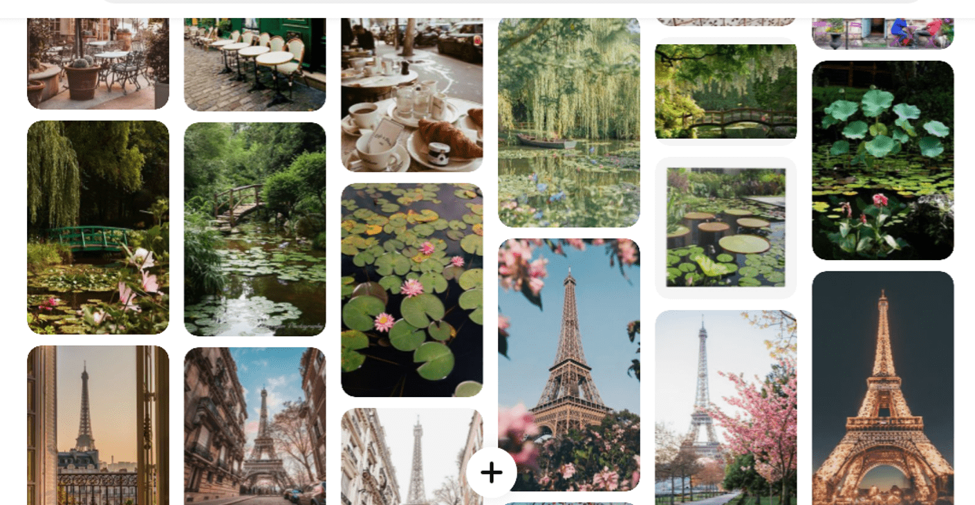

The locations are quite stereotypical for the most part, such as the cafe and Eiffel Tower so that most viewers can recognise that it is France I am trying to depict. The most enthusiastic culture lovers however, may recognise the less conventional references to France that I have included, such as the Irises, which are the flower of France, and the pond, which is a hint towards Monet’s Lillies.
Using my collection of images, I sketched out thumbnails for the museum and French environments. Here you can see notes I have made along the side to indicate what I like and don’t like about each piece. Certain elements seemed really fun visually, such as the domed glass roof, but I knew that I needed something clean, minimalistic and simple, to tie into my theme. For this reason, I chose the second sketch. I also like that it isn’t symmetrical, as it shows imperfection and makes it more appealing to the viewer.


The thumbnail sketches for the environments were super quick to draw, and I tried two angles for some of the first didn’t fit well. I think it is good that I have a variety in terms of simplicity – for example, the iris shot is much less detailed than the boulevard, and I can almost see them working together, shown one after another.
Having these thumbnails allows me to see roughly how I’m going to draw the backgrounds when making assets, so I didn’t feel the need to convert them all into finished digital pieces. However, I did do some digital concept art of the environments, mainly to add some colour and play around with texture. The first I did were these two museum rooms. It was fun experimenting with different shapes and adding gaps or statues to change up the shape a bit more, but I still prefer my thumbnail sketch, since it strikes the perfect balance between ‘dull room’ and ‘art museum’ thanks to the simple design.


As for the coloured pieces (my personal favourites), I chose to do the Eiffel Tower scene to have a go at the background, which I wasn’t 100% sure on how to do, and sky with a ribbon flying through, so that I could experiment with texture and light. For the Eiffel Tower scene, I want the background to be inspired by The Starry Night by Van Gogh, so when drawing it, I used a lot of flowing brush strokes and created swirls of blue and yellow, in a similar palette to the painting. I am hoping that this sort of pattern is recognisable enough for the viewer to see the famous painting. I also love the position of the character and how this is a more toned down, relaxing scene in the animation.

The ribbon in the sky may seem quite strange and random, but it actually links to an important part of French history. Revolutionaries wore blue and red cockades (ribbons) on their hats when they stormed the Bastille in 1789. The blue and red colours in the flag represent Paris. So, the red ribbon flying through the air is a direct reference to this and is a subtle nod to the Tricolour. I had a lot of fun creating the clouds for this piece because I used a textured brush in Photoshop and created the soft, fluffy look by changing the size, opacity and flow of the brush. This made the clouds look very dainty and cute but it still felt like something was missing, so I painted some god rays on top to add light and variety to the piece. I drew them on the right side, as this opposes the line of the ribbon and clouds and balances the piece out. I think this was a good touch, as it makes it look quite ethereal, but I probably won’t be including light rays in the animation, as it may distract from the ribbon.

Pre-Pro/Pre-Vis
Finally, I felt ready to begin planning my animation. As always, I began with a storyboard, as this helps map out my idea and it gives me a guide for my animatic. My first attempt wasn’t that great, as I still wasn’t sure what I wanted to present to the viewer. I wanted to show paint coming out of the canvases but this was really difficult to show in a clear way and put together with other scenes. After getting halfway through, I decided to stop as I didn’t like the length nor the angles.

My second storyboard is the one I used to finally put a clear idea on paper that felt manageable and less random. My idea is to focus on n/a as she walks through an art museum. One particular piece inspires her and she is taken on a journey through French culture and slowly discovers herself and changes into the actual version of n/a that you see in my concept art. Like my fantasy title sequence, I wanted a variety of angles, so I made sure to show n/a looking at the painting in three different ways.


Scene 2 is almost a compilation of different shots, but some of them include the character whilst others don’t. This is to make it faster to animate, but also show some of the scenes from n/a’s perspective. They’re quite different, which shows that this isn’t exactly a physical experience, but somewhat like a dream. It’s happening internally but she is also lifted out of the museum, so it could be somewhat spiritual/fantastical. She slowly gains her features, and when she returns, she is her true and complete self, and my plan is to have the painting change too, parallel to her own transformation (hence why it says illustration 1 at the start and illustration 2 at the end).

The final part of my planning for the animation is the animatic. Using my storyboard, I started drawing the main frames in animate and filling them in with some in-betweens to show the movement better. Using this technique allowed me to decide how long each scene would be and roughly how many frames I would be drawing. I was also hesitant with how the second scene would work in the storyline, but looking at my animatic, I think that it makes sense, as the fading to white at the end of scene 1 shows that n/a is transported and is experiencing France in all it’s colour and glory. In the final part, I really wanted the viewer to see a close up of the girl and show how different she looks but I knew that if I left it at that and simply showed the painting, it wouldn’t make sense, so I made sure to show the character in front of the transformed painting and make the changes more evident. I am satisfied with how the scenes flow from one to the next, and I think the frame-by-frame style will work really well with the artistic theme. Overall, my animatic does its job well, getting my idea across and will help me massively when making the animation.
Media Product planning:
Since I am not only doing an animation, I sketched some thumbnails and ideas for my illustrations and poster, as they are also part of my final products and I wanted to experiment and see how many different versions I could come up with and choose the best one.
When brainstorming for the illustrations, I originally thought about making one or two which don’t link to each other, such as the silhouette standing in the clouds which would symbolise enlightenment and inner peace. Or, something to do with the characters transformation and contrasting appearance, which I thought could be used in a half and half drawing somehow.


But as I mentioned earlier, I had the idea to make two that are part of a set, and change within the animation and this seemed to fit a lot better than having just one or two that aren’t related because it reflects n/a’s own change and shows the viewer that culture and art make up our world and sense of self. The two sketches on the right show a hidden lady surrounded by branches and then changes by being revealed fully with a halo of light. This theme of discovering yourself and the truth being revealed ties directly to my message and n/a’s journey, and the contrast between dead tree branches and light reinforces the contrast between the two. But, I didn’t like the long hair as it looked quite awkward covering only half of the canvas. This is why the first sketches are what I went for since they also show a change, but in a more clear way. I will talk about them in more detail in my final production post.
The poster was really fun to think up of, as there are so many different styles and possible compositions to use. I briefly thought about using old French fashion magazines as a style but this was discarded as I don’t think it fits with my theme. As always, I saved different images on Pinterest to help me think of something fitting, and I really loved the simplistic style of some art pieces I found, where the subject is outlined in white and otherwise made up of the background colour. I thought this would work brilliantly with the blank version of my character, and experimented with using the background of the museum to fit in with this.


Firstly, I thought to play on the differences between the two versions of my character. Since they are so different, and this makes up the main idea, I wanted to showcase the juxtaposition between a world and person with culture and art versus one without. Two different posters with them in opposing positions seemed like a cool idea, but so did making them interact in one, such as the poster split down the middle. I was finding it difficult to picture these with backgrounds, however, as simply adding colour to one half and leaving the other one blank entirely would look too harsh of a juxtaposition.

I went back to my mood board for inspiration, and this was when I started to replicate some of the styles I saw. For example, the minimalistic artwork of a subject in front of a solid colour block background made me want to use geometry to frame the blank n/a. My favourites, however, were the pieces with flowing lines and colour, as they reminded me of my original animation idea, which was quite psychedelic. I decided to pay homage to this and maybe include it in my poster!
This resulted in my favourite sketch, in the top left, which shows my character almost coming out of, or melting into the paint. I chose this one, and the third sketch to the left to try and turn into posters. You’ll notice I also decided on a name for my animation here, which I thought of after seeing the paint sketch. The title is ‘Monde de l’artiste’ which is French for ‘Artist’s world’. I think it is quite fitting since my message is that our world would not be complete or true without art.
I got to work in photoshop for the posters, but only one of them worked out, unfortunately. Here is the failed poster:

I don’t like the background as it is too jarring and doesn’t work with the character or text. I think the solid colour block style doesn’t work with this composition and has to have an actual colour for it to fame the character/subject nicely. But, I am glad that I attempted it and could focus on the poster that worked out. As for my illustrations, I will do some in-depth analysis in my other post, final production.