
Matte Painting
Matte painting is a technique used in photography and special effects film making to combine two or more image elements into a single, final image, often a representation of a landscape, set, or distant location. The technique allows filmmakers to create the illusion of an environment that is not present at the filming location. It is one of the oldest and most widely applied techniques in the visual effects industry because it can help create a setting that would otherwise be too expensive, inconvenient, or impossible to film live. In both its traditional and current digital form, it combines art and live-action, with the basic principle being that part of the scene is “masked off”, either with black material, green screens, or digital cropping. matte painting has been used by the film industry since the late 19th century and some of the most famous films in history used them to create fantastical worlds, like Wizard of Oz, the original Star Wars films, Mary Poppins, Titanic, and the Indiana Jones movies. They used actual paintings on sheets of glass to create the illusion of an Ewok village, a massive artefacts warehouse, a cliff face, or a night sky. Nearly all modern film nowadays use digital matte paintings.


I also had a go at this technique in photoshop and created a fantasy landscape that not only shows how the matte painting technique can be used but is also a part of my fantasy brief idea. One of the main environments in my animation are mountains with stone buildings/castles where orc tribes dwell, and during Umber’s reign, they are dominated by giant black dragons. I wanted to try and replicate this idea and using a website called Pexel, and Google, I compiled all of the images which I thought would come in handy.


I imported all of these into Photoshop, in separate tabs, so that I could pull them in as needed. I then began working on the base photo. Using the clone stamp tool, I removed anything I felt wasn’t fantasy, or didn’t fit with my plan. There was only really one thing, which was a bird in the sky. I covered it up with bits of cloud and sky.

When I felt that the base image was prepped, I started adding in the other elements. My first additions were parts of a stone castle art piece that I found, which would work perfectly infused with the mountain. My initial idea was to use the lasso tool to select individual parts of the castle to add in but I quickly realised that would take me to long, and I wasn’t precise enough. After some exploring, I found a nifty little tool called the “object selection tool” which automatically selected a shape within a certain area.


Once it was selected, I hovered inside the shape and right-clicked to select ‘layer via copy’ so that it would be copied onto a new layer on its own. I then dragged the shape into the base photo for my mountain and positioned it in a suitable place, scaling it using ctrl + t and making sure it fits with the photo. It already looked great, but I wanted to make it look even better, so, using the eraser, I played around with opacity and flow as well as the brush size, tapping along the bottom and the bottom edges to blend it out so that it doesn’t look like I pasted it on. Once that was done, using the clone stamp tool, I picked up different areas from the mountain and stamped them on the edges of the castle, again varying the size and opacity. I also made sure not to use the same pattern too much. Now it looked like part of the mountain!

I repeated this technique for pretty much all of the elements I added afterwards. I cut out three more sections from the castle and added them in the same way, and afterwards, I moved onto the dragons. Like the castle, I used the object selection tool for some of them, but for some, I had to use the lasso tool and select them by hand since the images weren’t very good quality and the edges were blurred. Once I added them where I wanted, I rubbed out the edges of the previous sky so that they didn’t look pasted and then I used blending modes to make them stand out a bit more and look like part of the picture. My favourite was ‘difference’, but it didn’t give the same result for all of the dragons so for one or two, I also used ‘darken’.

I felt that the mountain was looking a little bare. I wanted to add some colour and life. Using the other mountain image, I brought it in directly on top of the base and went straight to the eraser to rub out the sky and the areas I didn’t want. The mountains that were further back were already faded for me, so I didn’t need to create atmospheric perspective for the background. Once it was positioned where I wanted and a blending mode was chosen, I used the rubber and clone stamp tool to go in and clean up the edges as well as some details where the two images overlapped.


The hardest part here was making the greenery fade into the rock of the mountain. No matter how much erasing, stamping and blending I did, It didn’t look like one, and it was bizarre to look at. So, I went back to the original image and started cutting out sections from the green areas and pasting them on the rock, so that it looked like there were trees along most of the rock at the bottom. I had to do this several times and change the size, position and opacity of a few. Sometimes, layers would look bizarre underneath each other and I had to reposition them so everything was cohesive.

Everything was coming together and it was time for the final part of my painting: the dragon. I used one of my favourite pc wallpapers which screams fantasy because I distinctly remembered that there was a giant dragon wrapped around a spire. I knew the dragon was the right shape I needed so I went ahead and cut it out with the object selection tool, and put a copy in a separate layer using layer via copy. Then began the long and tedious process of using the eraser to sharped the edges and remove anything I didn’t want. I went along the edges of the dragon and started to clean everything up, carefully erasing the background and spire. It was a little difficult because the sky and dragon were the same colour and I sometimes erased parts of the dragon by accident. But I used ctrl + z to go back and correct any mistakes I made.

By the time I got to the left side, I realised a little too late that the object selection tool had not selected the sharpest edges of the left wing, so I actually painted in the points myself. I’m still debating if it would have been better to use the lasso. It would have been a longer process and I would have been wobbly but more accurate. With object selection, it’s faster, but not always as accurate and I sometimes have to paint in some details. They both have their advantages and disadvantages, and I conclude that it’s dependant on the image that is being used.
I added the dragon to the mountain but I ran into a problem. The dragon was too small for the spire, and I could have made it bigger, but I had a specific size in mind in correlation to the rest of the image and I didn’t want to make it too much bigger than that.

So I deleted the layer and went back to the dragon image. I rubbed out the tail and right side so that the left side remained and then dragged it back in. Then I went back, undid my action and rubbed out the tail and left side, so that the right side remained, and dragged this in so that I had two separate pieces for the dragon and I could drag them as far apart as I wanted without scaling them up or down. I was going to add the tail too however I saw that no matter how I positioned it, it would always be covering up a part of the stone buildings, so I made the decision to remove it altogether.
Now that I had my composition complete, the next step was to edit the colours. Firstly I did just the dragon because it stood out a lot and the contrast between it and the background was too big and it made it look as if the dragon wasn’t a part of the image. To remedy this, I experimented with the properties of different adjustment layers (using a clipping mask so that it only affects the dragon layers) like hue, saturation, brightness and contrast. I played around with different combinations until I felt that the dragon fitted well with the background. I did the same with other elements seperately like the mountains in the background/foreground before finally editing the whole composition. I dereased the brightness slightly, but increased the contrast. So, here is the final result!

I love the result and I think it has the perfect fnatasy vibes to refelect my concept. I was lucky to find the right shape of rock for the dragon to wrap around and I also really like the stone castle built into the mountain. I know that earlier on, the colours were brighter and sharper, but this is the effect I was going for – dark, mysterious and scary. That’s why it looks a little gloomier, so that you can understand that it is an evil/malicous occurence. Matte painting is actually more fun than I thought it was. I enjoyed every aspect, and commpiling the different images together was interesting and cool. I think I might try this technique again for another environment. But for now, it’s time to move onto the second stage and how I can enhance an environment concept art.
Lens Flare
Depth can be added or created with lighting effects like lens flares and light rays. A lens flare is an artifact in footage, created when a strong, focused light source enters a lens and scatters. They are normally generated by nearby contrast light levels like the sun or moon. Lens flares can be deliberate, for artistic or aesthetic purposes. Another technique called light rays, god rays, sunbeams or cepuscular rays can also add some more depth to an image . These rays only happen when a strong light source is partially obscured by something solid/dense. They also tend to occur more when there is cloud or fog. Both are most common and obvious during either sunrise or sunset.
Here are some images our classes compiled together:


Our task was to try creating each effect in photoshop so that we could understand the range of ways a setting could be enhanced and eventually apply this to our own work.
Firstly, I created a lens flare. I chose to use an image of the pixar lamp because it has a direct light shining towards us. After imposting the image in, I created a new layer onto (solid black) and converted it into a smart object. THis means that I could edit the filter after applying it, instead of having to redo it completely.

With that selected, I went to ‘filter’ at the top, down to ‘render’ and then ‘lens flare’. A window popped up where I could select what kind of lens flare I wanted and change the intensity. I cliked okay and saw that the flare was created on the layer. It wasn’t on the image though, so to make that happen, I went into blending modes and selected ‘screen’ which essentially removes all black. This left the lens flare and I could see it on the pixar image. It wasn’t positioned correctly, and I went back into the filter a few times to get it spot on. That wouldn’t be possible without the smart object.

If the lens types possible weren’t to my liking, it was possible to use a premade one off of the internet with a black background and use the eraser to blend it, but I liked the one I chose and it worked well with the Pixar lamp so I didn’t need to do this.
I wanted to change the colour of the flare so I went to the adjustment layers into hue and saturation to do this. However, it affected all of the layers when I only wanted it to affect the flare, so I created a clipping mask and only the layer underneath was affected.

That’s really all there is to it, lens flares are really easy to create and this took me twenty minutes tops. It’s a great way to add a light to an image! I finished it off by using an adjustment layer on the whole thing and altering the hue.

Next was light rays or god rays. The example used for the demo was a forest with light shining through the trees. I couldn’t really find anything more suitable so I also went for that. With the image in photoshop, the first thing to do was to select the layer, go to ‘select’ and then ‘colour range’. This make a window pop up, similarly to the lens flare, but with different properties to edit. It allowed me to select a certain area within the image, for example a colour (green areas) or shadows. Fuzziness is how far from that colour it deviates and range is the distance from the main areas selected. I chose ‘highlights’ so that only the light was selected and tinkered with the range and fuziness to find that sweet spot (not edging into the trees too much, but selecting all of the light).

Once I hit ok, I could see the selected areas because of the dotted lines. I hit the ctrl + j keys and duplicated the layer with just the selected areas. All the details were retained but now onto their own layer. This is when I converted the layer into a smart object because the next step was to create the rays.
I went to ‘filter’, ‘blur’ and chose ‘radial blur’, and that popped up another window. The parameters this time were for the type of blur you select (I chose zoom, which creates streaks instead of spin which rotates the image). The amount is how much it blurs, and once I positioned the starting point of the streaks to match the light source in the image, I changed the amount to about midway and because it was my first attempt, I selected ‘draft’ before hitting okay.

Once I could see the rays, I went back in and tweaked the amount and position so that they looked more realistic. I used ‘best’ when I was certain that the rays were to my liking, and then the final touch was to go in with the eraser and rub out the rays that were on top of the trees here and there. It was finished!

Again, I was surprised by how easy and fast it was to make such an effect. The forest looks so much more mystical now with the light rays filtering through and I could see myself using this effect with loads of different environments. I hadn’t even explored the blending modes and adjustment layers yet, which I could have used to create some interesting colour combinations and tones. I have ideas to create different coloured light to reflect a certain mood and darken and lighten them, almost like visual pathetic fallacy.
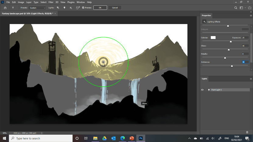
For the final task, I decided to take my fantasy environment concept art I did a while back and enhance it with lighting effects. I used the same technique as I did on my stone carving and went into ‘filter’, ‘render’ and ‘lighting effects’. The familiar oval guidelines appeared as well as all of the options you could edit.

But I wasn’t going for this, so I changed it to a single point so that I could add a glow to the sun and different sections. I messed around with the parameters on the left, mainly changing ambience and intensity so see what kind of difference could be made. I did this for each layer, including the highlights.

I really tried to think about the light sources; the areas directly in the light of the rising sun, I changed to golden or pale yellow. Whereas with the midground where the fountains were, the sun didn’t reach yet and only the slight glow from the waterfalls could be seen, so I changed the colour to pale blue and changed the range by extending the outer circle around the point.
In my opinion, the gold and blue light contrasting on the art from each direction adds a beautiful pearly, morning feeling. Like a new day in a fantastical land, where the water and light are just about to mesh, and we capture the moment of their glow creeping upwards towards each other. The lighting effects make this possible, and even if I simply added colour, without the light, it wouldn’t be as impactful. The final touch to my art was changing the colour, hue and saturation ever so slightly using the adjustment layers.

Once again, I think the result is quite beautiful. I’ve learned some really valuable skills, as I can see how great an impact adding light creates in a setting. It can transform it completely and change the atmosphere though positioning, type and colour. I could see myself churning out fast concept art with one image, by changing the mood lighting and presenting it through different times or periods.