
The First term at Confetti was more fulfilling than I thought it could be! In what felt like such a short range of time we learned about how to work with several different programs and acquired a multitude of different skills. So, as a way to finally use those skills and combine as much as we could together, we were asked to create a short animation on after effects. The themes for this animation were fantasy, sci-fi and horror, as well as being able to add comedy to any one of those themes. I chose fantasy because I feel like it has a very wide spectrum of possible topics, character and world design opportunities. We were told that the minimum time the animation should take is 8 seconds but felt that this wasn’t enough time to showcase everything that we had learned to do on after effects, so I was thinking to make mine at least one minute, in order to really showcase my progress. I was really excited about this project because it was our first real chance to create something entirely of our own idea. I regard it as my first real animation.
Like with any animation, I began in the idea stage, with a mind map. I often find this the most difficult part of a project albeit the most crucial. Whilst brainstorming ideas, I am always self-consciously picking specific things that I like out, and looking for that main idea- that spark that you know you’ve already settled on, even if you continue thinking of others. This doesn’t always come easily for me, because there are so many wonderful things I could pick from, so many options – that it’s hard to narrow it down to just one. This is part of the reason why I really love mindmaps. Their layout is ideal for me; I can see all everything I have thought out and all the ideas linked to them, enabling me to create links between them, add more or reorganise via colour-coding. Here is the mindmap I created. Fortunately, I had no need to colour-code it, since I picked out my idea very soon after seeing it all laid out.
I liked the idea of having a character who wants to do something. So I started off of that and built upon it. I had to keep in mind my abilities in after effects because I could have really let loose with this and gone with some sort of angel-like character. But, doing so would slow down my pace considerably, since a complex character is harder to animate. So, I had to go simple. I quite like birds and that helped inspire the idea for my main character. From there, the idea almost formed itself. The bird would have a goal of trying to fly, as he isn’t able to. I then thought, to amp up the fantasy factor, I’ll add in a concept within the world – that a bird has to find their element in order to reach their true form and fly. Through this, I have a chance to enforce a message with my animation – you don’t have to be like everyone else, and just because you are different, doesn’t mean you are not complete. I knew then, that it was time to move onto the next part of the process – making a storyboard. I had a chance to flesh out my fantasy world and decide from which perspective we are viewing each frame.
I expected to have to create another one, or even two mood boards because I don’t usually like the flow of each frame from just the first attempt. However, with this one, I had the storyline in my head already, and it was simply a matter of putting it down on paper. Storyboards are essential for animation because they are like the plan to look back on when you are stuck. They also give you a chance to see everything put together, and how some of the actions work, thanks to arrows, so you can decide if you like the way it all works or not. I was quite pleased with mine, but I suddenly came to the realisation, that it would be much longer than a minute, and with so many different assets, I needed another way to keep track of where I was. So, I created a checklist of all the assets I would need to draw and make in illustrator, and this was my lifesaver all the way up until I finally started to animate.
Now that I had my plan and my list to work off of, I could start drawing all of the character and background components. The flightless birdie that was to be my protagonist, I decided to name Bobby, and I wanted him to have a cute, simple design, to portray his innocence and also make it easier on my to animate him. Only the legs and the bobble on the top of his head move, and on occasion the face. I decided to only give him wings in certain situations, like when he is attempting to fly. I also had to keep this design in mind when creating the other bird characters, since they’d all have to be a similar style. I had decided that there were going to be ‘waterbirds’ in the animation, and I wanted them to be distinguishable as chicks like Bobby, only, they’ve found their element. They had to be unique and a little more extravagant to show the change, but also link to water and be simple enough to animate flying.


That screenshot isn’t Bobby’s final design, as I changed his body to be squatter and the tail sticks out less. I think that he turned out to be the best out of all the baby birds I designed – something about his form/shape is more pleasing to the eyes. As for the waterbird, I initially wanted to be able to animate each of those individual drops to almost be disappearing and reappearing, to mimic evaporating water or water in the air – but now I know that that would have taken far to long to do. What I would change in their design if I could go back, is the shape of the body. I don’t like how it turned out because it looks a bit awkward and strange whilst bending as the bird flies. Of course, there was no way to know this until I had begun to animate the birds, and by that point, there was no time to go back and completely change the design.
I think the backgrounds were the strongest point in my animation overall. I used Pinterest for inspiration because I had an idea for what I wanted, but I needed to refine it and pick out what I wanted to include specifically. For example, a big part of the world, are the giant swaying mushroom. They are probably my favourite aspects because they feel so fantasy-like. Another thing I knew I wanted for my world, was that it would have a soft, cartoony feel to it, which meant including lots of circular shapes. These things helped me know where to look in Pinterest and what kinds of backgrounds to draw inspiration from:
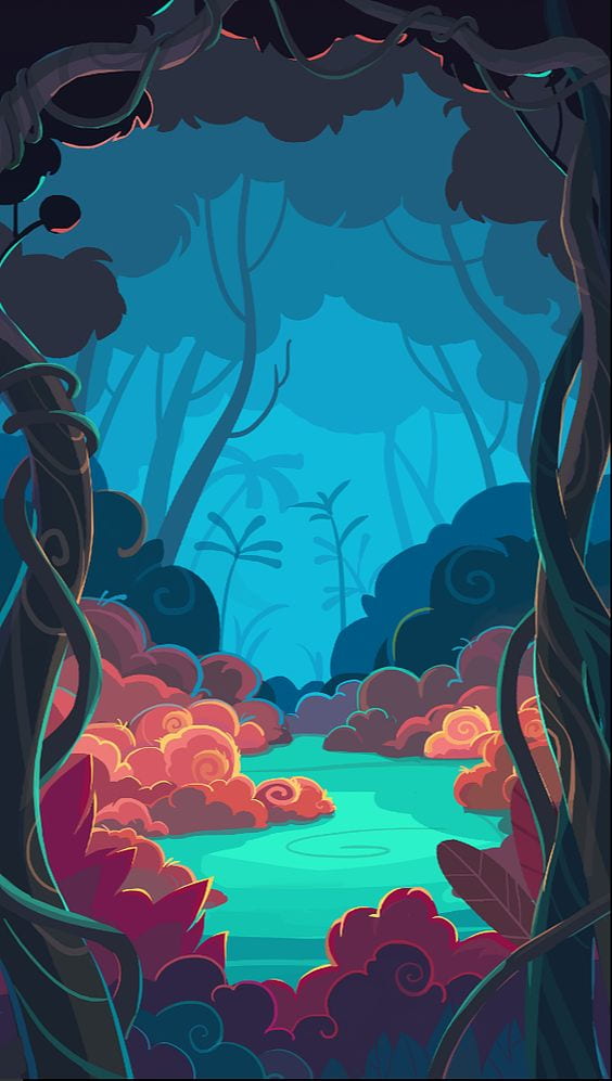


I also wanted to think carefully about the colour palette for this world. Something like the image about gives a very ethereal feel, but that wouldn’t match with Bobby or the simplicity I was going for with the style. So, after I designed the very first background, I went on an app on my phone that I love using to create colour palettes, called ‘Pigments’. It lets you select what kind of colour scheme you would like, and how many colours you want. Then you can experiment with adding, taking away and locking colours as well as choosing features like pastel or gradient. The colours scheme I used was tetradic because I wanted the world to be fun and vibrant, offered by complementary schemes but have more variety and options, which meant having more than one would be good. Once I picked it out, I added it to every single background I created in illustrator, ontop where I could see it at all and reference my colours. I love using purple when designing anything fantasy, because it’s so uncommon to see in the nature of our world, it’s almost certainly associated with fantasy.

After creating all of the backgrounds for the first half of the animation, I had to change my colour palette because the storyline took a darker turn. It is when Bobby realises that he still cannot fly, even after following the same method as the other birds to find his element, and walks off in despair, not really realising he is walking into the barren, volcanic wastelands. This darker world is where he undertakes his transformation, and so I couldn’t use the same colours. I order to really convey the danger and darkness, I decided to use predominantly red, black and grey. When designing the different elements of the wastelands, I used the opposite types of lines from the colourful fun world we see earlier: instead of circular, bubbly and fun, we get straight, sharp and jagged.

For each background, it was necessary to work in different layers and I had to constantly keep in mind what was to be animated and what was constant/still. For example, the lava, I created with different wavy strips of various shades of orange, red and yellow. And since each strip was to move in a different direction, they each had to be on different layers. The same was for the bubbles and clouds, which resulted in a lot of layers to keep track of and move around when necessary. The colourful backgrounds certainly took me longer to create, however, because there were many more details I added in, like the shrubs, rocks and flowers. Despite, this, I actually really enjoyed creating backgrounds, more than I thought I would. I always thought that character design was more my thing, but I realise that I may have a secret passion for creating backgrounds, and I’m much warier of simply discarding this as a career option. I’m grateful my horizons were broadened.
One challenge I didn’t think I would have to face was animating the mushrooms. It was tedious, but fun to add all of the different aspects to animate the mushrooms and I was quite surprised to find out all that I needed to do. My idea was quite simple – make them sway in the wind. Alas, creating the effect I wanted in my head wasn’t that easy. First, I needed to animate the whisps hanging from the mushrooms to look like they are flapping in the wind. For this, I had to apply three puppet pins to each one, and individually move them to make the whisp bend. I then added the loop out expression to this to make the animation a loop and did the same for each one, and precomposed them to the main mushroom body, so that I can then apply cc bend it to everything. I quickly realised that I would have to tweak the mask so that the mushroom could bend fully and not disappear at the edges. I moved the anchor point to the very bottom of the mushroom stem, along with one of the circular points of the mask, and then stretched the mask out a little at the top, to give the mushroom more room to bend, and to make it look less squished whilst swaying. Once I was happy with one cycle of swaying (roughly about 2-3 seconds to get to the opposite side), I added easy ease and loop out, and my mushroom was done! To save me the trouble, I could have copied and pasted this one mushroom three or four times and just positioned them throughout the landscape with varying sizes. However, firstly, I wanted each mushroom to sway at a slightly different pace, and some of them had only two whisps instead of three, so copy and paste wouldn’t have done the job for me. So, I repeated this process for each mushroom, which did take a considerable amount of time. The result was worth it though!

However, this was just for the first background, which was still. The real difficulty was when I had to animate the long background. The long background is double the size of the classic 1920 x 1080 px canvas size because my idea was that whilst Bobby is walking, we see the landscape slowly change as he enters the volcanic world. Some parts of this were quite easy to do, like creating two different skies, with a light gradient and a dark one, so that one fades into the other as Bobby walked. But other parts were quite time-consuming and complicated – like the mushrooms. I did, essentially the same thing as the first time, with how they were animated to sway. However, because the background moved this time, I realised that I had to also animate the mask to stay with the mushrooms whilst they were moving, which meant clicking the stopwatch for both points and moving them bit by bit as the mask moves, as well as the anchor point. This process took a very long time because there is at least one mushroom visible for more than half of the background. And, frustratingly, despite my best efforts to keep the masks with the mushrooms until the end, the edges of the mushrooms still disappeared when we got to the edge of the screen. I tried moving the points further and closer, and different angles around the mushroom, but whatever I tried didn’t work, so I had to accept it and move on.

Another skill that I found came in handy was rove across time, which I applied to the clouds so that they would move at a constant pace in the sky. This was necessary because I couldn’t animate them to move completely equally every few seconds, and they sped up or slowed down without my meaning to. I would have liked to use the puppet tool on them a little too because I imagined them swirling and expanding the way real storm clouds do, but I knew this would make this even harder, as, with the mushrooms, the mask would have to be animated to move with the cloud. So instead of this, I settled on just animating the scale of some of the clouds, to make them look more menacing as they grew bigger. As for Bobby, I animated his legs with just rotation and then tried to make that a loop. But, it didn’t work, because once one part of the loop ended, it started again at the start, when Bobby’s legs are straight and so creating awkward, sporadic, pauses as he walked. With expressions out of the line, I had to go with copying and pasting the keyframes all the way through, which was a long, repetitive process, since I kept making mistakes and having to go back and readjust the keyframes. I got it as smooth as I was able and then went back to animate the bobble and eyes too.


One thing that I found quite annoying was that every time I imported an asset with different layers into after effects, all of the layers were jumbled up. They were in the right places so it was just a matter of me correcting the order, but it would have been good to have that time used elsewhere.

Once I had gotten to the stage where I was adding in Bobby to this background, everything was going pretty smoothly. Looking back, I’m so happy with the whole process, even the parts where I made mistakes or had to redo certain things. For example, with Bobby falling, I wanted to make it clear that it was an accident by making the pupils constrict and the wings flap, to show fear and panic. For the wings, I simply used rotation to move them up and down, and brought the keyframes closer together to make this faster. However, I saw that I had made the wings too far away from the body because there was an annoying gap that showed up at certain times when they flapped. So, I had to move them slightly inwards and then continue. For the pupils, I knew that the highlights would have to disappear just before the pupils contracted, otherwise they would ruin the effect and make the eyes look strange. So, I had to time everything right, animate the highlights to disappear just as the pupils get smaller and make sure everything is precomped to the body so that we don’t have random circles floating around. These aren’t particularly big challenges, just little mishaps, or rather extra steps I wasn’t anticipating. It is because, whilst planning and drawing, there is no way to know every little detail of what will happen during animation, and I think that’s part of the fun because you have to be prepared and manage your time wisely. I am glad that I am learning lessons like this one early on because it will really help to know of tactics and tips when animating,
The final major task I had to grapple with was the phoenix. After the climax, near the end of the animation, Bobby finally discovers his element and transforms into a phoenix, which we see flying upwards from the lava and over the cliff. I had never really drawn a phoenix properly before, so I went back to Pinterest to find some examples and see what I could work with. I found many beautiful pieces of art made sure to pick out which elements I liked best.


I really love all three of the positions but there are individual aspects that I think are the best in each one. For the first, I really like the way lava is incorporated into the design. The edges of the wings are glowing, and almost look like they’re on fire, which is something I really wanted to do for my phoenix. Unfortunately, I didn’t get to animate this and it was only able to integrate this idea into the initial design (the drawing in illustrator). The image on the right has a phoenix which looks to be mature/an adult and is graceful and powerful. This is shown through the positions of the body and head, which are the main inspiration for the body of phoenix Bobby. But, the artwork in the middle is the one I drew most inspiration from. I really love the overall look of the bird and its position. The legs, tail and hair are all heavy inspiration for my design since I really liked the way the feathers faun out on both. Also, the head feathers have a nice curve and flick, which I combined with the ones in the third image.

I was really pleased with the way I drew phoenix Bobby and the outcome looks brilliant in the animation! But, it was probably the hardest thing I had to do out of everything. Here is the process I had to do after I had created the basic animation of the phoenix going up.
- Delete the wings precomposed to the phoenix and import a new pair on top of everything else, positioned where desired on the phoenix after it has risen.
- Apply the puppet tool, but putting pins on where the wings meet the body, one for the middle of each wing, and a few at the very tip of each wing.
- Animate the wings flapping up and down, ideally twice.
- Go into ‘mesh’ and then ‘deform’, where all the pins are, and copy and paste the first keyframes. Put them at the end of the flapping sequence before adding loopout.
- Add easy ease to make the flapping more natural, and then go through all of the animated pins and add loopout.
- Once that is complete, go into all the pins for one mesh at a time, highlight all of the keyframes and drag them back to the start so the wings flap as the phoenix comes up.
- Move the wings to the right layer, so they are below the body.
- Click on the eye, so anything in front of the phoenix disappears as it’s coming up from the bottom of the screen, and position the wings where they need to be.
- Parent or pre-comp the wings to the body and they should now follow it and flap continuously.

I had to repeat this process for the tail and head feathers too, but instead of flapping, I used the pins to make them look like they are blowing in the wind and curling and twining as the phoenix rises. It’s evident that if I was to attempt to make the edges of all the feathers on fire, I would run out of time and go past the due date. This wasn’t catastrophic of course, because the animation wasn’t a strict assignment, but I wanted my first proper animation to be handed in on time. So, I pulled back and worked with what I could, and I am immensely proud of the result. The light at the back is not a gradient, but a light layer I added from effects, which I animated to glow brighter as we see the phoenix in its full glory. I think that really added to the wow factor

To make the animation feel more complete, I decided to do a title sequence and prologues a the end. They are circular and I think that link to the start which reminds the viewer of Bobby’s journey, really reinforces the message I put into the story and makes the whole thing feel more rounded off. But, I wasn’t done just yet. I imported all of my rendered out clips into premiere pro, where I spliced them together and added sound, music and transitions. Although I’m nowhere near as comfortable in premiere than I am in AE, this was a very necessary step, because, without all of those things, the animation felt flat. I got the transitions done pretty quickly, as I just chose from the pre-made ones to speed up the process. Here and there, I extended and shortened the length of the transitions, like the fade to black one at the last two clips, which I wanted to be a little longer for dramatic effect. As for the sound effects like the birds tweeting, the waterfall, the clouds etc. I used a website called freesound.org. By simply typing in a few keywords, you can find all sorts of sounds, from cracks to explosions, to animal sounds. It was a very useful site and it made it much easier and faster for me, just downloading and importing the sounds, than cutting and placing them where I wanted.
The hardest thing for me was finding music. I knew, as soon as I finished animating the very first scene, that my animation could not be without music. I thought that I could just choose some fantasy music and put it as a backdrop, but it was far harder than I anticipated. First, there came a matter of legalities. I planned to post this on youtube, so it was imperative that the music be non-copyright and free to use. This was easy enough since there were youtube channels which found music specifically like this, with the requirement that you give credit to the artists. But then, there came the problem of making a choice. Nothing seemed to fit my animation, at least not the way I pictured it in my head. Bits and bobs from certain songs worked well, but I am not a musician, and I knew that I didn’t have the ability, or experience with premiere pro to somehow assemble different song parts together and make it sound cohesive. Eventually, I found three songs that I thought could work well, and I downloaded them from a website called mp3juices. Once everything was in premiere, I spent a very long time listening through each one from start to finish, cutting them up with the razor tool, moving them around and trying to fit them in with an appropriate part of the animation. It was like a puzzle, and I wasn’t very good at putting individual pieces together to match. The songs felt cut up and disconnected from one another. So, I decided to cut on out entirely and focus on the two main ones.
The first song, “Luz de Luna” by Juan Sanchez, is a peaceful instrumental piano and violin piece, which reminds me of a soothing fantasy forest or village, and so is ideal for the first half. Parts of it also dip quite a bit with the violin, and I think this portrays Bobby’s fluctuation in emotion and sadness pretty well. Towards the middle, as Bobby enters the barren wastelands, I quietened down and faded into the second one, “The Travelling Symphony” by Savfk, which more vivacious/epic and makes the listener feel inspired and excited, especially towards the end. It does an excellent job at building up the tension and it works wonderfully with the prologue. I think I made very good choices for the music of the animation, but it was quite difficult to decide how I would put them together. I tried a lot of things before just making them fade into each other in the middle, but nothing felt cohesive. I think it would be beneficial to learn some more about making music in premiere pro.


Skills/Techniques Included:
- Squash and Stretch and the 12 principles – used throughout to animate the characters
- Overshoot animation – used on the blinking stars around Bobby
- Animating along a path – used on the waterbirds when they’re flying in the sky
- Easy Ease functions – used throughout (mushrooms, waterbirds, phoenix etc.)
- Rove across time – used on the clouds
- CC bend it – used on the mushrooms
- Layers and naming conventions – used pretty much everywhere
- Basic keyframing – used everywhere
- Staggering keyframing – used on the blinking stars and mushrooms
- Creating lights – used on the final scene with the phoenix
- Parenting layers – used with certain aspects like the bobble on top of Bobby’s head
- Loop expressions – used throughout (mushrooms, waterbirds, phoenix etc.)
- Puppet tool – used throughout (mushrooms, waterbirds, phoenix etc.)
Extra Skills:
Some parts of my animation involved doing things I hadn’t learned in any lessons. I could have found a way around them, but I decided I wanted my animation to be like the visions I had in my head. And for that, I would have to use the internet and learn some extra skills. The most essential one was how I would make the water of the waterfall move. One option was to create several copies of the water, with various colours and sizes, like the lava, and then use loop out to make them bend and wiggle like water. But, I knew this would create awkward poses that would take many keyframes to smooth over, and it would look strange when it hit the pool at the bottom. So, I opted for another method, for which I would have to search for with some sort of tutorial. I found a long video that went through the process of making a waterfall in after effects and I didn’t follow all of it; I skipped forward to the section which showed how the water was made to bend that way. I learned that there is a preset on after effects called wave warp, which creates waves along the edge of the shape it is applied to. I tried this out and wasn’t surprised to see the customisation options were large in variation. I could change everything from the height and width of the waves to the gaps between them and the speed of the flow. I played around for a bit before settling on the parameters which I felt worked best for both halves of the waterfall. The effect works really well and the waterfall scenes looked much better after I applied it.
The other skill I wanted to learn was how to make it look like letters were writing themselves. I wanted the title to be shown that way, so I went to youtube to hunt for some cool title animation tutorials. Once I found one which looked really cool and I knew I wanted to replicate, I took notes on the method and then tried it out. Here is the video:
I think this is exactly the right thing to kick off my animation, and it really hooks the audience in from the start. I also loved the type of font used so I found a similar one, called ‘Heaters’, and downloaded it to use in AE.
So, now that I’ve covered all of the key parts of the animation process, I’m very happy to present my pride and joy, the very first complete animation created entirely by me – Rise: