
As the title suggests, the skill that we learned in this session was how to make a liquid motion graphic animation in After Effects, that can be applied as a transition, title reveal or simple, cool text animation.
Motion graphics are pieces of animation or digital footage which create the illusion of motion or rotation and are usually combined with audio for use in multimedia projects.
In other words, ‘motion graphics’ simply refers to graphics in motion. In practice, it looks like 2D or 3D animation techniques used to create something that’s visually pleasing. For example, YouTube intros/outros, TV indents and product explainer vids. It’s also quite popular as an NFT format.


Something that seems quite noticeable and unique to animated graphics like these is the style. They’re usually optimized as gifs and have a bold, fun, simple design, with a generally restricted palette. The whole idea is to be easy on the eye, satisfying to watch, and functional for the website, video or other formats they are used for. The use of clean lines and simple shapes has also made a well-known go-to methodology for producing motion graphics. An easy way to start is by jumping into After Effects and using the shapes and text to create movement, but for something more detailed, producing a vector illustration and animating that also works, and would follow the urbanity of these modern graphics.
Animate: Liquid Mo’ Graph After Effects Demo
In After Effects, create a new project and ensure that the composition settings are as follows:
Resolution: 1920 x 1080
Frame Rate: 24fps
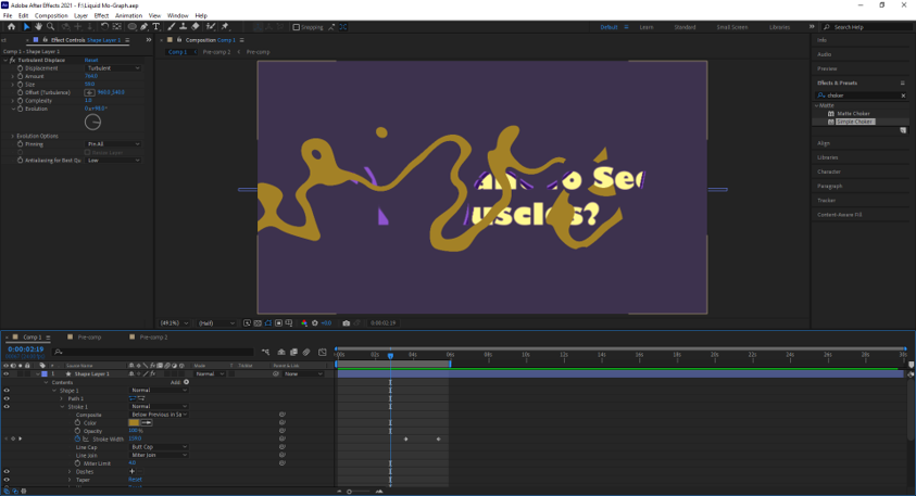
The first thing to do is to create the text and edit it as desired. This includes centring, enlarging, choosing the font etc. Next, make a shape and partially cover the text with it. With it selected, go to ‘effect’, ‘distort’ and ‘turbular displace’, which is the main effect used for the liquid motion technique. Playing around with the values allows you to change the appearance of the shape to create a subtle animation or an exaggerated fluid texture. The amount refers to how much displacement is applied, and is what changes the original shape into a more fluid blob-like form. The evolution shuffles the shape around, allowing you to change it from being splotchy and splattery to smooth and inky. The size is self-explanatory.
After experimenting with the effect, it was time to merge the shape and text, to create the animation. Change the track mat of the text layer to ‘Alpha Matte Shape Layer 1’ so that the shape is combined with the text, but both are visible. Animate the scale of the shape from 0 to anywhere between 1000 and 2000 in a couple of seconds, or more, depending on the desired outcome. Pre-comp the layers together and apply ‘fill’, which can be found in the ‘generate’ option of ‘effects’. Here, you can duplicate the layer, change the colour of the bottom one (this is done through the panel on the left) and slide the entire timeline of the layer slightly to the left, so that the colour is visible and peeking through with the initial displacement. It can be repeated as many times as necessary to achieve a gradient effect or different colour combinations.
To take the animation further, you can even use it for a transition, which is done by creating a new shape layer and drawing a horizontal or vertical line with the pen tool (make sure this entirely covers the screen). Increase the stroke width and add trim paths to the line, which can then be animated according to the speed, direction and position of the text animation. A good starting point would be “End: 0% -> 100% halfway through the animation. The stroke width can also be animated to entirely fill up the screen at the end of the animation by opening up ‘stroke 1’ of the shape layer. Finally, add the same effect as before – turbular displace – to the animation, and the transition is complete.
My Experience


I found this animation challenge really fun and a nice change of pace from the more complex, technical work we’ve been doing. The new effect we used ‘turbular displace’, created some really interesting movement and I got to experiment with how liquidy and blobby I wanted my shape. One thing I struggled with was a mistake I made early on in the process; I positioned my track-matted shape incorrectly, and it covered up part of my text. I thought that this was what we were supposed to do, but after animating it and seeing no change, I realised I had to go back and change it.

I attempted moving the keyframes, moving the shape itself and increasing its scale in general, but nothing worked and I had to ask for help, to my frustration. I felt a little ashamed that I had messed up such a simple After Effects tasks, especially since the steps were so clear, but what I had to do was more specific than my general ramblings. I had to click the second keyframe and increase the size of the shape, then move it back to its original position so that the animation didn’t take too long. Once I did this, my text was revealed much better and wasn’t blocked by any circular blobs.
I also liked being able to experiment with the transition. I wanted mine to look as cool and professional as the examples on the slide, so I kept changing around the colours, stroke and position of the keyframes. It never ended up looking quite like what we were shown, but I’m still happy with what I achieved.