
For the B1 Progression Brief, I will be conducting some research on brand logos and how they were designed in order to help my understanding of their development and creation.
Logos are symbols that identify a business and are usually made up of relevant text and imagery. Their purpose is to showcase what a company does and what a brand values, which is why logo design is all about finding and creating the perfect visual mark. They communicate key information, differentiate the business from competitors and build brand recognition. A good logo has a blend of the following elements:
- Typography
- Imagery
- Colour
- Context
- Static/dynamic elements
But depending on its purpose, these could be balanced in different ways. A good logo consists of all of these things and more but the main function is always to service the identity of the brand, which is almost always unique and specific, so there is no set structure or methodology when it comes to the makeup of one. It can be agreed, however, that an expectation has been built up for what characteristics an effective logo should have – bold, clear, appealing and memorable, since that is how the business gains popularity and profits!
World Wildlife Fund

Also known as WWF, The World Wide Fund for Nature (it used to be called the World Wildlife Fund and still is in the US and Canada) has an incredibly potent symbol to represent who they are as an organisation and what they do. The primary focus of their work is the conservation, preservation and restoration of natural environments around the world and their panda has become universally recognised for it!
Georgie Bridge, WWF-UK’s head of design management, says that “Our iconic logo is at the heart of all our communications and used on every piece of our brand identity,” reiterating the fact that the team always strives to ensure it is applied with respect and in its pure form.
Being the world’s leading independent conservation organisation, WWF had to ensure that their mission came across clearly in their brand design: to create a world where people and wildlife can thrive together.
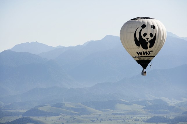
In 1961, WWF’s founder chairman, the naturalist and painter Sir Peter Scott designed the original panda logo and although it has not changed since the year 2000, it has been redrawn several times in the organisation’s 50-year history. It is said that Sir Scott and the group of enthusiasts that founded the organisation took inspiration from Chi-Chi, a giant panda which had joined the London Zoo that year and launched the start of the Fund’s visual identity. The bold, black and white logo has since become known and loved all over the globe.


Throughout the years, as the logo slowly became modernised and professionalized, its message was only strengthened – reflective of the way the Panda’s monochromatic markings and form were emboldened and made clearer with each update. Through the growth of the organisation, the logo and the great animal have become a symbol of all endangered species that would be able to thrive if permitted the range and natural environment of their origin. It is also representative of WWF’s commitment to wildlife and wild spaces. But this doesn’t mean that the adorable bear has gone without criticism.
In 2009, the controversial argument that pandas have “gone down an evolutionary cul-de-sac” was introduced by British television presenter Chris Packham, who suggested that the millions of pounds spent preserving the species could be better spent elsewhere. However, the organisation was firmly rooted in their beliefs and absolutely reused to drop the panda: “It’s a superb piece of iconic design and the equity built up over 50 years is irreplaceable,” maintains Bridge, “However, there is undoubtedly a challenge in ensuring that the panda is able to deliver genuine, widespread public understanding of how broad the work of WWF is in the 21st century. That’s what we hope that the brand refresh will help achieve.”


Most recently, design studio ASHA gave the brand a refresh, introducing a panda stencil and allowing imagery to show through parts of the panda logo that would normally appear black. This is what Bridge was talking about when he revealed his hopes of bringing a new element to the logo that wouldn’t overshadow its original look. ASHA nailed this, enabling the iconic shape of the panda to become a lens for the breadth of WWF’s work. The head of design management expressed excitement for this new outlet which would facilitate the team with the means to use new media, especially moving images, to bring their work to life and let people see ‘what’s behind the panda’.

I chose WWF specifically because it is an organisation that I know and love well. I have always admired their website and brand design, and the panda is at the heart of that! It is simple but impactful, which is why it stays in the audience’s heads – plus no matter how big or small it becomes, and what colour is applied, it is still recognisable, which is one of the most crucial aspects of a good logo. I also really like the stencil idea and I would love to experiment with something similar in the brief in order to expand the capabilities of the logo.
Blue Sky

I actually struggled somewhat with finding a good professionally-creative studio logo to research next. Most logos do not have information available behind their design and only the more well-known companies have any notable history to research. Blue Sky is such a case, having been a well-known computer animation studio established in 1987 by a team of former MAGI employees. It is another beloved studio of mine thanks to its production of some well-loved childhood classics in animation. Unfortunately, due to the economic impact of COVID-19, it was announced that the studio would be shutting down in April 2021, bringing its lineup of commercially successful franchises to an abrupt end. Its first feature, Ice Age, was released in 2002 by 20th Century Fox and it has produced 13 full feature films in total, the final one being Spies in Disguise, released on December 25, 2019.


Because Blue Sky’s logo is fairly simple, there have only been three primary variants throughout its history, with the most major changes. When it was founded, had a logo with a blue crayon scribble, meant to encompass the innocence of childhood and the rough origins of all artists: a piece of paper and a crayon. However, in 2005, the scribble was replaced with a blue oval for modernisation purposes and also to bring about associations of professionalism, completion and the circular nature of our Earth and sky. Finally, with the release of Epic in 2013, the most recent version of the logo debuted, with no oval and a modification to the text. The ‘Blue Sky’ font changed and two different colours of blue were added to the logo, one for each word.

It is important to note that since Blue Sky was an animation company, the logo was mainly created to be viewed at the start of its films, which is why there was an animated element to the design for most of the studio’s active years. The oval spun in place around the text, in a subtle way thanks to the motion only being conceivable because of the change in width around the edges. At a time, a shadow animation was also included behind the text for extra dynamism. Ultimately, this simple animation completed the logo beautifully, acting as a reminder that the key to the wonderful films was in the movement, the key to all life and therefore animation. Not only did Blue Sky pay homage to the roots of their trade and put emphasis on their name, but they also created a soothing tone for their brand design, one with associations of clarity, peace and the energy of the sky, all thanks to their asymmetric circular spin.
So how does this research help with my own brand development? Having looked into not only the main principles of a logo design but also the development and history behind its outlook, I now have a better sense of what is necessary when updating a logo. You need to have the meaning of each line, element and colour in mind, always referring back to the main message of the studio/person and thinking about how the design reflects current work and fits in with the market. I also enjoyed discovering variations of a design, such as with the WWF indents and I plan to try something similar with my own logo to test if it is recognisable and clear, and create some fun alternative versions!