End of Year Reflections

How has this year gone?

This last year has been a bit of a rollercoaster for me, in the middle of the year I moved class groups for confidential reasons however the support from tutors has been amazing. I feel as though I have grown in confidence not only in my skills in graphic design but also in meeting new people and how I present myself which was one of my targets at the beginning of the year.

Are you happy with the progress you have made?

I am happy with the progress I have made, looking back on my work from the beginning of the year I can see how much my style and skill have changed for the better.

What could you have done better?

Something I could have done better is to keep up to date with blog work and try and do as much as possible in the lesson to save it from all piling up towards the end of the assignment and being left with loads to do at the last minute.

What do you personally want to improve on for year 2?

I want to improve on my time management as currently, I believe I am giving myself too much work and planning too big at the beginning of a project which sometimes I cannot all do so I tend to fall behind on blog work. In future, I need to plan a little more precisely and realistically.

(A2) Peer Feedback RESUBMISSION

Why Is Feedback Important As A Graphic Designer?

It is important to receive feedback as other people may see things in your work that can be improved that a designer may not be able to see because they have become familiar with their work and are less likely to spot things. A different perspective can help you unlock your own and helps you become used to criticism and how to use it positively.

Peer Feedback On My Work

With the feedback given, I decided not to use all of the suits to make my own because it looked overwhelming and instead as my peer advised only used elements from three of the suits from the past. I found the feedback really helpful and isn’t something I would’ve recognised myself so is definitely something I will be doing for my other touchpoints and again in the future.

Before the feedback, the idea was to include an element from every suit on this board, however, with the feedback given from my peer I will minimise it down to 3 in this lesson.

After making adjustments and deleting some things my suit looks a lot cleaner and organised than it would’ve been with other things incorporated into it.

(A2) Smart Targets Week 33 RESUBMISSION

Did I complete my targets?

I completed my suits this lesson although I did run over the time of 45 minutes by 15 minutes, this ran into my time for designing my posters. I had the top parts of my suit to finish which I did manage to do.

This was the result after I had finished this.

I then moved on to designing my poster, I began by finding an image I could use to draw over with the pen tool and began drawing and continued this for the rest of the lesson.

(A2) The Best So Far RESUBMISSION

1. Magazine Cover and Spread

I believe this is the best piece of work I have produced because of how sophisticated my magazine looks. As well as this I experimented with many tools in InDesign, including text wrap which I really enjoyed using and used throughout my magazine. I love how clean the magazine appears and all the colours near collaborate with each other, especially on my front cover.

2. Playing Cards

I believe the playing cards are my second best piece of work as they all follow a glitched theme and I put a lot of thought into this project. I wanted to make a set of cards that had an old-themed style but looked like they were being taken over by a newer more futuristic style. I drew the characters from the nightmare before Christmas in pencil to give off a more old-fashioned style instead of more digital and they used created a glitch effect to juxtapose this and make it more digital looking.

3. Tshirt Design

I believe the T-shirt design was also one of the other best pieces of work I’ve made because of the number of attempts I had in making my shirt look perfect, although I haven’t included this. I wanted to create a funky and fresh feel like a graffiti style which I believe I achieved, as well as this I also made my own packaging and logo to make it look like this was an actual real brand as this is what would be needed when making an actual clothing brand so I wanted to cover all areas in that assignment.

Social Media Marketing

Social media is a prime way of companies to reach a wide range of potential consumers with relative ease. Algorithms are manipulated to with hashtags being used to ensure that posts can reach the widest range as possible.

The power of social media has seen it become the main stay with activism. Again notable hashtags trend on sites such as Twitter, garnering mass attention from the range of users these sites have.

Coming Soon Poster

For my coming soon poster I had the idea of being secretive with shadows and not giving anything away. I wanted to use a captivating line to address the audience my poster would be reaching but also make it personal so I came up with ‘We Are Your Team’. With this, the audience feels more included and therefore more captivated by the poster. I used shadows of the divers which I made by using the blending option on the layers in photoshop and changed the angle so they would be facing upwards within the corners of my poster. I believed this kept more with the hidden theme of the poster rather than showing the faces of the drivers, I also used images of the drivers in celebratory poses to remind fans of the great times of the F1 team. For the background of my poster, I decided to keep it simple, using a gradient to mix boh the blue and orange together that are seen next to each other in the suits I created.

What I like about my poster is how little it gives away, it lets the audience know that something new is coming but does not give any hints away so they are left in suspense, I also like the personal touches I added with the line and the driver shadows.

What I would change in future is making sure everything is in line with each other and maybe try and add more to my poster as it looks quite empty.

Coming Soon Poster Projects | Photos, videos, logos, illustrations and  branding on Behance

When looking at other coming soon posters you can see that they use up all the room they have, I also like the 3D effect they have added to their text, something I would use on my work in the future.

(A2) Project Development RESUBMISSION

What is my focus on the A2 assignment right now?

My focus on the A2 assignment right now is to finish my pitch and present it to the class.

What touchpoints am I creating?

Logo recreation, new team racing suits, merchandise, posters and tickets for races.


Moodboards

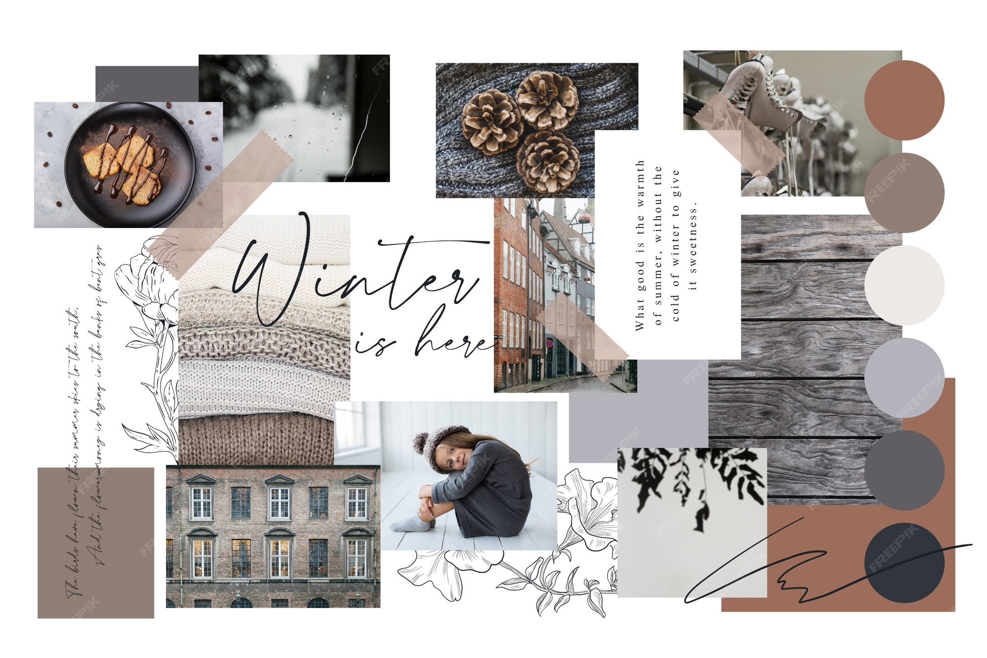
Mood board template Vectors & Illustrations for Free Download | Freepik

A mood board (or inspiration board) is a physical or digital collage of ideas. Mood boards help to build a foundation during the early stages of design.

Mindmaps

Mind Mapping | Mind map, Mind map design, Creative mind map

A diagram in which information is represented visually, usually with a central idea placed in the middle and associated ideas arranged around it.

Other examples of idea generation techniques are: storyboarding, group sketching and brain writing.

How to Storyboard | LucidsparkBlue Frog Creative Network - Sketching ProgramUsing Brainwriting For Rapid Idea Generation — Smashing Magazine

Making my own mood board and mindmaps

To get a more visual idea and for inspiration, for each of my touchpoints I have made a mood board with annotations, it consists f stuff I’d maybe like to incorporate into my project but also research into prices and what is most popular to customers.

I made a mindmap to brainstorm ideas and quickly get them written down, mindmaps are not a technique I would usually use as mood boards are usually the go-to for me however it helped me visualise my ideas for my touchpoints and what I wanted, how I would do it and what software I would use for this.

(A2) Researching Colous and Fonts RESUBMISSION

McLaren Rebrand Colour Pallete

Red-Orange Color Palette

#ffc100, #ff9a00, #ff7400, #ff4d00, #ff0000

With my colour palette, I wanted to find different shades of orange I could use to add variation to my project as I will be using a lot of oranges, and using the same colour might makae it appear to be boring. I also made a colour palette of other colours I would like to use in my touchpoints.

Fonts

I used https://www.dafont.com/ to get my fonts, I searched for mainly san serif fonts except one where I want to have some serif font on my tickets. I wanted the fonts to look futuristic as that is what F1 and McLaren are so they need to represent the brand well.

(A2) Pitch Development RESUBMISSION

What is Primary and Secondary Research?

Why are they important?

Primary Research– Instead of relying on data collected from previous studies, primary research aims to collect data directly. This method allows researchers to analyze the data in order to identify areas of concern.

Primary research is important as it can give a second-hand view of your work, people telling you what looks good and maybe what doesn’t which is good because designers may not see what doesn’t look good as their eyes have become so familiar with what they are working with. As well as this, if you require some data for your project, using primary research will look better to the client as it shows the care you are putting into the project.

Secondary Research– This method involves gathering and analyzing existing data. The data collected is then summarized and analyzed to improve the overall effectiveness of the study.

Secondary research is important as it allows the designer to do research into their client and get to know them before working with them, there may be things about them or that they have done which may mean the designer will not want to work with them or it may just mean you will be able to communicate better with them.

Current idea for Branding and Advertising

My current idea is rebranding the McLaren Formula 1 Team

What do I need to do in this lesson?

I need to begin working on my pitch for my branding and advertising idea to present to my class.

How long do I expect to work on different elements

I expect to spend about 45 minutes researching each of my touchpoints and making a mood board to then go into my pitch.


(A2) Branding and Adverising Week 1 RESUBMISSION

A1 Feedback

CRITERIA TARGET GRADE ACHIEVED
Informing Ideas D D
Problem Solving D D
Technical Skills D D
Professional Practice D D
Communication D D

Points recieved for A1: 15

To achieve my target grade for th year I will need to achieve 8 more points, fo distinction star I will need 14 more points.

Research into possible branding and advertising projects

I really like the idea of rebranding a Formula 1 team as I love the sport I believe I could do a lot with this. I would want to use a team that has a lot of history like McLaren or Ferrari, this could include posters, merchandise and advertisements.

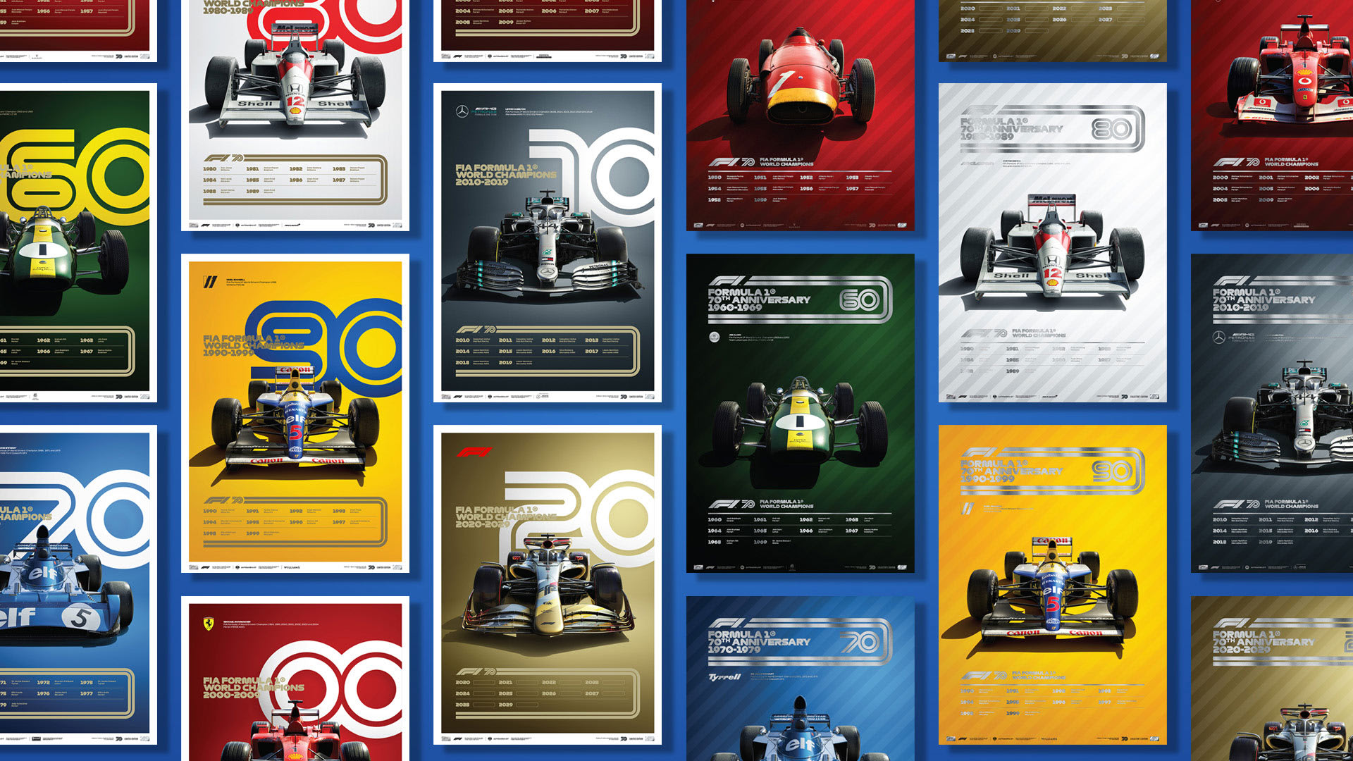
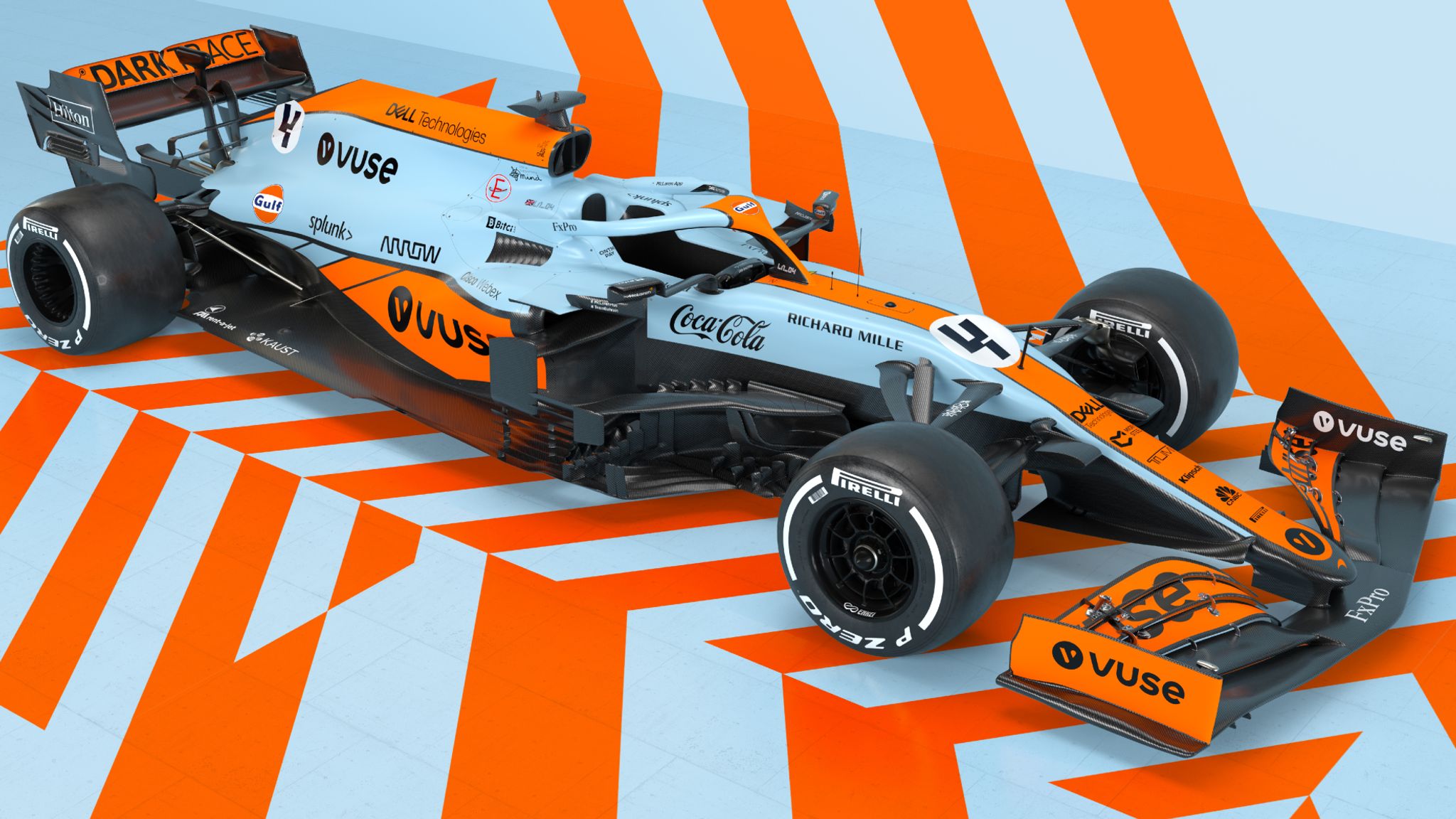
F1 Store | The Official Formula One Store - Formula 1 ShopFormula 1 and Automobilist announce special poster collection to celebrate  F1's 70th anniversary | Formula 1®McLaren - History, Stats, Latest News, Results, Photos and VideosMcLaren reveal retro blue and orange Gulf Oil legendary livery for F1 car  at Monaco Grand Prix | F1 News

Layout Experimentation

Why is layout important?

Good layout design is both dynamic and clear, creating visual points of interest that guide the reader through a piece of content without overshadowing its message.

When youre deciding how to layout your magazine spread, there are some things to consider.

PURPOSE

What is the purpose of the magazine/spread you’re working on?

Is it image base, story based, formal, funny?

BALANCE

Is your content evenly distributed over the spread?

Overloading a page with content is prime way of losing your readers interest.

HIERARCHY

Do the right pieces of information stand out?

Establish importance of the information by indicate this visually.

READABILITY

Is the text easy to read?

Your choice of typeface, size, spacing, position/orientation all play a part in how readable something is.


This is the intended reading pattern for the reader.


Task- Quickly brainstorm potential ideas for an article

On paper, create 3-5 thumbnail sketches of potential layouts for a single page of a magazine spread.

Portfolio Gallery

I have chosen these 10 pictures out of the 50 given because of the different skills they portray through the work which shows off the person best to the client.

Ranking Mini Briefs From this Year

1= Best

8= Requires Improvement

  1. Magazine Cover
  2. Tshirt Design
  3. Soda Can
  4. Playing Cards
  5. Album Redesign
  6. Typography Poster
  7. Ident
  8. Digital Illustration

Descriptions of each Mini Brief

Magazine Cover

What we were asked to do- Develop skills in InDesign, learn how to make and break a grid system to incorporate graphics, text, photos and more into a page spread and magazine cover.

How I approached it- I approached this task already educated about how to use InDesign so I had an advantage in this brief however I did learn extra skills throughout this brief like how to scale and use the grids.

Tshirt Design

What we were asked to do- Develop your skills further in Photoshop and Illustrator to create at least one design after some consumer/market research. Create wearable graphics for specific target audiences and demographics.

How I approached it- I approached this brief with many ideas about what I wanted to produce, however, I was also unaware of the research that came with doing this and learning about the audience demographic I would have.

Soda Can

Web Accessibility

Accessibility- The quality of being able to be reached or entered.

This can be related to web design through making a website accessible to the consumer, this can be through making it easy to use and find what the person is looking for through your website, this relating to the topic your website is based around.

It is the inclusive practice of ensuring there are no barriers that prevent interaction with, or access to websites.


Disabilities that may require people to need the help of accessibility features:

  • Blind or with low vision- This can impact people by not being able to see, read or have basic independence. Blindness can really damage a person’s mental health as the disability takes away their mobility to do basic tasks such as boiling a kettle. By making a website accessible to this disability not only are you bringing in more people to your website by making it able to use by the blind you are showing to be all-inclusive and not making a disability a reason for people not to come to your website. Blindness and low vision can be catered for by using the text to speech function where users hear the writing on the screen to them as it is read out to them rather than reading it. Other features, like high-contrast themes and enlarged cursors, make it easier for users with limited vision to see the screen.


  • Dyslexia- A learning disorder that involves difficulty reading due to problems identifying speech sounds and learning how they relate to letters and words. In the daily life of someone with dyslexia, a person may have trouble with their memory, timekeeping, organisation, communication, multitasking and most commonly known, reading. By making your website accessible to people with this disability you are making it readable by paying close attention to your layouts and fonts, this may also come in handy with people without this disability as your website becomes easier to read also to people without dyslexia. A way to make your website accessible for dyslexia is using multiple pictures as they offer context, making sentences simple and direct to the point, using san-serif fonts as using ‘hooks’ on letters can become a distraction when reading and offering the option to change the colour of the background of the screen as it can help the individual focus better.


 Considering the needs of those who have special needs links falls in line with tolerance and mutual respect, one of the British values.

Multi Formatting

UI/ User Interface

User interfaces the user interface is the graphical layout of an application. I.E buttons, the text, images, sliders, and anything the user interacts with. This includes screen layout, transitions… everything.

UX/ User Experience

A user’s experience of the app is determined by how they interact with it. Is the experience smooth and intuitive or clunky and confusing? Does navigating the app feel logical or does it feel arbitrary?

Ranking of Websites 0-5 Stars

Paradise Drinking Water- 2/5

This website appears very boring, it doesn’t have anything ordinary in it just a white website with hints of blue here and there with some old-fashioned cheesy pictures of people smiling which makes her user experience next to none. Aside from this, the website is interactive and where words are underlined it is clear that these are links to other parts of the website which makes it easier to navigate around, it also has the contact information in bold at the top making it easy to see, it shows they have at least thought of the use of hierarchy in this website.

Headhunter Hairstyling- 4/5

This website was really easy to navigate around and if you did want to know something about this website eg the prices you would be able to find it in seconds. They have kept their homepage both minimalistic but also kept it stylish with the moving image in between the page of their building and the colour theming in the page to match the website, something like this makes you trust the website more as it appears less sketchy, unlike the Paradise Drinking Water. Something I would change about this website is the quality of the photos that they use, the website includes a gallery where there are pictures of past clients, the idea is great as it shows future clients coming to the website the abilities of the hairdressers, however, the quality of the photos makes part of the website look a bit tackier. As well as this I would also experiment with the layout of these images, using different sized images and presenting them differently instead of the same size grid layout they have used.


Airbnb

Ident Brief- Background Research

What Is An Ident?

An Ident– A short sequence shown on television between programs to identify the channel.

Task- Brainstorm a list of channels you regularly view content

TV Channels

ITV

MTV

BBC

Channel 4

Channel 5

Nickelodeon

Adult Swim

Cartoon Network

Film 4

Dave

Background Infomation on Channels

MTV

The channel began as a 24-hour platform for music videos and debuted at midnight on August 1st 1981 with the broadcast of “Video Killed the Radio Star” by the Buggles. It became so popular in the 80s, 90s and 20s that if a song was played on MTV it was almost guaranteed to become a hit for the artist. Its most popular video to air on the channel was Michael Jackson’s Thriller in 1983 which was a breakthrough as the channel in its early days faced criticism for an almost complete shutout of Black artists. Its target audience is older teens to young adults as it mainly plays the songs that are trending at the moment which also mainly aims toward young adults as well. After its success in the music industry, in its later years, MTV also started broadcasting reality TV shows which also seemed to become a hit with its most popular show being MTV cribs where celebrities would give tours around their house giving them an insight into their lives to the public.

00aeef , ed008c , fff000 , 000000

Adult Swim

The channel frequently airs adult animation features, mockumentaries, sketch comedies and pilots. It was first launched in 2001 as an alternative channel at night when the primary audience of the cartoon network, younger children, would go to sleep and the new target audience became adults. Adult Swim is known for its sexual themes, nudity, strong language and graphic violence and has created popular shows such as Robot Chicken, The Eric Andre Show and Rick and Morty.

0af167, ee70a6 , 520099 , 39eafd , 39eafd , 0d0735 , f5f5f5

Channel 4

Created in 1982 Channel 4 is the UK’s biggest streaming service and stands out from other channels through its purpose of representing unheard voices, challenging with purpose and reinventing entertainment. Its purpose was to provide a fourth television service to Britain in addition to licensed BBC one and two and the singular channel of ITV. In 2010 the channel was extended to Walesa and became a UK-Wide television channel. The channel grew so vastly it became cooperation and created more channels consisting of; Film4, E4, More4, 4Music and 4seven. The Box Plus Network. They have said themselves that their target audience is 16-34-year old’s. The most popular shows made on channel 4 is The Inbetweeners, Peep Show, Gogglebox, Skin, Fresh Meat and the IT Crowd.

2e1f54 , 52057f , bf033b , f00a36 , ed3b21 , ff6908 , ffc719 , 598c14 , 335238 , 4a8594 , 051736 , 000000 , 706357 , b0a696 , dbe0e3 , dbeede

My Chosen Company

For my chosen company I will be doing adult swim as I would like to use popular characters from their programmes such as Rick and Morty and have these characters ripped in half to reveal the name adult swim.

Intro to Editorial Design

What is Editorial Design?

Editorial design refers traditionally to the design of newspapers magazines and books but can also now include online publications.

A History of Magazines

Before the creation of the internet magazines were the primary source of finding out information and news regarding topics of science culture and many more.

Covers that have been viewed as iconic all have a common trait between them, they all have a strong use of imagery that can catch a reader’s eye and be impactful.

Magazines can be filled with text and information but it is the use of imagery coupled with words that can lead o powerful pieces and leave a long-lasting impression on the reader.

Definitions for Magazine Features

Magazines follow codes and conventions just like anything in life to keep things consistent.

Task- List the definitions for the terms linked to the anatomy of magazines

Masthead– The title of a newspaper or magazine, informs the reader what magazine they are reading and also creates a name for themselves.

Coverline–  A headline on the front cover of a magazine advertising a story or feature inside.

Magazine Deck–  One or more lines of text found between the headline and the body of the article can tell the reader the date or what the theming is of the magazine.

Headline– A heading at the top of an article or page in a newspaper or magazine and tells you what the main article of the magazine.

Kicker–  A line of newspaper typeset above a headline usually in a different typeface and intended to provoke interest.

Byline– Tells the reader who wrote the story giving credit to the writer.

Negative Space– The portion of a page left unmarked, can be powerful depending on the image or can be left to prevent the cover from looking too busy.

Image– A visible impression obtained by a camera, it is the first impression a reader will get of the magazine and can grab attention if done right.

Image Caption– A few lines of text are used to explain or elaborate on published photographs.

Stand First– A brief introductory summary of an article in a newspaper or on a website, typically appearing immediately after the headline.

Pull Quote– A brief, attention-catching quotation taken from the main text of an article and used as a subheading or graphic feature.

Footer– Information about the author of the section, copyright data or links to related documents.


Task- Annotate pages from a magazine with the key terminology


The designer of this magazine has stuck with a colour theme matching the suit of the cover image which in this magazine is Andrew Garfield. They have done this so the colours don’t clash and make the magazine look tacky, doing it this way keeps the magazine looking sleek and sophisticated. They have also used both serif and san serif font, they have used the san serif font to grab attention and make it the larger font as it stands out above the serif as it appears to be loud. However, t keep with the sleek theming they have also used serif to also show the polished style the magazine is following to try and reach all audiences. As Garfield is pictured wearing a suit the designer has tried to stick with the theming around being businessman-like but uses big bold kickers to stand out above magazines hat will also be placed around the shelf near the magazine.

Project Organisation

Milanote is an easy to use tool to organise your ideas and projects into visual ideas.

By noting down the tasks that I need to do, it helps me stay organised and I am more likely to do them by getting a visual idea of what is yet to be done.

Creative designers will find millanote useful software to use as it keeps them up to date on what they have and haven’t done making it easier to meet deadlines and keep them and their client on the same page with how the project is coming along with the ability to share the page.

Style Frames

Story Board

A storyboard is a visual depiction of a film or sequence that shows how it will unfold. It sketches out the various elements of the video and how it will unfold shot by shot.

Mainly linked to the narrative of storytelling, it’s common for storyboards to be produced for animations. However, for short animations such as idents, storyboards are not necessarily required.

Style Frames

A style frame is a snapshot of a finished frame as it would look within a longer animation. It aims to capture the overall look and feel of an animated or live-action video but in a still image.

Style frames can be a great way to present a sample of the work that you intend to produce for client work, before getting into the time-consuming animation process.

An example of what style frames look like, taken from the opening titles of F1, shows shots from different angles and colours throughout.

Style Frame for my Ident

By using photoshop I have created my style frame to present my idea for my ident. By using a png online I imported this into photoshop twice and by using the eraser tool separated the two characters and using the transform tool rotated the one on the bottom so it could be beside the other.

In my final ident blog, I will talk about how I created my characters to be in half using the marquee tool here I will be talking about how I have sectioned my ident idea into three shots. For my ident, I want to follow the idea of my two characters being ripped in half with the name of the channel being in between this and dripping. This idea has come from the show these two characters come from ‘Rick and Morty’ these being the names of the two characters I am working with for my ident. The show uses gruesome and wacky ideas to entertain the audience so I want to carry this theme into my ident as it best resembles the show.


For the three shots in my style frame, I have minimised my ideas which follow through with what my ident will begin like, what it will look like In the middle of the sequence and finally what it will look like at the end. It will begin with my two characters separated at the beginning, them crashing into each other and then attaching each other at the end to be split in half and the brand name being in the middle.

With my style frame, I now have a rough idea of what my storyline/ sequence will run like making it easier for me in the production process as I will get to spend more time on actually creating my ident.

Idents

What is an Ident?

A short visual image is employed between television programmes that work as a logo to locate the viewer to the channel.

What is the purpose of an Ident?

It is a way to introduce a movie or a channel to make it known what it is and who has made it. It is a way for the brand to make a name for themselves and something an audience can become familiar with and recognise through the ident.

MTV


To stay on brand, MTV creates cartoon characters that are dressed funky in vibrant colours dancing to a beat to show that it’s a music channel with upbeat modern music hence the vibrant colours will mainly appeal to the younger audience.

ITV


To stay on brand ITV uses repetition in their idents to keep consistency. Across their multiple channels, the brand keeps a clear white background and uses the dot in the ITV as the focal point of the ident. As it is the only point in the letter that doesn’t link together with the word so uses this to start off the animation. As there are 6 channels ITV also has an icon that brings all these channels into one as each channel is assigned a colour, doing this makes it clear to the audience that these channels are tied in together keeping it on brand.

Universal

Universal stays on brand by also using consistency and using this opening ident across every one of their movies. By doing this, the audience has become so familiar with the ident and watched great movies coming from universal that when they see this ident they are reminded of the great movies that have come from it creating high expectations when they see this ident.

Transferable Designs

What Does It Mean If Something Is Transferable?

Transferable- If something is transferable, it can be passed or moved from one person or organization to another and used by them.

Brand designs will often transfer to lots of different products to remain ‘on brand’ this meaning they carry the same tone of voice and often the same design elements will be carried as well including colour, patterns, font etc.

Why Are They Important?

They are important as they make a brand stand out above the rest, keeping designs consistent make them recognisable to the customer and easy to find above the rest, if you make your design visually appealing people will be more inclined to buy it. Your design is the first thing a person will see when they buy the product so you need to make a good first impression, if the consumer likes this product and you use the same design the customer will feel more inclined to buy it because of their good experience with the brand before.

Apple is a great example of this, they have a sleek design that is recognisable without a logo because of their consistent transferable branding over the years.


Task- Create a logo for yourself made out of your initials 

My Logo

To make my logo I wanted to use a retro-style font that linked my letters together, after browsing for different I found a font that I liked and believed suited the brand identity I was going for. A problem I ran into however is my letters did not link in together so using the pen tool I began to draw to link these letters to each other. To begin with, I had to find a way to link them into each other making it look like it was all done with one line, this meant I had to move the letter D downwards a bit so the line that goes through A would directly link into the top of D. Here is where I began to use the pen tool to fill in the awkward gaps where my letters showed that they were not meant to join in the way I had made them, I filled the outlining of my pen tool shape in black and my letters now appeared to slot into each other perfectly. Finally, as my logo was looking a bit bland I decided to add some white lines into my letters to add more character and make it more unique, many other people could have ‘AD’ as their logo but this would help in making my logo more ordinary and distinguishable above the rest.

Task- Download some mockups and apply the logo you have made to them

Using mockups I had found off the internet I attached my logo to them to see what my logo would look like in the real world and attached them to different materials. This gives me a better idea of where my logo is best suited, the size of the font I’d use on different objects and if I were to change anything if I were to place it on different things.

T-Shirt Moodboard

After researching different styles of t-shirts and gathering multiple images, I created a mood board where I would group these different shirts into categories. I made four different groups which I believed my shirts would fit into, these included; edgy, happy, imaginative, and playful.

I made the category edgy as when I looked through my gathered photos I found that a wide majority followed this, this being because of the graffiti look on some of the tops and almost like handwritten designs. I believe what makes them look edgy is the rushed look that is given to them, something that is considered a crime, graffitiing a wall onto a T-shirt and sticking tape and splashing paint onto the shirt as if it weren’t meant to happen. What I really like about the edgy style is it is something that shouldn’t work but does, 50 or so years ago if you were seen to be wearing something like this you’d probably be considered a ‘tramp’ but now it’s a style that can really express a personal style and in some cases spread a message through the design as well.

I made the category happy as some of my T-shirts I had found I saw conveyed a positive message or contained bright happy colours. Colours like yellow baby blue and green are used across the T-shirts which can be considered happy colours because of their bright appearance and eye-catching tones. On one of the T-shirts, there is a grinning person that takes up half of the shirt which radiates happiness because of the persons’ emotion and as well as this the smile on the person is what stands out the most because of the duller colours against the bright white teeth of the person. There are also on the other T-shirts that contain positive messages like ‘feel good’ or ‘feeling fresh’ which when people around them will read this not only do they understand that the person wearing that top is probably having a good day this rubs onto them too when reading it reminding them to feel good. Finally, on one of the T-shirts we see a children’s cartoon character eating cereal, childhood mainly being associated with happiness and good memories links into this theme as well as showing a person’s playful side.

I made the theme playful because of the artists creating these particular tops were clever with their art and used already popular designs and added their own spin onto it. On one of the tops, we see ‘The Great Wave of Kanagawa’ being made to look like a dinosaur walking, this is a creative way of thinking of this piece of art and a way to give the piece a whole new meaning.

Gathering Data

What is Primary Research?

Instead of relying on data collected from previous studies, primary research aims to collect data directly. This method allows researchers to analyze the data in order to identify areas of concern.

What is Secondary Research?

This method involves gathering and analyzing existing data. The data collected is then summarized and analyzed to improve the overall effectiveness of the study.

Quantitative- The process of collecting and analyzing numerical data

Which of the following do you prefer…

What is your age…

Which of the following are your favourite…

Qualitative-  Involves collecting and analyzing non-numerical data

What do you think about it…

What is it like…

How would you…

  1. What supermarket are you most likely to shop at to buy a can of soda?
  2. How many fizzy drinks do you drink in a week?
  3. Of the drinks listed below, which would you feel most inclined to buy?

4. Do you prefer bolder more artistic packaging or a plainer more simple look to the packaging of a soda can?

5.  What is the most you would pay for a can of soda?

6. Do you prefer processed flavours in soda cans or natural flavours?

The link to my conducted survey featuring the questions from above:

https://www.surveymonkey.co.uk/r/NT2JBFC


Pyschology Around Colours

What is Colour Psychology?

A popular area of colour theory is colour psychology, it assigns emotional and psychological connotations between colours and emotions. Many questions whether colour really does have an impact on our day to day activities and the short answer to this question is yes. There are multiple studies that support the theory that colour can impact our decisions. The same colours can also have different meanings that can be dependent upon a person’s upbringing, gender, location and values as well as a variety of other possible factors.

Primary Colours

Red- It is considered to be a strong colour and has the capacity to trigger physical responses from human beings, this can be through an example of a light going red at traffic lights making a person stop. The colour red can stimulate many feelings in a person from love and passion to anger and power. People tend to associate red with negative and danger bearing emotions, this being because it is the colour of fire, blood and sometimes dangerous animals. Across cultures, people tend to associate the colour red with the concept of anger this may be because it is the colour a person’s face goes when they have increased blood flow when they become angry, this is where the expression ‘seeing red’ comes from being based on these characteristics. However, the link between someone’s face turning a shade of red can also be because of someone having; elevated blood pressure, enhanced metabolism, increased heart rate, increased respiration rate which all can be linked to excitement and energy. The colour red is also linked to the thoughts of passion and desire; it is a colour that is consistently rated as more attractive to the opposite sex seen through research from 2008. A final thing red can represent although it can be linked to many more emotions, a popular linked emotion is the feeling of power. The red carpet that is rolled out for the most prestigious celebrities almost shows a sign of hierarchy and importance therefore the higher amount of power a person will feel when on it, as well as this a red tie is seen to be a ‘power tie’ when worn by businessmen. The association red has with power and wealth is a reason why women and men find the colour red so attractive.

Blue- The colour blue is favoured by many people and is often viewed as the most non-threatening colour as it calls feelings of calmness and serenity in the mind.Businesses that want to project an image of security often utilize blue in their marketing strategies, trying to appeal to their audience as calm and controlled. The colour can often create feelings of sadness, famously shown through Picasso’s work during his ‘blue period’ therefore some people tend to avoid this colour and to some the colour is one of the least appetizing and weight loss plans advise to eat food off a blue plate. In opposite ways to this, blue can lower the pulse rate and body temperature because of its calming attributes and the connections it has to be a ‘cold’ colour.

Yellow- It is the colour that is the most noticeable to the human eye. The radiant colour promotes happiness and optimism in a person more than any of the other major colours. Positive attributes to the colour red include; increased mental activity, heightened awareness, increased energy levels and an increased metabolic rate. However, as well as this, because it is such a strong and bold colour it is the most draining and fatiguing colour to the eye which can lead to agitation in the observer. Some negatives of the colour yellow include; increased irritability, increased anger, heightened levels of aggression and a heightened level of agitation. The colour yellow is regularly seen in logos and advertisements because of its eye-catching colour, this is most recognisably seen in the McDonald’s logo and the badge of the famous superhero of Batman.

Secondary Colours

Purple- In colour psychology purple is considered a royal colour and is connected to power, nobility, luxury, wisdom and spirituality. People often describe the colour as mysterious, spiritual and imaginative. It is a symbol of royalty and wealth, in ancient times, creating dyes to colour fabric often required a great deal of effort and expense. Because the colour purple is less common in nature it was harder to create dye with the colour, therefore, making it more costly. The colour purple also represents wisdom and spirituality, because of its rarity it gets connected to the unnatural, supernatural and divine. However, using too much colour is seen to cause frustration in people as some perceive its overuse as arrogant. 

Orange- It is a colour that can be very strong and energetic, it can be very attention-grabbing which is why it is frequently seen In advertising. Orange is described as being a colour that makes people feel happy, uplifted and spiritual but as well as this, much like purple, tends to be a controversial colour it tends to be either loved or hated. It calls feelings of enthusiasm and excitement to the mind because it is a high energy colour, because of this it is regularly seen being used in sports teams’ uniforms, mascots and branding. A 2018 study published by Frontiers in Psychology discovered that the colour could increase energy levels and make it more difficult to engage in tasks such as studying and another study found orange was associated with feelings of playfulness and vibrancy. Other studies have found that orange is considered a highly stimulating but friendly colour and its attention-grabbing qualities is its reason for often being used in traffic signs and advertising. Orange is the colour of bright sunsets and foods such as oranges and tangerines so the colour is associated with the beauty of sunsets and the refreshing taste of citrus releasing the emotion of happiness. In the United States, the colour orange is associated with prison uniforms meanwhile in other countries is linked to religion and spirituality. The colour is often used in spiritual practices including medication and compassion, in Southeast Asia Buddhist monks wear orange robes that symbolize simplicity and letting go of materialism. 

Green- The colour green is associated with balance and harmony, it is a great balancer of the heart and the emotions of a person. For many people, it has strong associations with nature bringing the idea of grass, trees and forests refreshing the mind because of their tranquil colour. Green is a cool colour because of its shorter wavelengths, in colour physiology colours that are made up of longer wavelengths are considered arousing or warm and colours with shorter wavelengths relaxing or cool. Our eyes need to adjust to colours that have longer wavelengths but those with shorter wavelengths do not need to and this is the same with the colour green, making it easy to look at with the eye. Other common associations with the colour include money, good luck, health, envy or jealousy.

Black and White

Black- A popular colour in retail, black has the symbolic meaning of mystery, power, elegance and sophistication; in contrast to these, it can also evoke emotions such as sadness and anger. Some brands use black and white photos to keep consistency in their brand and the colour is seen to be used across multiple fashion retailers’ logos. It isn’t a primary, secondary or tertiary colour as it isn’t on the colour wheel or even considered a colour at all. Black absorbs all light in the colour spectrum, it is also all colours on the colour spectrum. For some, black evokes positive associations including attractiveness and elegance; it oozes sophistication and is the reason why so many wear the colour when attending a fancy event. It’s also why high-end brands like Tiffany & Co and Chanel utilize black in their logos. Despite this, the colour is also used to symbolize all things negative. In history, the sombre colour has been tied to death, anger, fear, aggression and anger. It has been associated with many negative actions and events such as; Black Monday, Black Plague, Black magic, Blackhole, Black-hearted, Blackmail, Black market and a Blackout.

White- The colour that represents purity and innocence, a bride wearing white is often thought to convey to brides virginity yet blue was once the colour worn to symbolise her purity. Designers often use the colour white to make rooms seem larger and more spacious as it can create a sense of space or add highlights. However, the colour is also described as cold, bland and sterile and whilst a room painted white can make t seem more spacious it can also make a room feel empty and unfriendly because of its lack of warmth within it. Hospitals and hospital workers use white to create a sense of sterility because of its brightness and cleanliness. Positive meanings behind the colour include; cleanliness, freshness and simplicity because of its blank slate the colour can symbolize a new beginning and fresh start. On the negative side, however, is the colour can also come across as stark, cold and isolating. In one study on adults’ colour preferences out of the 18 colours white only ranked fifteenth as the overall favourite colour yet was ranked first for evoking moods of quietness and concentration.


It is important to consider colour psychology when creating a design as by using a certain colour you can portray emotion through the colour you choose. However, by choosing any random colour you can also portray the wrong emotion for example using the colour black when trying to evoke the emotion of happiness when a more suitable colour for this would be yellow.


Planning for Drinks Brand

Brand Name- Golden Glazed

Slogan- Glaze your senses in luxury.

Target Audience- Over 18s, alcoholic drink

Brand Toolkit

What is Brand Identity:

  • A brand is not what you say it is, it is what the customer says it is.
  • Logo, colour palette, website, communication, brochures
  • A brand is what customers think and feel about you.

Brand Identity is the visible elements of a brand such as colour palette, design, typography, and logo that identify and distinguishable the brand in customers’ minds. This can be seen through brands like Mcdoands and Adidas which do not need a name against the logo for the majority of customers to distinguish the brand.

A Brand Kit is a resource that goes over all the details of your brand identity in one place. It contains the important visual elements of your brand when it comes to marketing.

  • Logo
  • Alternate logo
  • Colour palette
  • Possible typography

Brand Toolkit for my Playing Cards

For my brand toolkit, I have decided to follow a glitchy theme with bright neon colours pink and blue. I have decided to take this route as I think it will contrast with my drawings which will be more old fashioned following the ideas of Tim Buton and adding a digital effect to this will make these designs my own and add something new to them.

I found making the brand toolkit helpful as it gives me a guide for the theming of my playing cards and would use it in the future again to get my ideas on paper as a visual for myself.


Playing Cards Ideas

Playing Card Facts

Traditional suits in cards:

  • Spades
  • Clubs
  • Diamonds
  • Hearts

There are 52 cards in a total deck of cards.

9 total numbers in a suit as well as an Ace, Jack, Queen and King.

Styles of decks:

  • Ambigram– Something that can be flipped and still be read and often done with words for effect.
  • Bicycle Cards– The most common card brand renowned for its quality, they come in a variety of editions and themes. 
  • Stylized– Black decks often with gold and silver holographic features adding a futuristic twist onto an old fashioned style.
  • Themed– Often tied into a theme or culture, this style of playing cards will add unique visual styles to match the chosen theme with the numbers and suits.

Playing Card Specification

Dimensions of playing card

Height-88m

Width-63mm

Must indicate a number and a suit

Could be an ambigram

Must be double-sided

Have a visual style

2 Number Cards, 1 Face Card, 1 Ace of Spades

Moodboard Ideas For Playing Cards

For my playing cards, I have decided to follow the routes of one of my favourite artists Tim Burton, therefore I did some research on his artwork and drawings and included these into my mood board. As well as this, I included some images of playing cards other people have made including Tim Burton’s designs for inspiration, some following themes of old-style vintage cards, and some looking more futuristic. I continued by finding a colour palette I would like to follow and the colours I would like to include in my work, followed by researching different fonts in which I chose a more gothic and victorian style of font approach. For my approach to the playing cards on first ideas, I would like to follow the gothic style of drawings Tim Burton had made and recreate these making them look more digital adding a modern approach to them as well as making the design on the card itself look original making it a seethrough type of plastic. As these are my first ideas the approach to this may change when it actually comes to creating my cards.

Anatomy of Type

What does Anatomy mean?

It is the branch of science concerned with the bodily structure of humans, animals, and other living organisms.

What is meant by Anatomy of Type?

The use of typefaces, their fonts, and font families can affect the brand identity of a company, each of these components makes up the anatomy of type and typeface.

 Definitions

Ear – The small stroke that projects from the top of the lowercase g.

Stem- The main vertical portion of a letterform.

Bowl- A curved portion of the letterform that encloses a counter. The exception is the lower curved part of a lowercase g.

Ascender- The portion of a lowercase letterform that ascends above the x-height of the typeface.

Descender- The portion of a lowercase letterform that descends below the baseline in a typeface. In some typefaces, the uppercase J and Q also descend the baseline.

Counter- The negative space of a letterform. A counter may be either fully or partially enclosed.

Open-counter- The open space in a fully or partly closed area within a letter.

Serif- Small decorative lines added to the end of a letterform’s stem and stroke. Serifs improve readability by leading the eye along a line of type.

Terminal- The end or termination of a stem or stroke with no serif.

Tail- The stroke or loop at the end of a letterform such as the tail of an uppercase Q or the stroke of an uppercase R.

Link- The part of a lowercase g that connects the loop to the bowl.

Baseline- The invisible line upon which a line of the text rests.

X-height- Is the body of lowercase letters of a typeface, excluding the ascenders and descenders. It can vary considerably among typefaces with the same point size which is based on the width of certain uppercase letters.

Spur- The projection that extends the endpoint of the curved portion of a letterform; it is smaller than a serif.

Spine- The main portion of the letter s, both upper and lowercase, that curves left to right.

Counter

By using the idea of a hula hoop representing the idea of the letter o I filled the negative space inside of it with the image of the actual space as a play on words.

Baseline

Using the letter L I used a play on words again with the term Baseline being where a letter rests therefore I made the letter L a deckchair to rest on the line.

Descender

By mimicking the letter J with the lower handle part of an umbrella, I created a line for it to sit on as the J descends underneath the line.

Album Redesign Ideas

Before creating my final design I created ideas for what I may want to do. By using photoshop I designed the following ideas;

By adding another layer, I duplicated the main image of Frank Ocean so I could rotate it and if I needed to go back to the original image to change the background without changing the main image, I could. Still focusing on the main image, I used the blur effect to create the shaken image effect and to make the image less distinguishable. Finally, on my main image, I used the noise effect to add grain to my image and to make it look more distorted.

To create this design, I created another layer of the main image again and on the duplicated layer of the main image, I did an outline of Frank Ocean with the paint tool in pink to contrast with the green hair. As well as the pink paintbrush, I also used the colour green paintbrush to do the hair, however, I only did a rough outline and fill with the paint on the hair as I used the smudge tool to create texture for the hair. To finish I used the blur tool again to make the image less distinguishable, as well as this I then moved the paint layer to move it away from the body of Frank Ocean so it doesn’t completely hide the outline of his body in the original image.

Album Annotations and Moodboards

What Makes an Album Cover Iconic?

Iconic- If something is considered to be iconic, they’re very influential, recognizable and revered.

To make an album cover iconic it must be remembered for decades that come after it and something the majority of people are knowing of. There may be a rule of code an artist may have broken in making the album making a difference within the time or something people have looked up to and followed. Examples of iconic albums are:

Pink Floyd The Dark Side of the Moon

The image of the white beam splitting the prism stood the test of time because of the laws of science, transcending the music and becoming an icon in its own right.


The Beatles Abbey Road

The final album The Beatles made before their split had the location of them crossing the road of Abbey Road attract thousands of fans to come and visit it every year because of its simple easy to reach location.


Sex Pistols God Save The Queen


This album became iconic because of its found mockery of the queen who is expected to be respected by all but because of her lack to the country during tough times found less positive remarks made about her, this album is one of them which was the led to it all.


Who is James Reid?

A British Anarchist helped to define the rock punk scene in the 70s in Britain by his style of art mimicking ransom letters.

Who is Jonathon Barnbrook?

An abstract artist who became a frequent album designer for David Bowie in his later years leading up to his death creating abstract pieces.

Album Research

I chose to annotate three Kanye West covers to show a journey on the different styles he has experimented with within his music career. I annotated the albums to show the different graphics and colours that were used and why these specific colours may have been used and what they are trying to show through them. By annotating these albums, I have been given more of an idea on how to redesign my album and how to show a story through one.

I have chosen to use the Blond album by Frank Ocean because of its blank space, it inspired me to add colour to it and make it look more eye-catching. I collected images that correlate to the songs in the album; eg the ivy represents the song ivy in the album. Making a mood board for this makes me easier to come up with ideas and start to create my first ideas for my album cover. I want my album to have a dark night theme with a retro filter.

Logo Sketching and Designing

Advantages of Sketching– Sketching helps you extract numerous ideas quickly and be creative, experimenting with different ideas before entering into a graphics editor starts designing the official look and feel. Presenting your ideas helps you by saving time in the long run, especially with client work.

Today I was given the option to use different brand names and create my own logo, I chose a brand called Blue Turtle. I made 3 design sketches of what this logo could look like and used various ideas to portray the energy drink brand.

Sketch 1

With this image, I like that I have kept with the theme of water and the repetition of the water droplets as these are associated with a turtle and it is in water. Despite this, I wanted to include a turtle into my work and have this as what the customer associated my brand with and its name, not just the water droplets.

Sketch 2

With my second sketch I incorporated a turtle lying on its front and put Blue Turtle in the inside of it, what I like about this design is the turtle takes up the majority of the image. However, what could be improved in this idea is the placement of the text and the position of the turtle as the name of the can is very small and doesn’t stand out which wouldn’t help with catching a customers eye and making them want to buy it.

Sketch 3

With my final sketch, I changed around the placement of my text which I like and the positioning of the turtle to the middle so it is the first thing the consumer will see when picking up the can. With this sketch, I tried to bring in the idea of placing cans around the turtle as I wanted my drink to have the tagline of it being environmentally friendly, however, by the end of me drawing this, it came across that my can looked as if it were portraying this in the opposite manner so I decided not to use this idea in the end.

By sketching out my ideas I could maximize my knowledge of what I wanted my final design to look like and how to make it look most interesting. After sketching my three designs I went into Adobe Illustrator to start designing my logo digitally and start to add colour. In the end, I incorporated my first and second sketch and the placement of my title in the third together to create my final design. I wanted to use a colourful background so when on a can the logo stands out and looks fun making people want to buy the drink, it helps it stand for what an energy drink does, gives you energy.

To create this design I used the gradient tool to create my multicoloured background and used the colour bar to edit the colours and where they would fade into each other. Adding another layer, I put a water droplet effect on the top of my multicoloured background and added a turtle on top of this to represent the turtle beach. Finally, by going on defont I found the font that represented the name ‘turtle beach’ the best. I wanted to find a handwritten font that looked grunge, after doing this I spread the font in half so I would not have any empty space. I changed the name to Turtle Beach as this is what I believed suited the name of my brand better. Finally, I added a teal stroke around my text of 0.5pt to finish my design.

Moodboards

Definitions of Abstract and Literal

Abstract- The use of shapes, colours, forms to achieve the end product. Abstract art allows you to give your own meaning to your piece.

Literal- Taking words in their literal sense without exaggeration, the most basic stripped-down version of something.

What is a Mood Board?

A mood board (or inspiration board) is a physical or digital collage of ideas. Mood boards help to build a foundation during the early stages of design.

Task- Making mood boards based on the theme given but being sabotaged between each round

The first mood board I created consists of ideas that first came to mind when I thought of the word ‘football’, I looked up images on google and moved them onto a photoshop page to bring all my ideas together.

For my second mood board, I did not use simple ideas such as using images of just footballs, I was made to think more abstract and use images that did not immediately relate to football.

For my final mood board, I had to think even more abstractly and use images that wouldn’t immediately correspond to football and could be linked to different things completely. For example, a football is a sphere so therefore using an image of a sphere, made me think more out of the box for this task. This is the task of mood board sabotage that I found most difficult as I was made to strip down to the very literal basics of football, the shapes and colours that you may see, it became very tempting to add more in than would have been allowed like crowds cheering.

Initially, I found mood board sabotage quite easy as it started off as finding images that linked immediately to football, this being the basics that you get to know within life for example stadiums, football and the players etc. However, as this went on it became more difficult as I was having to think more abstract into these things and thinking of the shape of the football and the colours you may see and the shapes that correspond to the sport.

I believe I would find myself using this skill again if I were to plan an abstract piece corresponding to something as it helps to make you think of the basics around a topic.