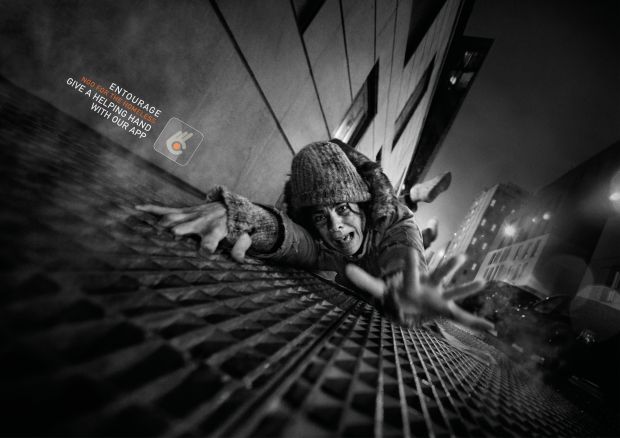
(A2) Drawing McLaren Drivers RESUBMISSION

Using the brush tool in photoshop I drew out the McLaren drivers which I was going to use for my poster but decided against this in the end. Instead, I decided that I would sell these as posters separately to McLaren fans as collectables. I really enjoyed making these and expanding my skills with the brush tool and also the Wacom tablet which I used to draw these. I finished these off by writing the names of the drivers on the side and writing their driver numbers along with the signatures which tied the drawings together. This was my finished product of this.

(A2) Tickets for McLaren Rebrand RESUBMISSION

For the tickets in my McLaren rebranding, I wanted to introduce more colour and graphics to the F1 tickets, they are the first thing a person sees before they go to the event so making a great first impression is essential.

My initial idea was to use different concepts depending on race I would be designing special edition tickets for a small number of races in the season. This included races like Monaco where I would do vintage-style tickets because of the numerous years it has been on the F1 calendar and Silverstone as it was the first F1 race to exist.

I began by making a mood board full of different ideas and other tickets that graphic designers have made for inspiration and to refer back to. I also included current F1 tickets for things I will need to put in my tickets such as the date and areas people are allowed.

I decided to design my tickets in Illustrator in case I wanted o use the pen tool I did end up using so this was a good decision for me. I began by drawing the helmets for my tickets as I knew they were something I wanted to include I decided to make my tickets access all areas for the McLaren garage, these were going to be VIP tickets. I did these in separate files in illustrator and when finished drawing them saved them as PNGs ad brought them back into my ticket file. I then split my ticket to a place where I could have a barcode strip for each day which I took inspiration from my mood board. In these I included the date, what was happening on that date and the barcode that could be scanned, I did this for the 4 different days. Instead of keeping the background for this white, I decided to add striped coming from the bottom left corner to which I used the colours from the helmet at a lower opacity to fill these. This then gave me inspiration on how to fill the rest of my ticket, using the pen tool I made blobs around the ticket which I could then fill with different shades of orange and some light blue at a low opacity so the text could still be seen. I did different shades of orange to match the McLaren theme and h blue to match when I featured it in my other touchpoints. For the name, access and ticket reference, I used a san serif font to make it differ and stand out from the rest because it is the most important part of the ticket, I used hierarchy to differ what would be in the larger font and what would be smaller, I made ADULT largest as it deciphers what kind of ticket it is and then accesses all areas so it can be easily seen when walking around the paddock. I put a white box behind this so it could be easily seen above the colour in the background of my ticket and put the text in black to contrast with this so I would stand out and be more readable from a distance. I then added the F1 logo and race in the corner using the original style that is normally seen in F1 tickets so mine would look more realistic and didn’t believe needed remaking as it already worked like this. I also added my McLaren logo into the white box to show that his ticket was directed only at McLaren’s personal and VIP fans. Finally, I added in the legal stuff below my white box just like I had seen n all the other F1 tickets, it again made them look more realistic and professional.

I love how my tickets came out, in the beginning, I was struggling with what I was going to do with them and how to design them, but in the end, my mood board helped me and with plenty of experimentation they came out exactly how I wanted them to.

Something I would change in the future is also to make my tickets able to go in lanyards or make lanyard versions of these which people are seen to be wearing on the paddock all the time to get in.

(A2) Merchandise for McLaren Rebrand RESUBMISSION

For the merchandise section in the redesign with the chosen theme of colour and similar style to the racing suits, I would like to create multiple examples of merchandise for McLaren that fans of the team will be able to wear. This could include special edition merch to brand collaborations. The clothing brand will be made from sustainable materials in an attempt to appear to a larger audience rather than just fans of the sport and attempt to keep the prices of the merch at a reasonable price.

I made a mood board looking at merchandise that already exists and the price range that McLaren sells their clothes for and seeing what the most popular things were within the McLaren fanbase.

I found that the price range for their clothing is quite high, and a lot of their merchandise isn’t affordable to fans who would still like to openly support the team but do not have the funds to do so, this is something I would like to change. As well as this I also found that the McLaren hoodies appeared to be the items that sold out most often compared to everything else, something I will take into consideration when creating my own. They keep their style simple without it being over excessive and I think this works however sometimes I do think their items are overpriced, a hoodie being sold for £60 and only having ‘Miami’ written on it isn’t something I would spend my money on.

I began by making the hoodie, with the time I had left for this project it became clear that I would not have the time to do a range of clothing items so I decided to go with the item that was most popular to the public.

I began by doing a little research about what colours are most and least favoured to wear and I found these results:

Conclusion to Color Preferences by Gender

  • Blue is the most popular colour for both men and women.
  • The most unpopular colour for men is brown.
  • The most unpopular colour for women is orange.

https://neilpatel.com/blog/gender-and-color/#:~:text=Blue%20is%20the%20most%20popular,color%20for%20women%20is%20orange.

With this I decided not to use the colour orange for my hoodies even though it is the main colour of McLaren, I would add some orange into the hoodie but it would not be its main colour. Instead, I would use a cyan/ turquoise colour as it still links into the theming as the colour is included in the suits and in the research found that blue is the most popular colour for women and men.

With this, I found a mockup I could use to begin my design, using the colour bar I was able to make a refreshing cyan colour when finding the colour I constantly had the thought of whether people would actually wear this colour or not. Although my target audience for my merchandise is McLaren fans who are young adults I also want my merch to be something that all people can appreciate and find appealing, making it a tacky bright colour would not do this. When happy with the colour I had chosen, I added the McLaren logo I had created onto the front of the hoodie so that when worn it would be on the top left. I wanted to add more to the hoodie than this to make it worth buying for the customer so I added the driver number and name onto the back of the hoodie where it would take up most of the room with the driver number being the largest, there would be 2 versions of this for each driver. I used an outlined font so the inside of the letters would be the same colour as the hoodie keeping a more clean and organised look to the back. Even after this I still feel like my hoodie didn’t have anything that made it original so I tried adding a bit more orange into it by making the hoodie half and half, I did this by editing the layer mask on the mockup. I added a few stripes onto the orange side also to make it more eyecatching from the back to passersby. It is important for people to see my hoodie as in a way it is like a walking advertisement, if people see my hoodie and like it and would like to know where it is from or what it means, by looking at the back they would see Ricciardo and google this and they would reach McLaren where they could be inclined to buy stuff themselves and begin to support the team.

What I love about my hoodie design is making the most out of the space I had on the hoodie without making it look tacky and unfashionable. It doesn’t have the team plastered all over it so I believe anyone beyond a McLaren fan could wear this and appreciate this hoodie.

Something I would improve or would have liked to have done is made another version of this for the second driver where I could have experimented with different colours for the hoodie and changed the name and number on the back to 4 and ‘NORRIS’.

I would charge £50 for this hoodie, I wouldn’t be able to take this price lower as sustainable fabrics are more expensive to work with however I believe this is more affordable and worth the money because of the amount of design there is. I would also add 10% off to new buyers on the McLaren website.


In addition to the hoodies, I made caps for the fans to buy where I used similar colours that can be seen on the racing suits.

Making orange the most visible colour with the cyan next to it with elements of red across the end almost matches up to the suit design which will look fitting when the drivers wear it and make McLaren fans stand out when walking around in either public or on F1 camera footage at races in the crowds.

I would charge £20 for the caps.

With the cap mockups, there was also a package that came as part of the mockup which I took advantage of and designed which is what any items that are sold would be shipped in. Again I kept to the similar theme of cyan and orange to make everything link together with a nice message on the side to add a more personal touch to the buyer which could make them feel more inclined to buy from McLaren again because they feel special.

Finally, to go with whatever the customer buys, they receive a free sticker from their driver (they will be asked this when they reach the checkout on the website) which again makes the product more worthy to buy. With mass production of these stickers, there is no loss of profit because of how cheap they are to make.

To create the stickers I simply used the pen tool to outline an already existing image of both drivers and created a simple drawing of them both. I decided not to add facial features as I believe it looks better without, making them look cleaner and more cartoon-like.

(A2) Poster Design RESUBMISSION

Taking inspiration from posters made by numerous artists for races aimed at different teams. I researched different styles and approaches for the different posters as I begin to make my own, I made a mood board to collage my ideas.

I gathered numerous amounts of posters all consisting of different styles in the attempt to maybe use these styles in my poster. 

I decided to base my poster on the race in Monaco and use the pen tool to simplify the image of Monaco, this is the image I used to trace over with the pen tool.

Using the ink dropper tool I filled in the shapes I had drawn with the pen tool to keep the colours similar to the original. I copy and pasted the shapes of the buildings and the tracks and made them a lighter colour to create the impression of shadows.

I then used the pen tool to create the outline of the car and to have it on the track, I used an image of the 2022 F1 McLaren car for this and did find it a bit of a challenge using the pen tool to outline this because of all the different components in the car.

After looking at the different fonts on the other posters I decided I wanted a san serif font which looks quite artistic and interesting. I made the ‘Monaco’ the largest piece of writing on my poster using hierarchy to show it was the most important part of the poster as it is the location. I made the colour a bright orange to link to the McLaren colour but also to give off summery connotations. Under this, I then wrote the date of the event underneath this in the same font but smaller and in a lighter tone than the orange I used before. Finally for the fonts, following the theme of the other Monaco posters I put what number Grand Prix the Monaco race was, I placed this at the top in a different font to add variety and also because this is another theme seen in the other posters.

I finished the design of my poster by adding my McLaren logo in the bottom corner to show that this was a poster mainly aimed at McLaren fans and to tie all my work together.

Overall, I was quite happy with the outcome of my poster, I really like my choice of font and I believe it can be very easily recognised as Monaco.

Something that I would change is making my poster brighter at the bottom as it appears quite dark in comparison to the top where it is very bright. As well as this, something that I ran into was my mistake in drawing the car where I had used the pen tool in the wrong places meaning I couldn’t fill it with colour as the colour would spread to places I didn’t want it to however I did not have the time to spend any more time on this touchpoint to correct it.

(A2) Suit Design for McLaren Rebrand RESUBMISSION

For the redesign of the racing suits, I did research around different patterns, colours and features on the suit. For the colours I was still torn between using the gulf livery colours and the original McLaren colours red and white so to fix this frustration I did some research into past McLaren suits that have been used from 1970 to now.

For the racing suits my idea was to take an element for each suit there has been and make one complete suit out of all of those elements, I got a template off of the internet for this that I could work on and brought this into illustrator. I used the pen tool to make the blocks of colour in each part of the suit, by doing this I actually improved my skills with the pen tool because of the tight areas I was working with with the template and this meant I had to be more precise with the pen tool. As I was incorporating each part from the suits into mine I was trying to be very wary that colours wouldn’t clash and make the suit look tacky and disorganised. I decided to use the black spread across the chest as it was a theme in the suits that existed for 5 years, I also liked it as it kept the chest area simple and not too overcrowded as well as providing an area for me to put my sponsors. I added an element of the 1970s suit to the sleeves with a red strip using the same colour as the original by using the ink dropper tool. I used elements from the most up-to-date suit down the sides of the legs with the blue and papaya orange, it was important to me that there were more orange highlights in the suit than any other colour apart from the grey as it keeps the McLaren brand still recognisable with the orange being what they stand out most through now. Although not shown in my mood board, I also took inspiration from the 1970s suit for the back of my suit, having it red and instead of the Malboro logo which is not allowed anymore in F1, I placed the driver’s number there instead. I decided to only use these elements and not anymore from the timeline I had created, this is because I had peer feedback that using that much may make the suit look overwhelming which I agreed with so decided to leave the suit how it was.

I decided to keep the same sponsors that the team already has as I found this would save me more time so I could spend more time on my other touchpoints as this one was already taking up a lot of my time, additionally keeping the sponsors that already exist make the suit look more realistic with familiar sponsors. 


What I like about my suit is how even with the numerous colours used the whole suit comes together as one and blends instead of colours looking like they have been patched randomly across the suit. Although I didn’t use all of the suits to make this one after receiving peer feedback that it looks overwhelming, I still think it works really well in taking a snapshot of history. Following on from that I also like how I have managed to keep all parts of the suit the same no matter the angle so it doesn’t look odd.

Something I would improve on is placing this suit onto a mockup, although I did try this I found it really complicated to work with as the mockup was 3D, I could’ve fixed this by making my own mockup by using an existing image of a driver if I had more time. Time is also something else I needed to work on as I spent more time than I should’ve making these suits which made my original timeline plan go off track.

(A2) 3D Logos In After Effects RESUBMISSION

Task- Convert vector imagery into 3D designs 

To make my 3D design I did not need to create a logo for this task as I already created one for my rebranding project and decided to use this one to possibly use it in my actual finishing product.

I imported this into after effects as a composition so it will break the design into its AI layers. My idea was to have my logo rotating around so all angles of it could be seen so to do this I had to enable cinema 4D which I did by clicking composition settings and then the renderer, I then extruded the logo to add depth and thickness to my shape. Instead of having my logo rotating, I decided to instead have a light rotating around it as if it were in the spotlight, I added this in by layer-new-light which abled me to add this. To then animate the movement of the light surrounding my shape I used the timeline and keyframes, each time I would move the light around my shape I would save the keyframe. This was the finished result of the process.

Logo Illustration 2

Overall I am happy with the outcome of my animation and I like how it looks like the light is continuously spinning around my logo which I have done by aligning my beginning and ending keyframe at the same point in my timeline.

Something I would change for the future is to also experiment with having y logo spinning at the same time as the light spinning to really challenge my skills. This is inspired by the warner bros where we see it fly onto the screen which allows us to see it from other angles before the light glows over it.

I learnt a lot in this lesson and found it easier to use after effects than I did before for example I did not know how to use the 4D tool before this which I think will be really useful in the future.

(A2) Use of Textures RESUBMISSION

What is a Texture?

Noun: The feel, appearance or consistency of a surface or substance

Verb: To give something a rough or uneven texture

They are a great way to add additional details to designs and make them look more interesting. Key elements that are used when using textures in photoshop are blending modes and clipping masks.

Blending mode: An effect you can add to a layer to change how the colours blend with colours on lower layers.

Clipping masks: They are a great way in which you can tell a layer above to only affect the layer it is clipped to, thus giving you more control.

To make my textures, I used the website texturelabs.org and picked out three different textures to experiment with, I wanted to use ones that were completely different so I could also experiment with the colours of my shapes.

I used the clipping mask tool to add the textures onto my shapes which I did by importing my texture into photoshop and right-clicking on the texture layer and clicking clipping mask which then made my textures visible within my shapes.

After applying different textures to my shapes experimented with different blending modes to see what would happen, here I used the linear dodge blending mode and I found that the colours of my shape then attached to the textures which I found would be great to use if you were doing a design where you still wanted to see the colour in your image with a texture.

After trying using textures on shapes I wanted to try and use it on work I had created, using a paper texture I used this on a drawing I had created.

I really like how this came out and it makes look like this was hand-drawn instead of digitally which I think is really cool.

Overall, I believe textures are a quick and easy way to make what could be boring imagery into something fun or just an easy way to add more to your image. In future, I would like to incorporate textures into my designs and experiment more with the different blending modes.

(A2) Pixel Styles in Graphic Design RESUBMISSION

What Is Pixelation?

Pixelation is caused by displaying or interpreting bitmap imagery at an increased scale so that the entire area gets converted into large, simple coloured squares. It is the oldest style of digital design and has zero negative space and is overwhelmed with colour.

This can be done with artistic/ stylistic intent or in some cases to censor any elements that clients may not want to be easily seen.

Cristian Zuzungaga Pixel Style

Eye On Design: The Pixel Fire Sofa By Cristian Zuzunaga | The Worley Gig

Converting Images Into Pixels

All imagery in Photoshop is comprised of pixels & colour values, but we can use filters & effects to alter how the pixels merge together, creating larger stylised blocks of colour.

After sending my image into photoshop I used the Mosaic tool to pixelate my image, I could choose the cell size of these pixels and how distorted I wanted it to look.

Creating Pixel Patterns

I created a new pattern similar to creating the impression of lego bricks, I did this by using the pattern tool, a new pattern, and using the shape and text tool to make the lego pattern. Then by messing around with the settings you can choose how many pixels you want in your image which will alter how many of your patterns you will see in your image.

I liked experimenting with pixelation and although I would not use this in the current branding and advertising project I am doing I would use it in future as I really like the blurred effect it can give to an image whilst it is also being mildly visible.

(A2) Rebranding McLaren Logo

For my rebrand one of my touchpoints is to make a new logo for McLaren, however, I don’t want to just make any new logo for the team as the idea behind my rebrand is to try and bring back some of the iconic McLaren from the past that has got lost along the way.

To help with this I created a mood board consisting of each logo that has ever existed for the team.

After making this I began to sample ideas that could work together, what worked best with new and old. I tried using new fonts but found that it looked wrong and wouldn’t work well with fans as it would have lost the iconic look it has carried for years. I decided to try and stem my new logo right back to the beginning with the look of the kiwi as there is an important reason why it was a kiwi for the logo in the first place.

The first McLaren logo was designed in 1964 by Michael Turner, it was centred on a Kiwi, the national symbol of Bruce McLaren’s homeland, New Zealand. From here we have seen drastic changes but then however in 1981 they have kept to the same theme of font and 1991 saw the beginning of the evolution of the corner symbol in the McLaren logo that the brand is recognized for.

With this I used the 1967 adaptation of the kiwi with the modern font to see what this would look like with the papaya orange that is used in McLaren today, I believe this to be the perfect mix of new and old.

With my rebranding of the logo, I thought not to use the whole of the word McLaren as the ‘M’ works alone because of the trademarked font to McLaren so it is only recognisable to them. The line underneath the 1967 rendition of the logo I made to cover both the letter and the symbol so it all ties into one so the logo didn’t look strange just standing alone. The papaya orange keeps the modern McLaren still in the loop and really makes the logo pop.

What I like about my rebrand of the logo is how I believe I have successfully taken a snapshot from both new and old and tied it into one, the logo is both recognisable with new and old fans and I believe will be further appreciated by old fans to see the old logo they would’ve one known been brought back to life and maybe even bring older fans back into following the sport which is the most important thing and shows a successful branding strategy.

(A2) Vector Realism Using Illustrator RESUBMISSION

What is Realism?

Realism uses accurate shapes and sharp edges which makes it not generally attributed to vector illustrations, however, it is still possible to get realistic-looking results.

Tyler Stout Poster Realism

In Tyler Stout’s designs you tend to find heavy black lines outlining the characters to give the comic effect, he sticks to a colour theme for the poster depending on who the centre character is. In this poster, we can see it is Iron Man who is in the centre so the poster has been based on the colour red, however, he does not overwhelm us with colour and he keeps some of the poster greys so where red is used it stands out more which I think is really clever. He adds highlights onto the character’s faces to give them dimension and makes it look like the characters have been snapshotted from different points in their movies and placed into the poster, not every character is at the same angle so it keeps the poster looking interesting.

Vector Art

This is the process of creating any type of art with vector paths, this normally consists of drawing paths & shapes that combine to create a larger image using fills/gradients.

Vector Portraits

This is when artists use vector paths to create a portrait of a person, sampling & tracing from an image of them. These can take a long time to make.

Making my Own Realism Vector

To create my vector I began by opening Illustrator and importing my image into the page, I also duplicated this image to the side of the page for colour references.

I then began tracing over my image with the pen tool, I began by tracing the main blue body section of the suit and then moving on to the rest. To stay organised and easier to arrange my layers I arranged them into groups in the layers section and named these layers.


Doing this is helpful because it then means you can hide and lock layers after you have finished constructing that shape. After I had finished drawing my image I filled the different sections with a colour, using the eyedropper tool on the reference image to get as close to the original colour as possible.

Using the effects tool which I got to by path-effect I added a drop shadow behind my image to add dimension so the image looks less flattened. Finally, using the ellipse and gradient tool I added a background in which I wanted to reflect a city in the nighttime, with light at the bottom from the streetlights and dark at the top because of the late-night sky.

I am very happy with the outcome of my vector image and believe it looks very similar to the original image in shape and colour.

In future, I would develop my image by placing a pattern into it similar to the scales that appear on the actual suit in the original image.

I would definitely use this skill again in the future and will most likely bring this into my rebranding project to draw out my drivers using this technique.

(A2) Social Issues/ Interactive Branding Design RESUBMISSION

Task- Create a mood board/brief collection of imagery and posters associated with just one of the social issues you listed.

Different Design Studios Approach To Social Issues

This Striking Print Campaign Offers a Helping Hand to the Homeless |  LBBOnlineThis Striking Print Campaign Offers a Helping Hand to the Homeless |  LBBOnline

This approach to homelessness is really interesting and eyecatching as they make it appear as if the people are falling when actually they are lying on the pavement. It’s really clever as when you first look you have a completely different idea of what the campaign is about than when you actually take time to properly look at the poster.

Task- Create a poster with a message to raise awareness on a social issue

For my poster, I wanted to make something hard-hitting that grabbed attention so using the pen and ellipse tool I made an image of the world, half normal and half on fire. I used punch phrases under these so when people read it they will feel hard hit and hopefully come to the realisation of what is happening so I made the image quite graphic.

What I like about my poster are the phrases I have used and how I have spaced out my poster so the first thing a person will see is the earth on fire, grabbing their attention and making them read the rest of the poster to find out why it is on fire.

In future, I would also add to my poster what people are doing to the earth to make it catch fire as I believe this would make the poster even more grasping.

(A2) Image Consistency RESUBMISSION

When creating a campaign, or multiple iterations, of images it is important to make sure they visually match each other – this is where subtle colour grading can come in handy.

You can use colour grading to create different moods & tones, once you have your image how you like it you can then carry those settings over to other relevant imagery.

I started colour grading my image by bringing it into photoshop, it’s a dark image which I want to make lighter and add an effect to make it look like she is looking at a sunset.

On photoshop I used the half-circle icon and clicked on it where I was given a list of options and effects I could add but for this, I only needed curves at this point. After this I had to limit the outer gates, each s different per image so you have to make sure that low and high start at either part of the graph. After this, I used the curves and dragged down the RGB to make changes to the lighting in my images but not too much as I want to keep it subtle. I then created fill layers to add different colours to the image, added red and orange to add the sunset tone and lowered the opacity of these to 5% with the blending mode set to colour burn. I then grouped the colour fill and curves layers together in a folder so I could re-use them in other images which I could simply do by copying and pasting it into the other photoshop file I would be using with the other image. This was the result of these changes.

I am very happy with the outcome of my image and believe it gives off the sunset vibe I was going for.

In future I would try and make the lighting in certain parts of the image different as in my example they all look the same brightness.

I think colour grading is a great skill to know and can be used in photos that a designer may take or one they have got off the internet which they may want to manipulate the lighting. I will use this skill again in the future as I found it easy to learn and use.

(A2) Dark Side to Branding RESUBMISSION

What Do You Think The Dark Side Of Branding Means?

Hiding the truth behind graphics, making something look better/ more innocent than it actually is. Disguising the truth.

An example of this is Kelloggs’ cereal brands, on the front of their packaging we see vibrant colours, bold text and happy-looking mascots to entice children to want this cereal and make their parents buy it, increasing the sales. The dark side of this is for example Kellogg’s Frosties cereal contains more sugar than a single sugar ring doughnut.


Greenwashing

This is where a company or brand will use ‘eco-friendly’ packaging in an attempt to increase sales to fit in with trends and make a person feel better about themselves making them believe they are helping save the planet. This can be done through the colour theory of green or using nature or eco signs and plastering it across their packaging, but greenwashing is when brands do all this but it is actually false, their products aren’t recyclable or what they are writing about their product is false. Factors of this include recyclable, non-toxic, cruelty-free, eco-friendly, biodegradable and sustainable.

Innisfree Accused Of 'Green Washing' And 'Misleading' With Label | Beauty  Packaging


What To Look Out For


Sustainable

There is no consistent definition of what it means for a product to be sustainable. What makes it sustainable? Under what authority and by what legislation is it sustainable?

Recyclable

Many items are not practically recyclable even though they will have recycling-friendly plastered on the packaging. Some plastics can only be recycled at one centre in the entirety of the UK.

Biodegradable

Most items that are labelled as biodegradable even though they will decompose will take a very long time for them to do so, therefore will end up doing harm to the environment in the meantime as it decomposes.

Cruelty-Free

Cruelty-free is not legally defined so anyone can claim that their product is on their label. Look for legitimate certifications such as the Leaping Bunny.

The Leaping Bunny Logo | Leaping Bunny

Non-Toxic

Non-toxic is an unregulated term therefore it has no legal definition when used on a product label. Green and non-toxic household cleaners often have potentially dangerous chemicals included in them.

Eco-Friendly/Environmentally Friendly

We don’t actually know if the process of making the products is environmentally friendly so it is a meaningless term to have unless explained in concrete terms.

Task- Create a poster to advertise Coca-Cola as a ‘new zero’ manufacturer

To create my poster I first started by adding a green background as this colour in colour theory is linked to nature and recycling which is what everyone thinks when they see the colour green. I then used DaFontt to find a pen-like font for the Coca-Cola label and used a different style of writing style for ‘on the planet’s side’ underneath this. I did this to make the can appear more personal and to make it look like more care had been put into it when in real life it would have been made on the same production line as the rest of the cans. I made a tagline to grab the consumer more when they read it on the shelf making them want to buy it so they are also on the planet’s side. Finally, I also made sure to put eco-friendly and biodegradable in the top left corner to add more to the greenwashing false advertisement.

What I like about my poster is that I didn’t use the original Coca-Cola font or red colour which will make it stand out on the shelf and make people pick it up and look at it wondering why it is different and after reading it will want to buy it to be better for the planet.

What I would change or improve on for the future is also include recycling icons or other icons that are used in greenwashing.


Exclusionary Marketing

What Do We Mean By Exclusionary Or Targeted Marketing?

This is where products are based solely on the target audience which most of the time can be discriminatory to the people who the product isn’t aimed towards.

Target audiences are made through data some of the time, if you find out 70% of people who buy your product are female then you target them and ignore the rest. What happens to the other 30% by purposely excluding them they’re missing out on a large, growing chunk of the market.

Examples of the exclusionary market include Yorkie in the 2000s who stated on their chocolate bars that their chocolate was only for men.

The Story Behind the Yorkie Chocolate Bar

Exclusionary marketing is done in very subtle ways nowadays unlike the Yorkie campaign from the 2000s but still keeps gender roles alive and strong.

Task- Create a poster for Chupa Chups sugar-free lollies that is non-exclusionary and aimed at both parents.

To create my poster I began by making my background which I used the gradient tool, I decided to do a light blue to dark blue to represent the sky as I wanted to have a cloud-like font and also because the colours are bright and will catch children’s attention. For the font, I then found my cloud font and wrote New Sugar-Free so when the child gets the adult’s attention the adult will immediately see they are sugar-free and feel more inclined to buy them. To make my packet non-exclusionary I put to give all parents peace of mind but made sure to put ‘all parents’ in a larger font than the rest of the sentence so that that would be seen first within the sentence. I then added the final touches like the Chupa Chups logo and the flavours and added some more about the lollies being sugar-free and good for the kids which finished my poster.

What I like about my poster is how I have made it that everything I want to be seen is what immediately draws attention first like the lollies being sugar-free and that all parents at peace of mind.

What I would change about my poster is in future I would draw out my own icons of the fruit with the pen tool and add highlights to make the poster more personalised to the brand.

(A2) Word Branding RESUBMISSION

Task – Using a random word generator design a logo wth the word given in Adobe Illustrator 

Adjective- Many

When I was given the word ‘many’ the first thing I thought of was a collective of things so I did a stack of circles to begin with using the ellipse tool. From this I thought that the logo needed a colourful background to make it stand out and less bland rather than white shapes being on a white background. To do this I used the pen tool and drew out random shaped blobs which I then filled with different shaddes of blue and lowered the opacity to 60% before sending these to the back of the page so the circles sat on top of the blobs. I then wrote down the word I was given under these shapes in a san serif font to make it appear less boring as to many people maths is boring. There was still something missing in the logo as the circles looked quite empty so I came up with a catchphrase where I could put each word in the circle, I decided to make this logo represent a maths tutoring company.


Noun- News

With the word news I immediately thought of the world because of he events that happen all over it. With this using the ellipse tool I drew the eart and using the pen tool drew rough drawings of each country. I made the background blaack for space but also because it would make my colours pop more. Because each event that happens is important I drew out explanation marks to be coming out of each part in the world to represent different things going off at once like seen in the news.

Designing a brand with word generator

Adjective+Noun- Thirsty Midnight

For the words thirsty midnight I took the adjective thirsty and thoughts of a drinks company but more specifically an alchohol drinks company because of the noun midnight which makes me think of clubs in the nightime. I kept the background of the can dark to stick with the theming of midnight and it being dark wihi the night and used the graphite pen tool to create the impression of stars. I used a serif font to make the brand look more luxury persona on the can.

What I have taken from this lesson is being innovative and fast thinking when given words, this will also come into use when working with clients and they want logos being created just from words.

(A2) Milky Moo Shakey Shakes RESUBMISSION

Two Types of Research

Primary and Secondary

Primary Research– Instead of relying on data collected from previous studies, primary research aims to collect data directly. This method allows researchers to analyze the data in order to identify areas of concern.

Secondary Research– This method involves gathering and analyzing existing data. The data collected is then summarized and analyzed to improve the overall effectiveness of the study.

Brand– A business and marketing concept that helps people identify a particular company, product or individual. https://www.investopedia.com/terms/b/brand.asp

 Brand Identity– The visual elements of a brand including colour, design and the logo that identify and distinguish a brand. It is the outward expression of the brand and is what is most important to grab the attention of the customer.

Intangibles– Intangible asset is an asset that is not physical, this includes examples of brand recognition, goodwill and intellectual property such as patents, trademarks and copyrights. It is often difficult to assign value to and is incapable of being touched.

Logo– Images, texts or shapes that depict the name and purpose of a business. It is a brand’s most important and recognisable signifier.

https://www.tailorbrands.com/logo-maker/what-is-a-logo

Mission Statement- Describes the organization’s purpose and its overall intention.

https://www.shrm.org/resourcesandtools/tools-and-samples/hr-qa/pages/isthereadifferencebetweenacompany%E2%80%99smission,visionandvaluestatements.aspx

Task-

Find out three things through secondary research 

Identify– Which flavours of milkshakes are popular

Explain– Pick 3 countries to market your milkshake brand to and say why you chose them

Analyze- Choose colours you believe would sell the best when creating a brand of milkshake for the flavours you chose and say what is positive/negative messages of those colours are in colour psychology.


Identify

In a survey conducted by RTA Outdoor Living, it was found that the strawberry milkshake was the most favoured flavour of all.

The chocolate milkshake is the second most favoured flavour and other flavours like oreo and vanilla follow this.

Explain

3 countries that I have chosen to market my milkshake to are the US, the UK and Japan.

I have chosen these countries because of the different artistic capabilities I can use on my packaging when advertising in Japan, it is a theme you see when looking at products there, they are full of colour sometimes characters and look more like art compared to any other average drink packaging.

I have also chosen the US and UK as the general public seems to be joining into this trend and is open to trying new flavours, in supermarkets now it looks like a competitive battle for best graphics and not best flavour as seen on the Lucozade bottles on the image below.

Bottles and cans of soft drinks on supermarket shelves, UK Stock Photo -  Alamy


Analyze

I believe the colour mint would sell well on the milkshakes as in colour psychology it is seen as a refreshing colour.

Color Mint: Meaning, Symbolism and Psychology

The colour pink is also a colour I believe would sell well as colour phycology says it is a loving and kind colour since this is a milk brand this can be linked to that the cows are looked after.

Millennial pink' is the colour of now – but what exactly is it? | Design |  The Guardian

Finally a colour I believe would sell best is lime, in colour psychology, it is thought to promote liveliness, freshness and confidence something a person would want to feel.

Lime Green Lacanche Colour Sample - Lacanche Range Cookers and Accessories

Task- Find out three things through primary research of as many people as possible

Q- What would make a great logo?

A- Something that stands out on a shelf and links to the audience it is trying to reach.

Q- What colour should you use for a logo?

A- Something that links into the colour of the drink, apple drinks seem to be centred around the colour green because that is the colour of the juice.

Q- What should be included in a logo?

A- What’s included in the drink or maybe a mascot for the drink.


Creating a Logo for Milky Moo Shakey Shakes

To make my logo I used the pen tool and ellipse tool to make the shapes, I used pink mint and lime to match the colours I had previously researched. I used a more child-like cartoon font as that is who my target audience is to give children more calcium. To add to this I also made cartoon cows because of my primary research where one of the answers was that there should be mascots in a logo so I drew cos with the pen tool to go on top of my logo for this.


What I like about my logo is how all the colours blend with each other and the innocent feel it has to it for a child. I like how it isn’t overcrowded and simple but yet is still full of colour and fun.

Something I would work on for the future is adding flavour ingredients on the front of my packaging which there is room for at the bottom.

I did find it a bit easier to work with clients’ wishes in mind because it gives you limits but more guidance to what you can and can’t do so you can spend more time on designing what you know needs to be in there.

Shape Builder Tool

What I really like about this design is the imaginative aspect behind it, using inspiration from the colours of the fruit and adding well-known cartoon characters onto these fruits.


Shape Builder- An alternative to the pathfinder when you are wanting to use smaller shapes and paths to create larger, harder-to-draw imagery.

By using the shape builder tool I was able to recreate the image of the pear. I found using the shape builder tool quite hard as sometimes it didn’t go the way I would want and would become frustrated with this. After using different tools within illustrator I have found that I am most confident with the pen tool and would’ve been able to make this image look a lot better by using that tool.

Black Panthers

Who were the Black Panthers?

The Black Panthers were formed in California in 1966 and they played a short but important part in the civil rights movement. They did not believe that Martin Luther’s peacefully protesting ways had made any lifestyle changes to the black community and using the ‘traditional’ civil rights movement, would take too long to be implemented or simply not introduced.

When were they prominent?

The party was founded on 15 October 1966, Oakland, California, United States

The party disbanded in 1982

What were they fighting against?

The Black Panther Party (BPP) had four desires: equality in education, housing, employment, and civil rights.

What events reflect the Black Panther Party today?

The unification of people after the events of George Floyd and the BLM movement.

Other Facts about the Black Panthers

The group would prepare 20,000 meals a week for schoolchildren in poor neighbourhoods for free as they started the free school meal regime.

Adobe After Effects: Compositing and Video Manipulation

Colour Keying:

It is the act of selecting a specific colour value in a shot and then making any pixels with that value (or similar values) transparent.

When filming/ photographing content with a keying screen, lighting is the most important factor.

Lighting the Subject

You need to make sure that the person/ object is lit well so that you can see it, you need to contrast to key effectively.

Lighting the Screen

Once the subject is lit how you want, use separate lights focussed on just the green screen, to remove all shadows and make it as consistent colour as possible.

If the screen isn’t clean enough, or there isn’t enough contrast the green screen effect won’t be as effective.

Colour Correction:

The act of improving the look of a photograph by adjusting the levels of particular colours within it.


Colour Compositing

Once you have your footage & it is imported into your software, you can then start to apply effects onto your layers to composite your images together. 

Keying and Masking

These are techniques used to remove parts of imagery:

  • Keying tools remove colours (Keylight Effect)
  • Masks remove user-defined areas(Pen / Shape Tools)

Colour Correction 

Once you have your final clips & effects, you then have to start altering the colours of your layers so that they match & look like they belong together naturally.


CREATING A NEW COMPOSITION

  • Importing everything in through clicking on files highlighting everything and dragging it into after effects

APPLYING THE KEYLIGHT EFFECT

  • I added the background by dragging the image into my composition.

APPLYING COLOUR EFFECTS TO CORRECT THE IMAGERY


AE Project Management and Rendering

RGB VS CMYK

RGB- Red Green Blue– These are the three primary colours in the colour wheel A light source within a device creates any colour you need by mixing red, green and blue and varying their intensity.

CMYK- Cyan Magenta Yellow Key- These are used in colour printing and is also used to describe the printing process itself.

Importing from Illustrator into After Effects

Some find it more beneficial to create assets in other pieces of software and then import this over to after effects, this is what I did today with illustrator.

In illustrator when opening it to create a new file you are greeted with a set of presets, when using this software to later bring your work into after effects you would want to click o the film and video option and click on HDV/HDTV 1080 as this is the normal setting which works with any computer.

Ident- Final Design

For my ident, I used the tv company Adult Swim and 2 characters Rick and Morty that feature in a show on the channel. To begin with, I found an image online to help me begin with imagining my idea.


Original Idea

The idea I originally had for my ident was for the characters to begin with them both being against each other and moving away from each other and coming back towards each other and clash to make them merge. From this, they would separate from each other and only have half of their heads, this is where the ‘ADULT SWIM’ would come in as it would slowly be revealed whilst the characters move apart.

Bringing the Idea to Life

To begin with, I brought the original image of Rick and Morty on top of each other into photoshop so I could erase the middle and make them separate.


As well as this, I also needed to create versions of the characters cut in half so when they separate in half their faces merge together as it will be 50/50. By using the layer mask tool, I could cover half of the faces of my characters and get rid of what I didn’t want without losing information.


This is the result I had after making these adjustments, this made it easier for me to move the characters in after effects and make them independent so they fit in with my design idea.

When opening after-effects I selected new composition where I was met with a settings screen where I can choose how long to make my composition.


I set the time to 6 seconds as I believed this would be long enough to include everything I wanted but still be short enough to be viewed as an ident. From this, I imported all the images I would need into after effects and dragged them down to the ‘new composition’ tool that would place my images into the composition.

The tool with the coloured shapes in the white rectangle is the new composition tool.

From here, I began to animate my characters, I aligned them to the middle of the composition and marked this so I would always know where the middle is throughout the process, this also helped with keeping the composition consistent and not having the characters moving all over the place and keeping them on an equal level. When beginning to move my characters, I clicked ‘P’ on the keyboard, which means position, so it would know where my character starts and by moving the time needle I can then tell after effect where I want the movement to end.


Indesign Overloading Print

When designing anything visual, especially when it contains text, you need to make sure that you are organising your words and paragraphs so they are manageable to read.

Keep the text as incorporated into the design as possible and not stand out too much, whilst ensuring that the colours and shapes used throughout your work aren’t overwhelming.

A Bad Example- Too much text, no break, very similar

A Good Example- Breaks, size/hierarchy, colour aid

When creating pieces of work containing lots of information they become busy, this can be seen on magazine spreads or websites. When doing this you need to make sure you keep your reader’s attention and have it where you want it, when you do use large shapes, specific colours or imagery will help to draw in the reader’s attention. Once you know where they are looking you can then give them the best journey through the design possibilities with the previous techniques.

Wix and Web Design Introduction

Wix is an online resource that allows users to design and create their own websites, it has been designed to be easy to learn and simple to use no matter the project.

It encourages you to utilise and create your own website with it, there are loads of presets that you can utilise, these can be either for inspiration or as a starting point for your final portfolio design.

If you want a preset template from Wix, Squarespace or any other similar resource, it is important you change the template enough to make it your own, your portfolio should represent you and by using an already made template s clients may recognise it from other people also using it. This could put them off if they recognise the use of one.

Task- Create your own Wix website from a template


In the early stages of using Wix, I am finding it really easy to work around and use. I love the way it presents my work and the website looks like a professional one which forwards my work even better. I still need to add all the extra work that went with my brief and do little explanations to do with these as well.

I have used a template that has given me the option to have different sections to show off the work of the different parts of my briefs, so far I have only completed the digital illustration part of this and am yet to add explanations to my images.

Graphic Design Trends 2022

Pass- Generally competent selection and manipulation, some awareness

Merit- Effective selection, mostly consistent technical competence

Distinction- Accomplished selection, skillfully application, technical competence sustained.

5 Synonyms for Trendy:

  • Chic
  • Fashionable
  • Stylish
  • Popular
  • Designer

2022 Pantone Colour of The Year

“Very Peri exudes a good-natured warmth” – Pantone

“Happiest and warmest of all the blue hues”

“Blends the faithfulness and constancy of blue with the energy and excitement of red”


3 Design Trends of 2022 in Graphic Design:

  • Mixed Media Design- Mixed media art involves mixing different creative mediums to create work that incorporates two or more art forms.

  • Authentic Hand-Drawn Elements-

Disruptive Type

Disruptive type is an experimental use of typefaces to make work stand out from others, some making their work harder to read to make readers stop and think about what it says. 

For my experimentation of disruptive type, I have turned my letters into familiar objects for example turning the A in my name into a triangle, as it still follows a similar shape layout it can still be distinguished as an A. As well as this I turned the D in my name into a smiley and the X and O interlinking making the O look like a warning sign. I like that in my recreation you can still clearly see what it says whilst also making it look busy but something I would improve on for the future is making the two parts of my name at separate levels so I have more choice to make the link of the letters in my name link.

References:

https://www.format.com/magazine/resources/art/beginners-guide-mixed-media-art

https://www.twenty75.com/projects/disruptivetype/#:~:text=’Disruptive%20Type’%20is%20the%20experimental,down%20and%20make%20people%20think%3F

Creative Resume

A CV (also known as a Curriculum Vitae, or resume) is a written overview of your skills, education and work experience.

Creative CVs are a way to get the information down in a way that can allow your personality to shine through.

Examples of Creative CVs 

Website Design With Figma

What is Figma?

Figma is a free online application that allows you to create graphics and designs for websites, apps or general use.

The free app is something you may be interested in utilising from home as an alternative to Adobe Illustrator.

Example of Surf Shark

What I like about the design of this website is the way the designer has followed a colour theme to make all their photos blend and link into each other which makes the home page look appealing to the consumer’s eye and become more likely to click on further. As well as this I also like how they have used more photos than text for a minimalist approach, if someone did want to find out more they would have to go further into the website, a clever way to make your audience more hooked into your work. The shape that is used for the photos makes the home page look similar to an Instagram layout showing that the page is trendy and with the times not old fashioned luring in a younger audience because of the theming around it. They have made it easy to find their socials and how to guide the website with everything being at the top so it will be one of the first things you see as you enter the website following the rule of hierarchy as the most important stuff is at the top of the page.

My Initial Figma Layout

For my initial layout for my portfolio website, I used Figma to give myself an idea of where I would want things to be. I don’t want my home page to be filled with words but instead to be quite minimalistic, I have taken inspiration for this from the example I found of surf sharks with the images taking up most of the room of the page. However, what I have changed for my layout is I have placed my name in the middle of the page so it is the first thing that a person will see which is important as they will know whose work it is with the images spread around the name. I have put an ‘about me’ section underneath my name so it is easier to navigate and because I believe it is one of the most important parts of my portfolio website I have played it in the middle so it is more likely to be clicked and grab the readers attention. I have followed a near pastel theme as looking back on my work a lot of it follows through with these types of colours so by following this my page will look more appealing to the eye.

Creating Mockups

Starter- Colour Blindness Chart

By creating a colour blindness chart I become more aware of what colours to use to make my website more accessible and inclusive. I can work with these colours that I have made in my chart following what people with different types of colour blindness can see.  By creating different settings people will be able to see work with colour and enjoy it more than if I used colours with the mindset that everyone could see them, it means my work isn’t reaching everyone properly because there are limitations of what some may or may not be able to see because of their disability.

Mockups

What are they?

A visual representation of what your design will look like on a product gives it a real-life form.

Why do we use them?

To show the consumer what your design will look like, it is also a better way to advertise your product or a way to show your prototype. They allow you to show your product with more of a professional presentation for a final design.

By creating your own personal mockup you remove the limitations that you may have using somebody else’s, you have full creative control with how your product is presented. These limitations can include, having to sign up to mockup sites using your email giving you unnecessary emails constantly which can become annoying, you can only get access to free mockups unless you are willing to pay a fee for more in detail mockups, going through multiple pages trying to find the mockup that is right for you which takes up your time. Finally, a limitation that you may encounter especially when in business or advertising is people using the same mockup which would look very good to a client who may have seen the same mockup somewhere else, by using your own mockup you are showing your originality and making your product look more appealing and new.

Creating My Own Mockups

To make my own mockups I found images that I could use to edit and turn into mockups. I began by opening the image in photoshop and using the ellipse tool to put a fitting shape around my image, after this, I turned this shape into a smart object. A smart object is a non-destructive layer in photoshop, any edits you make to the shape can be done or revisited as long as these edits are saved each time. I then transformed my shape so it would fit the image I am using, by holding ctrl t this opened the transform tool where I could edit my shape and by holding down ctrl I could edit my shape more precisely by moving the corners so it would fit into my image more closely and better. Then, by double-clicking my shape layer, my smart object layer would open up where I could edit, changing the colour of my shape and being able o write in it, which I did and then clicked save. This changed what my shape then looked like on my image layer and I could always go back and revisit that smart layer.

Using my own work I used an image of a book and turned it into a mockup for my magazine spread. This time I also had o use the warp tool to create the bending around the edges of the magazine, however one of the problems I have run into was my magazine getting squished into the spine of the book, I will improve on this when using the warp tool with smart objects in the future.

Magazine Cover Spread- Final Design

The Brief

Graphic Designers have had to be able to mock up page layouts for decades, now it is your turn. This task will teach you how to make and break a grid system to incorporate graphics, text, photos and more into a page spread and magazine cover. You will develop your skills in InDesign, one of the leading industry-standard software for desktop publishing, to create a magazine cover and a 2-page spread for a fictitious/or real magazine of a topic of your choice. Your final design will be mocked professionally and showcased on your portfolio website.

My Work

For my final piece in my magazine brief, I have decided to base my magazine around the F1 driver Lewis Hamilton as there has been a lot of news regarding him and is someone I as a person look up to. To begin with, I started researching images I could use in my magazine and implemented these into a mood board. I annotated what I could use these images for and the pros and cons of using them.

By doing this mood board it helped me imagine my format for my magazine, how much writing in ratio to photos there would be. I decided I didn’t want my magazine to be too text-heavy and make people lose interest in the magazine but where there is writing still makes it look intriguing and not blocky.

Before beginning to make my magazine I did some research on past magazines made around Formula 1 and what codes and conventions they follow.

After doing this research I was amazed at the different layout styles used even though they were all based on the same subject. There were some that went with a very simplistic approach using lots of negative space and some that filled every bit of space there was to take. Some included a mesh of lots of colours and there were some with minimal colour or only sticking to one colour throughout. This showed that each brand of the magazine had a targeted approach and also how the design process has changed throughout the years trying to fit with the taste of the people of the times and making it more modern. People now prefer more minimalism as seen through a survey “In the last ten years, minimalism has become one of the biggest growing movements in the US and around the world”, for this reason, magazines have been seen to use fewer taglines throughout their magazines and loud colours as it is considered more ‘tacky’ to something that is more toned down with paler colours and more modern fonts.

With all this in mind, I began the creation of my magazine, I began to gather some images I would want to use for my front cover and double-page spread. For my front cover, finding an image was more complex as I wanted to find one which I could write around but still be impactful and eyecatching to the reader.

These were the first two initial photos I found that I thought would work really well with my magazine and give off the impression I wanted, Hamilton being a dominant and strong figure.

I moved on to making my double page spread and decided to leave my front cover until after I had finished the spread. For the first page of my spread I wanted to do a whole page of text surrounding an image of Lewis Hamilton, the reason for this is many readers are not fond of lots of text-heavy pages, doing one page with all the text you then have the freedom to space out your other pieces of writing on pages and not have to write as much keeping readers more interested in the magazine. Even though my page will have lots of text on it it will not appear like this as the text will be working around the outline of Lewis Hamilton keeping the page captivating and looking less text-heavy on the eyes. I did this by first picking out an image of Lewis Hamilton that I would workaround for the first page of the spread.

Within the three photos, I had found I decided that the third one with Hamilton in a standing pose with his racing suit on would work best and be easy to work with as well as keeping the page clean with the minimal colour in the image already. With the images decided I opened InDesign and began to set up my document.

To set up my document I clicked ‘Print’ when met with the options board when opening InDesign, I selected A4 and ensured ‘Portrait Mode’ was selected and made sure ‘Facing Pages’ was ticked. In the ‘Pages’ panel, I clicked the ‘+’ symbol twice in order to create my cover and double-page spread.

To create the guides for my pages I selected ‘Create Guides’ from ‘Layout’ I made my rows to 11 and the gutter to 3mm and made sure fit to preview was ticked, this would make working a lot easier as it would help make sure everything is in line and is spaced correctly. I placed my image into the page and dragged it out to fill it, by right-clicking on it I had the option to make it a high quality display, which I did. To start the process of making my text wrap around Hamilton I started by using the pen tool and drawing a rough outline around him and making the stroke to this line 1pt so I could see it clearly. From here I found the piece of text I wanted to use for my magazine, using san serif to make it appear less old fashioned and instead more modern. I drew a text box and clicked on the outline I had drawn previously and opened the text wrap window and selected the ‘wrap around object shape’ option, I raised the offset of this to 2mm and here I saw my text wrapping around where I had drawn my line.

I turned the stroke of my line back to 0pt so it could no longer be seen and using the type and tables tool turned off the hyphenate option so none of the text I had placed would hyphenate. I also used the drop caps tool to make the first letter of my paragraph larger, something that has frequently been seen to be used across magazines for decades. To add a more professional look to my magazine I highlighted all my text and lowered the K number to 80, this made it look more like print than black. Finally, I added a title to the piece and this was my first page finished.

For my second page, I didn’t want to fill it with too much text and instead use more images. So again I gathered some that I would want to use.

I again found some text for this page and began experimenting with different layouts and using photos that were relevant to the text I’d used. One image that I thought would look really good would be the one of Hamilton and Verstappen facing with their backs opposite each other as they are each other’s biggest rivals so I went with this. However, I needed to do some editing to this image because of the background it included, I transferred this image into photoshop where I used a clipping mask to get rid of the background of my image without losing the information to it and transferred this image back into InDesign where I used it at the top. I again used the pen tool and text wrap as I did for my first page to get the text to wrap around the two making it look more absorbent and less boring with blocks of text. I originally used two photos of Lewis at the bottom of the page with two questions written around them however later decided that an image with his future teammate looked better and neater. This finished the process for my second page in the double-page spread.

I returned back to making the front page for my magazine where I began to experiment with the images I had chosen before. After numerous experimentations with both images I just could not make them work or look right, when applying text to them the text either became really hard to read or there was simply not enough room to write around, I found this difficult as the pictures I had chosen represented exactly what I wanted but I was back to the drawing board to find a new picture to use for the cover of my magazine.

After spending some time searching around on the internet for images to use I found one that I believed would really work and I would be able to write and work with, unlike the other two previous photos.

With this picture, I was able to use the empty space to write my masthead and cover lines with plenty of room to work with and with the grey background my writing would be legible grabbing more attention from readers. I used pale colours to keep the cover minimalist so it wouldn’t take away the attention from the main image which is what all my writing would again be surrounding as I used the pen tool and text wrap trick once again, I wanted Hamilton to be centre with his eyes being the pulling cause making readers want to buy.


The majority of my fonts were san serif to keep a sleek and modern look apart from Lewis Hamilton which I put in san serif to stand out above the rest and show its importance as well as making it larger than everything else apart from the masthead and then the headline coming below his name in the hierarchy.

    This is the finished design of my magazine placed on a mockup to show it in a real lie setting. I am really pleased with how this turned out and followed the ideas I had from the beginning with it looking minimalist and modern. Although it does not look as minimal as some of the magazines I saw, I don’t believe my magazine looks overbearing or text-heavy like some that I saw.

What I like about my magazine are the different layouts I used on each page and experimenting with different ways to layout text to separate all the text from being together in one big paragraph and not make it appear boring.

If I were to change something from my magazine and learn from it in future is finding different ways to add coverlines in more artistic ways rather than them being stuck in the corner as although they are not the most important part I don’t want them to be something that ruins part of the presentation for the cover.

Keyframe and Animation Principles

Mat Voyce

Mat Voyce uses lines with thin strokes and vibrant colours against them to make the colours pop more, in this artwork in particular by using white on the front against the navy background it stands out further through the contrast in colours. Using a san serif font keeps the style informal and fun, the rolling smiley faces also contribute to this. By not having the rolling smiley faces rolling on the actual letters it keeps the spacing in the work looking neat and not overcrowded and overly busy.
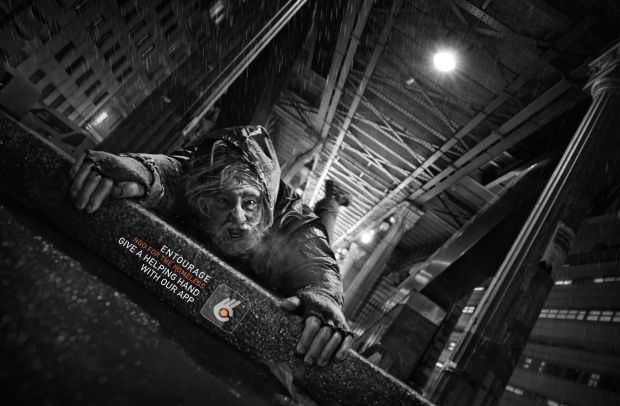
 

Bark and Bite

Using a paper style of texture within the work creates the impression of the artwork coming to life from the page. The different shades of purple and the small use of yellow with the gloves and boots make the character in the centre not blend in with the background.

Who created the list of the 12 principles of animation?

The 12 Principles are:

  1. Squash and stretch
  2. Anticipation
  3. Staging
  4. Straight-ahead action and pose-to-pose
  5. Follow through and overlapping action
  6. Slow in and slow out
  7. Arc
  8. Secondary action
  9. Timing
  10. Exaggeration
  11. Solid drawing
  12. Appeal

Ollie Johnston and Frank Thomas in the book Illusion of Life: Disney Animation in 1981 outlined the key teachings for the professional animator.

The 12 Principles of Animation Explained:

Squash and Stretch

This gives your animation the illusion of Gravity and Flexibility.

This can be linked to the idea of a bouncy ball, it stretches when it’s being thrown but squishes when it hits a hard surface.

Stretching makes it thinner.

Squashing makes it wider.

Anticipation

This prepares the viewer for action, adding realism and physics.

Consider jumping, it’s hard to do without bending your legs.

Actions happening without any preparation, especially large/ heavy movements will look awkward and not realistic.

Staging

Very similar to composition when working with art/video frames.

Small animated elements can be used to help direct the viewer’s attention to something or show movement.

Think about a moving car, and how it could have small trails behind it to show that it is driving fast.

Straight Ahead/ Pose to Pose

Straight Ahead- For more fluid and realistic animators, draw each frame one after another.

Pose to Pose- For more control, draw key events (start, mid, end) and fill in the gaps where needed.

These can often be used together in many ways to get varied results.

Follow Through/Overlapping

Follow Through- When different parts of one object stop moving at different rates.

Think of jelly wobbling after being slid across a table.

Overlapping Action- The time difference (delay) between multiple objects moving at different rates.

Consider a hat with a feather flowing behind it.

Slow In/Out

Easing movement at the start & end can give them more life.

This is done by adding more frames at the start & end of animations in comparison to the main sequence.

Think about a bicycle, it starts moving slowly, hits its maximum speed and then slowly grinds to a halt when the brakes are on.

Arc

When working with animation it’s best to stick with the laws of physics.

Most objects follow an arc or path when they’re moving and your animations should reflect that arc.

Think of when you toss a ball into the air, it follows a natural arc as the effects of the Earth’s gravity act upon it.

Secondary Action

Secondary actions are used to support or emphasise the main action going on within a scene.

Adding secondary actions helps add more dimension to your characters and objects.

For instance, the subtle movement of your character’s hair as they walk, or perhaps a facial expression or secondary object reacting to it first.

Whatever the case may be, the secondary action should not distract from the primary one.

Timing

For this principle of animation, we need to look at the laws of physics again and apply what we see in the natural world to our animations. In this case, focus on timing.

If you move an object more quickly or slowly than it would naturally move in the real world, the effect won’t be believable.

Using the correct timing allows you to control the mood and the reaction of your characters and objects. That’s not for you to say you can’t push things a little (especially if you’re creating an imaginary world) – but if you do, you must be consistent.

Exaggeration

Too much realism can ruin an animation making it appear static and boring.

Instead, add some exaggeration to your characters and objects to make them more dynamic.

Find ways to push the limits just beyond what’s possible, and your animation will pop.

Solid Drawing

You need to understand the basics of drawing.

This includes knowing how to draw three-dimensional space and understanding form and anatomy, weight and volume, and lights and shadows.

While you can push the limits here, too, it’s important to remain consistent. If your world has wonky doors and a warped perspective, keep that perspective throughout the entire animation.

Otherwise, things will fall apart.

Appeal

Your characters, objects, and the world in which they live need to appeal to the viewer.

This includes having an easy-to-read design, solid drawing, and a personality.

There is no formula for getting this right, but it starts with strong character development and being able to tell your story through the art of animation.

Class Work

By opening up my already made animation of my box moving up and down, my plan was to give my box the squash and stretch effect. To do this, I began to edit my piece, first changing my composition setting and changing it from 2 seconds to 4. This meant my square had more time to move, making my shape not move so fast that you cannot see what movement the square is making. Despite me changing the time of the composition, the old footage is still the length of the old clip so I dragged my clips along to fit my new clip length of 4 seconds, however, I also could’ve used alt + ] to do this and snap it to the end.

To create the bouncing effect first you have to squash the shape you have made which is done by stretching out the shape and bringing it to the bottom, the keyframe will follow this shape as it will make the shape gradually turn into what you have made it at the second set.

How to Create the Bouncing Box

You then bring this shape back up to the middle at a different time creating a new keyframe, this will make your box start to have the bouncing effect when you play it back.

Then bring this shape back to the floor with the squash effect again at a different time after your last keyframe.

This is what my bouncing box came out looking like after following these steps.

Something I would change about this in the future however is the speed of the bouncing box to make it look like it actually has momentum. I would do this by editing the speed within the keyframes.

Own Work

When making my own moving box I tried to make it more complex than the bouncing box that I had made before. I attempted to use the 12 principles of animation whilst my shape moves around hitting the sides of the screen. These included squash and stretch when it would hit the floor, taking into consideration the timing for this and how long it would take to come back up and go to another wall. I also used arcs in my animation to stick to the laws of physics and to make my animation look more realistic which are used as a secondary action as well as the box moves around.

Finished Video

What I like about my video is the movement, my box is continuously moving and each time it hits a wall it squashes and the use of arcs allows my box to hit all corners around the screen letting me use all the space possible.

Something I would change about my animation is the speed, as it reaches the end of the video the speed of the box rapidly increases which is a consequence of me misunderstanding how to use keyframes which is something I need to work on in future when I come to using after effects again.

Primary Research-

The methodology that is used by researchers to collect data within the moment and not from the past means they then ‘own’ the data instead of using somebody else’s.

Secondary Research-

This is research that uses already concluded data, this can be from public libraries, websites and data obtained from already filled in surveys. It is more cost-effective as it makes use of already obtained data, unlike primary research where companies will hire a third party to gather data.


Image Editing

What is Image Editing?

Image editing refers to modifying or improving digital or traditional photographic images using different techniques, tools or software.

When selecting images to use you must make sure they are of high quality. When Google searching, hover over an image to find its resolution. 1000×1000 will not be of good quality, it is important to use good quality images so you will be able to feather and so your image will then also fit into other images without them looking out of place.

Task- Work on how to separate images using the pen tool

Tools to use; Pen tool, Layer Masks and select and mask

To do this I began by importing my image into photoshop and drawing around it with the pen tool, once completed I would I have the marching ants around my drawn shape around the image. By right-clicking I was given a list of different actions, I clicked ‘Make Selection’ and by doing this I was met with a box that gave me the option to feather the image and click ok, I clicked ok as I could continue working on my image as I would feather it after this. Using layer masks is like using an eraser for the background however unlike using the actual eraser it is a way that is less destructive as you will not lose all the information you had.

This box is the image I started with and using the pen tool and layer masks I was able to erase it from the background and place it in a different setting.

Using this method means I can easily and quickly place my image in different images/ backgrounds and still edit if I need to.

Extra examples with me using image editing.

In today’s lesson, I have learnt how to use the layer mask tool to erase unwanted backgrounds from around my image. With the new skills learnt I can take this into future projects I do to manipulate an image by removing it from one and bringing it into another one making it look like it was always there.

I can also bring the skills I have learnt today into my magazine cover and spreads by deleting the backgrounds out of images I may want to use to have plain backgrounds or if I want to give them a new background. Where I will want to place text around my images, it will look more professional them having no background rather than making it look overly busy with loads of images having different coloured backgrounds.

Empire Magazine Covers

Editorial Designs

The particular decisions are made about everything on the page, including layout, colours, text, and graphics, in order to maximise communication while maintaining a pleasing aesthetic appearance.

Consider it a design framework; these elements are in place so that the main ‘structure’ may fulfil its function.

Elements

Management

Typography– Any use of text in your design- SIZE, FONT/TYPEFACE, SPACING

Colour– Choosing correct/ relevant colours- THEMES, CONTEXT, AUDIENCE

Imagery– Any use of images in your design- SIZE, FULL BLEED, THEMES

Consistency– Keeping things the same for the reader- REPETITION, MIRRORING, FORMAT

Time– It doesn’t have to happen all the time- PAGE BREAKS, SPACING, FACE

Layout– How the page and content are arranged- MARGINS, SPACING, GRIDS


Task- Create your own front cover for Empire Magazine

Empire Magazine

Empire magazine is a popular media publication recognised for having very distinctive covers and campaigns that set them apart from all of the other magazines on the market/shelf, with a very specific readership of media-lovers.

They usually focus their covers on one piece of upcoming or popular media and theme their facing content around that.

They’ve also been known to run cover campaigns, where they sell different versions of the cover and encourage readers to collect them all, either to have all the variations or to create a larger image when the covers are combined.

The huge emblem at the top of the magazine’s cover is the only thing that never changes.

Empire Magazine Design

To create my rendition of the Empire Magazine I followed through with the idea of using The Amazing Spiderman as my cover talking about his return in the new movie No Way Home. Using Adobe InDesign I created a new document and page, from here I created an image where I could paste the image I had selected into, when it is in the frame I can still change it and its size or where it is placed.

After placing my main image into place I began using the text box tool where I could start writing my headlines and bylines. To begin I started with writing ‘Empire’ the name of the magazine and changed the font to the exact one the brand uses that I had downloaded off of the internet so I could match the originals as close as possible. I decided to change the colour of the masthead to the dark blue colour of the suit, I matched this with the ink dropper tool so I could get the most accurate matching of colour. I did this so all of the front covers of my magazine link in with each other and there are no random colours spread across, the way I have done it I believe makes it look neat and professional. I made sure that the masthead was the largest piece of writing on my magazine cover as it is the most important part with it being the name of the magazine, it is what you want the reader to see first to recognise and want you to pick it up in the moment and in future. When a reader is picking out a magazine they want to read, in a shop, they will scan their eyes on the tops of the magazines which is where the majority of mastheads are, the more you make yours stand out the more likely your eyes will be drawn to it and be picked out. I also made sure there was space around it so it had its own area of importance and is where the eyes are taken to first, however. I did add a byline underneath this in small writing including the date however I do not believe this takes away the impact I have given to the masthead with the space left around it.

For my headline ‘The Amazing Spiderman’ I used the original font that was used in the Spiderman comics, I did this because I thought it would bring in a wider audience, longtime spiderman fans would want to read this magazine because of the topic and also the inclusion of the font used all the way back in the beginning which you would believe to interest them more as it would bring them back to the days reading the comics. Aside from this, I liked the font anyway and believed it would be eyecatching because of the rigid lines around the letters, this makes it stand out above many of the other things happening on the front of this cover and I also placed it in the middle of the magazine on the chest of spiderman to catch the eyes and stand out above the red in the background as made the font white. To finalise making my headline, I added shadowing behind the letters so they blend into the magazine better, without this the writing looked misplaced and to an unprofessional standard. When I believed to be finished with this I wanted to add a bit of context behind my headline, I added ‘featuring the comeback’ to the top of this in smaller san serif writing to sow it wasn’t as important to be seen first however it just gave further guidance to the story in the magazine.


I finished my magazine by adding coverlines and additional coverlines across my page to fill negative space, I did this with relevant information that would be featured in the magazine and stay relevant to the topics this magazine brand regularly covers, upcoming movies in the cinemas and I decided to place the actors that feature in the movie to fill space too.


Overall, I am really pleased with how my rendition of the Empire magazine came out, I liked my attention to detail and trying to follow the codes and conventions that are regularly seen in the Empire magazines to make them as popular as they are. I like my experimentation with different fonts but each one has reasoning for them being used and sticking to a colour scheme throughout the creation of the magazine keeping a clean and crisp look to it.

If I were to improve something in my Empire magazine in future, I would like to use an image where I can overlap the head of the main image into the masthead, where Empire themselves have done it I believe it adds a whole new feeling to the magazine. It makes the characters look more interrogating and interesting as well as adds different dimensions to the magazine.

Animation Timeline

Different Types of Animation

Phenakistoscope

It is a disc that gives the illusion of movement through a spinning disc invented by Jonathon Plateau from Belgium in 1832. A Phenakistoscope was an early animation device, the disc had multiple drawings on it which would all be relatively the same but would have changed a little in each drawing so when the disc is spun, it creates the illusion of motion. The audience will see a small repeated action when looking on top of the disc as there is only a limited amount of drawings but in the day when this was created, this was a groundbreaking experience for the world of animation.

Zoetrope

Created in 1834 the zoetrope was a cylinder with vertically cut sides that a person would look through to see the moving imagery. By using a strip of card or paper and drawing the animations piece by piece, it would be slotted into this cylinder so when it was spun round it would create the fast illusion of the drawing coming to life and moving. The creator was called William Ensign Lincoln who was born in Trinidad and came up with the name zoetrope after the Greek words ‘Zoe’ meaning life, and ‘tropos’ meaning ‘turning wheel of life’.

Kinetoscope

The Kinetoscope is an early motion picture exhibition device designed for films to be viewed by one individual at a time through a peephole viewer window at the top of the device. The Kinetoscope was not a movie projector but introduced the basic approach that would become the standard for all cinematic projection before the advent of video, by creating the illusion of movement by conveying a strip of perforated film bearing sequential images over a light source with a high-speed shutter. The 35 mm film travelled continuously over a bank of rollers, each picture being viewed briefly through a narrow slot in the revolving shutter. First described in conceptual terms by U.S. inventor Thomas Edison in 1888, it was largely developed by his employee William Kennedy Laurie Dickson between 1889 and 1892.

The Kinetoscope was an early exhibition motion device created by Thomas A. Edison, born in Milan Ohio, and William Dickson, born in Le Minihic-Sur-Rance, in 1891. Inside it, a strip of film was passed rapidly between a lens and an electric light bulb while the viewer peered through a peephole. The idea for the kinetoscope was for films to be viewed by one individual at a time through a peephole at the top of a device, customers would pay 25 cents to use the machine to see a small piece of animation.

The Lumiere Brothers

The brothers, individually named Auguste Marie Louis Nicolas Lumière born 19 October 1862 and Louis Jean Lumière born 5 October 1864, were from Besançon, France and created the Cinématographe. To make this piece of machinery work, two pins or claws were inserted into the sprocket holes punched into the celluloid film strip; the pins moved the film along and then retracted, leaving the film stationary during exposure. The first movies were born through the cinematographe allowing people to have a large, new, shared experience of cinema. The first private demonstration of the Cinématographe took place at the Société d’Encouragement pour l’Industrie Nationale, Paris, on March 22, 1895. The Lumière brothers and their camera operators made more than 1,400 films of subjects all over the world from 1894 to 1905. The first public demonstration of the Cinématographe took place at the Grand Café, Boulevard des Capucines, Paris, on December 28, 1895.

Claymation

It is a form of stop-motion, characters that are constructed out of a malleable substance mainly plasticine are moved frame by frame and then played back in quick succession to give the appearance of movement. Will Vinton, born on the 17th of November 1947 in Oregon was the inventor of claymation, his work gained rapid popularity and ended up appearing in Michael Jackon’s music video Speed Demon in 1988. He ended up winning an oscar alongside several Emmy awards and Clio awards for his studio’s work. Vinton sadly passed away on the 4th of October 2018 in his city of birth. The oldest claymation film known is Long Live the Bull by Joseph Sunn in 1926. Claymation works by taking a shot frame by frame moving your malleable figurine moving it a tiny bit and taking another shot, this continues until you have finished the movement or scene you want, this is then sped up at the end when you have taken all your shots to end up with your finished piece. On average it takes around 3 years to do a well-animated stop motion film that is around an hour-long because of all the shots that have to be taken. An episode of Wallace and Grommit takes typically around 30 frames per day, their film curse of the rabbit took 15 months to make, this was with hundreds of people being in on this too. This is a children’s program that uses claymation from 1994.

Some popular films that have come from claymation include; Chicken Run, Coraline, Monkeybone, ParaNorman, The Boxtrolls and Wallace & Gromit: The Curse of the Were-Rabbit.

Stop Motion

Stop motion is an animation technique where static objects are photographed frame by frame, moving them in small increments and continuing to photograph these frame by frame. The first stop motion film was created in 1898 and was called The Humpty Dumpty Circus created by directors J Stuart Blackton and Albert E Smith bringing in the first works of stop motion then lead on to more mainstream and modern works with stop motion. It is incredibly tedious and difficult to produce because of the precision and requires filmmakers who have lots of patience because of the time it can take to make one scene. As technology has improved and years have passed, computer-generated animation is by far the more preferable method filmmakers prefer as they can do anything with much more ease. The film The Nightmare Before Christmas took three years to create, one minute of the movie took about one week to shoot and ended up having 110,000 frames in total by the time the film was finished being created. The film was shot at 24 frames per second meaning the crew had to arrange characters and objects 24 times for every second of the film, this proves the patience and skill a filmmaker in stop motion requires, however, the hard work paid off as the film made $91 million in the box office in 1993 and is still a majorly famous film in modern-day.

This is a scene from Tim Burton’s film Corpse Bride in which stop motion is used 2005.

Some of the most popular films made with stop motion include; James and the Giant Peach, Coraline, Fantastic Mr Fox, Corpe Bride and The Nightmare Before Christmas. Tim Burton is one of the most famous animators in the stop motion industry and it is what makes his work so unique, it is what makes his films stand out and gives the gothic look to them.

CGI

CGI (Computer Generated Imagery) is the application of computer graphics to create animation and VFX in films, television programmes and videos. John Whitney was a pioneer in digital art and animation in the 1950s, he collaborated with Saul Bass, a graphic designer, to create the animated opening sequence for Hitchcock’s Vertigo (1958). The first movie to use CGI was Michael Crichton’s Westworld in 1973, it was then a few years later when  George Lucas used CGI in “Star Wars.” CGI has been improved vastly over the years and it began to be taken seriously with the release of Jurassic Park in 1993 when audiences were able to see lifelike dinosaurs on the screen before them. Following this, in 1995 with the release of Toy Story by Pixar characters like Woody, Buzz, and Rex blew audiences away. Pixar soon followed up with other CGI movies like “Monsters Inc.” and “Finding Nemo.” The 2009 film Avatar did something new, the film won three Oscars and became the highest-grossing movie of all time with its combined motion capture with facial capture. The result was stunningly realistic characters. CGI has also spread to other areas. It’s used in many television shows and video games today. CGI is made with different methods including;

  • Using algorithms can create complex fractal patterns.
  • 2D pixel-based image editors can produce vector shapes.
  • 3D graphics software can generate everything from simple primitive shapes to complex forms created from flat triangles and quadrangles.

The movie Transformers is mainly made up of CGI with the movie being based on robots, in this scene, we see two of the robots Optimus Prime and Bumblebee fighting which we see the impressive use of CGI. The contact the robots make towards each other and the damage they cause makes it look extremely realistic and lifelike.

My Animation Timeline

Shapes and Tranformations

Introduction into Adobe After Effects

What is After Effects?

Adobe After Effects is a digital visual effect, motion graphics, and compositing application developed by Adobe Systems and used in the post-production process of film making, video games, and television production.

To begin my introduction into adobe after effects, I began by learning how to make a simple square move up and down.

T-Shirt Initial Design

My Own Design

For my t-shirt, I have included these ideas which I would like to incorporate into my own design. The stickman logo is what I have created myself as I will have the front of my t-shirt be more of a minimalist design with my logo in the corner of the top in the chest area and have a more colourful and extravagant design on the back. I will have ‘The Future’ as my tagline on the back of my top as,y main audience is young adults, with this,  young adults are who will be in control of the future as they are the future generation, with my t-shirt they can make this known to people too.


I spent some time researching different fonts all following the theme of graffiti and a grunge look, this being because graffiti is associated with wrongdoing and I wanted to use this as irony and almost mockery as elders usually associate younger with always doing wrong. By having ‘THE FUTURE’ on the back of their shirts it lets people around them make people know they are self-aware that this is the reputation they have labelled onto them. As well as this, I like the style of streetwear this design falls into, the bolder style for people to wear that can go with many other articles of clothing.

Soda Packaging- Final Design

The Brief

Graphic Designers have to be able to evoke visual representations of flavour and smell with specific target audiences in mind while also adhering to legal packaging requirements. This task will allow you to explore the expanding field of bespoke and short-run beverages. You will also develop your skills further in Photoshop and Illustrator to create at least one functional and UK consumer-ready soda package with the intent of it being rolled out to UK supermarkets. Your final design will be mocked up on a can to enhance the packaging designed and will feature on your portfolio website.

My Work

For my soda can design I wanted to follow with a design with merging colours, by using a colour picker I found colours that fit the same theme and weren’t too different from each other. I brought these into my photoshop document so I could use these colours in the shapes I’d be using to create my design. I started by placing my assigned coloured circles into each corner of the screen making them overlap each other. I then used the smudge tool to merge these colours together to create the effect that they’d been mixed into each other, I also ensured within this process that there were no white gaps left. Following this, to add the name of my drink I had originally planned for it to have a yellow background behind the name, to do this I added a yellow square in the middle of my pre-existing mixed paint design, again, I used the smudge tool in an attempt to blend the square with the rest of my colours. Finally, I added the name of my soda drink on top of this with a font I had found when making my mood board, I decided to stick with this font as I believe it represents my can well with the idea of it being relaxed and easygoing.

This is the product that came out of my initial design, I didn’t like the way it looked, I believed it looked bland and the yellow in the middle looked out of place, in an attempt to fix this, I tried adding in brighter colours over the pre-existing colours to try and lighten the image, I also added white lining to were my colours met each other and added white scribbles underneath my text, this was the result of me trying to fix this.

Still, I was not happy with this design concept, I believed it looked busy and didn’t portray my soda business the way I wanted it to. After numerous attempts of me trying to fix the yellow background I came to the conclusion that it just wasn’t working and neither was the extra coloured lines I had added, the only thing I liked from my new additions to my design was the white scribbles behind the name on my can. I went back to my pre-save of my background and started again. I added a white scribble within the middle of my mixed colours and placed the name on it with the same font from before. This was the result of my new update to my design.


Even still, after these further adjustments, I still wasn’t satisfied and felt like something was missing. I went onto my mood board research and found I hadn’t added my tagline or any ingredients so using the same font, I tweaked the original idea of the tagline I had originally created and added this to the top of my design as at the bottom I wanted my ingredients and alcohol percentage in the same place and my tagline did not correspond to this. So using the same font but in a smaller pt, I added these adjustments. I made my tagline slightly bigger than my ingredients and how to drink the drink even smaller and my alcohol percentage being the smallest. I did this because it shows the order of hierarchy and what I want the consumer to see first when looking at my design. This is what the result of these adjustments came to be.

Just before I was about to bring my final design into my mockup, I decided that I wanted to make the middle of my image with the name of my product bigger to clearly show that it’s the most important part of my can and what I want the buyer to see first. To fix this I made the scribble behind my text bigger and higher the pt of the name, finally after these adjustments my design was finished.

With these additions made this is what I believed was going to be my final design for my can.

When reviewing my final product I started to think about the future of my brand and how I would make additions to it and expand it. I found that I had made it difficult for myself if I were to make different flavours it would not be clear to the consumer what flavour this would be as my colours would not correlate to the flavours and would all be random colours. To fix this, I went back into photoshop and began to change the background of my design to two colours that would blend into each other and correlate with the flavours. For example, I made the flavour strawberry and grape have the colours pink and purple blend into each other making it clear to the customer when having all varieties on the shelf that they are different to each other and already give them an idea of what these flavours may be. By making this change I would not run into a problem of what colours I should use when making a new flavour for my drink.

Final Comments Of The Finished Product

In the end, after many adjustments and changes, I really like how my design for my soda can ended up, I believe it suits my brand and what it stands for, being carefree and relaxed. It doesn’t look too busy but it also doesn’t look too bland exactly the look I was going for. I like how much I critiqued my design and kept going back until it ended up looking exactly how I imagined it too. I like how my design isn’t too bold and vibrant but still finds a way to catch the eye because of its different colours and hand-drawn design. If there were to be something I would change about my design I would attempt to make my drink suitable for all audiences, this would mean making an alcohol free range in an attempt to reach younger audiences who cannot drink my drink as it contains alcohol.

Photoshop Brushes and Textures

Using photoshop I was able to create my textured photograph, I did this by pasting my texture into photoshop and using numerous tools. By clicking FILTER>OTHER>OFFSET I moved around my image creating separate sections to which I then have to blend. By using the healing tool I was able to go over the clear line where the image of my bricks had been sectioned off, by using this tool, this blurred out that line however it was still clear to see there was a line that separated my image. I used the clone stamp tool to take a sample of one part of my image and use it on the part where the image had been sectioned, this blended my bricks together making my image look like it hadn’t been edited in the first place. I then saved this image into my patterns so I could use it in the future. Following this, I found an image of a woman taking a photo which I used to go with my brick texture, I pasted this image on top of my brick layer, spreading it across my document. I then used the blending option tool and clicked on pattern overlay to incorporate my pattern into my image, I lowered the opacity to this so it didn’t completely take away the photo of the photographer.

Another example of me using this tool:

Soda Research

The design of the AriZona cans was inspired by the Southwestern decor of their creators’ childhood home, which was decorated by their mother. It is
known to be an affordable but stylish brand with it selling cans for only 99c
a can. It moves with the times, the company now moving to packaging that
is 20 percent lighter and packs nearly 350 bottles into one palette, which
translates into a truckload that carries more than 7,650 additional bottles,
yet weighs more than a thousand pounds less. I really like the design packaging of AriZona tea and I often drink the drink myself, what made me want to drink it was the packaging that made it stand out from other drinks that were on the shelf. Each drink is different and follows a retro look with vibrant colours and reflective materials.


Bauhaus

The Creator of Bauhaus- Walter Gropius (1883-1969)

Who was Walter Gropius?

Walter Gropius was a German American architect and educator who was the director of the Bauhaus movement (1919-1928). His work exerted a major influence on the development of modern architecture, he worked on projects such as school buildings and faculty housing at the Bauhaus, the Harvard University Graduate Center, and the United States Embassy in Athens.

What was The Bauhaus?

It was founded in 1919 in the city of Weimar by German architect Walter; its core objective was a radical concept. The idea was to reimagine the material world to reflect the unity of all the arts and Gropius expressed this vision for a union of art and design in the Proclamation of the Bauhaus. The Bauhaus combined elements of both fine arts and design education, it was all-inclusive with the students coming from a diverse range of social educational backgrounds. Following the interests in Bauhaus theory, students entered workshops that included metalworking, cabinetmaking, weaving, pottery, typography, and wall painting.

What were the main characteristics of the Bauhaus?

Qualities of Bauhaus design usually include:

  • Plainness
  • Straightforward simplicity
  • Being conducive to mass production
  • Retaining the integrity of craft materials (as in materials should be used in their honest and natural form and not altered)
  • Streamlined aesthetics
  • Modernity

Bauhaus favors pragmatism and practicality over beauty for the mere sake of beauty.


Herbert Bayer Artwork Recreation

Examples of his work:

My recreations of his work:

Product Mockups

What are mockups?

Mockups are a great way to demonstrate how your product will look when applied to a real-world context.

They add a layer of professionalism and help to sell the viewer on the utility of the design, not just the design itself.

What is their purpose?

They allow the person to give themself the first idea of what their final design will look like when final details are applied. They are a simple and easy way to bring a design to life and can be worked around to show their client their design, if adjustments needed to be made they can be and simply be reapplied to the mockup.

By using a playing card mockup I was able to present my design on an actual set of cards as my mock design. It shows the front of one of my cards within the set and the back of the card and its pattern. As well as this I also changed the background colour of this image to fit with the theme. In the future, I would also make an example of my box design to go with my mockups so the audience would be able to see the whole package of what they’d be buying. I would use this skill again as it is a great way to communicate with the consumer and allows me, the designer, to see what my product looks like in a real-life setting which I found extremely helpful within my playing cards.

Illustrator 3D Transform Effects

There are three main 3D effects in illustrator:

  • Rotate- Takes your vector art and allows you to spin it to any 3D angle you want
  • Extrude & Bevel- Converts and vector path with a 3D object, with appropriate highlights and shadows.
  • Revolve- This allows you to create a 3D shape by only drawing one-half of it in 2D. To create this chess piece and make it 3D I used the pen tool and the revolve tool. By drawing out half of the chess piece and connecting the top to the bottom half. By clicking on effect<3D<revolve I was able to create the 3D effect to the chess piece.

To create my 3D heart I used the pen tool to draw my outline of the heart and by using the extrude and bevel tool I turned my shape to the side to make the left edge of it appear to be in front.


I would use this tool again to create more dimensional shapes and to easily add highlights to them. Of all these tools I prefer the extrude and bevel tool the most as I found it the easiest to use and found the outcome of using it, to me, the best.

Pattern Creating

To create my pattern I used the shape tool, by using the fill tool for the shape I clicked Libary<Patterns<Basic Graphics and was given a choice of lines, dots, or textures to work with. To edit these patterns and change their colours I used the edit pattern tool and clicked on either a singular dot or line and changed the colour of it whilst also changing some more of either the dots or lines to create a pattern within itself. I did this numerous times within the shapes to create an array of different colours, I decided to stick with a neon theme throughout my pattern. Overall, I used about 4 shapes to create my pattern in total, copying and pasting these shapes across my page in similar places as patterns consist of the same design across the page or whatever is being worked with, an example of this being wallpaper.

What I like about my design is the continuous theme of neon and the effect of a tv screen losing signal/buffering. I also like how I only stuck with the theme of lines and not dots as this helped with my idea of the tv screen buffering progress. Something I would change about my pattern or improve on in the future is making my pattern look more dimensional, adding more shading to almost make my pattern look 3D.

In the future, I would use the skills I have learnt to create backgrounds for artwork or in closer to the future work, use this skill to create a background for my playing cards.

Typography Poster- Final Design

The Brief

Graphic Designers have to be able to understand different symbolism and uses of different fonts. They have to play with what is being said and what is being shown through imagery. This task will allow you to explore the interaction of words and images while developing your skills further in Photoshop and Illustrator to create a 2 colour poster print with the intent of it being framed and displayed in someone’s home. Your final design will be mocked up and will feature on your portfolio website.

My Work

For my typography poster I wanted to follow the idea of advertising a brand in a way that hadn’t been seen much before, I decided to use the brand Nike for this. My idea was to use a shoe from the brand and use catchphrases from the brand as the lining of the shoe, to show my idea in a visual effect I created a mood board.

In this mood board, I featured examples of the idea I wanted to follow that had been done before however I only found two of these. I also found an image of the show I was going to use as it has bold lines and lots of angles that I will be able to work with. I also found some fonts that I would want to use, I gathered these from the retro section as this is the theme I want to follow, I also experimented with different colours I would want to use. I kept these colours to a beige/ nude theme, I have included one in purple to see if this would work by adding pops of colour in places I wanted to stand out more than others in sections of the shoe.


To make my shoe I used Adobe Illustrator using an A4 document in the landscape layout, I pasted in the outline of the shoe I would be using and lowered the opacity of it to 50 so I could still see it but I would also be able to work around it without it being too distracting, I was only using it to guide the shape of the shoe.

From here I began to use the fonts I had chosen and decide where I wanted them to go on each part of the shoe. I wanted the bolder ones with more to them to go on the outside and be the main outline of the shoe and be a part of the famous Nike ‘swoosh’ and the others to be part of the smaller linings in the shoe.

For making the outline of the shoe I used the text box tool and pasted my text into it, when placing this onto the shoe I realised that the shoe had bends in it and it would not work with pasting in my text in straight lines. With the direct selection tool, I was able to change the direction of my letters as I was changing the anchor points to them and making them move in different ways.

Moving on to the other parts of the shoe with different fonts I continued using the direct selection tool and transform tool to make my letter fit into the original shape, I experimented with different things, in the top corner of my shoe I used lots of overlapping with the word ‘Air’ to fill the space and used different transparencies so the purple colour didn’t become too dark and messy, this also made it look like a different use of tones of purple in the corner and made it not require and outline with the pen tool with it.

There were some parts that I didn’t want to use text for and instead used the pen tool, this is because I didn’t want too much overlapping happening in the shoe as it would make it appear messy and too busy and hard to recognise what it was.

In the end, I didn’t end up following the nude theme and instead reversed it into using more bold colours and made the ‘swoosh’ a nude colour in an attempt to make it stand out more as it didn’t fit in with the other colours used.

I did a look back at my shoe thinking I was finished but thought the lines that I had drawn looked out of place so I experimented with a few different styles of lines with the pen tool and settled with a pen drawn effect as I believed it fit with the fonts chosen and looked less blocky like the ones I’d used prior.

This was the updated version of my shoe, I believe it looks improved and liked the new effect of the streaky paint. This finished the process of making my typography poster.

What I like about my poster is my attempts to use the direct selection tool to make my test fit the shapes of the shoe without me having to use the pen tool, when looking at it you can very easily show what shoe this is which shows this has worked well.

To learn from in future and something I would change is starting to add shadowing and different shapes to the poster, I would like to bring in different tones to add dimension and show my different skills learnt in digital illustration.

Like in this poster for the video game Firewatch we can see the different tones used and layering to make it look more interesting and give that real-life effect, although I am not sure how I would do that with my shoe now it is something I would like to think about in the future.

Pathfinder and Expansion

What is typography?

The art of arranging letters and text in a way that makes the copy legible, clear, and visually appealing to the reader.

It can include:

Font, Type, Size, Scale, Colour, Contrast

Typeface- The actual name of the text family you are using.

Font- The variation of typeface you use.

Serif typeface- Has little ‘kicks’/’feet’ at the edges, considered classical.

Sans-serif- Clean, simple/ geometric letters, considered modern. Is considered to be easier to read.

To create the avengers’ logo I used the pathfinder and expansion tool to be able to create different layers and make shapes disappear into each other creating a transparent effect in other areas of the shape.

Album Redesign- Final Piece

The Brief

Graphic Designers have to be able to adapt and update designs for modern audiences while still appealing to the original fan base of the design/product. This task will allow you to explore different methods of photo/image manipulation in photoshop to then develop and design a reworking of an album cover of any band/artist which will feature on your portfolio website as a demonstration of technical skill, ability to use your imagination and style preference.

My Work

The album I decided to redesign is Blond by Frank Ocean.

Colour Tones and Hierarchy

H//S//B– Represents somethings colour, its intensity and its value

Hue– What colour something actually is, identifiable by a number

Saturation– How colourful something is, desaturated means no colour

Brightness– Can also be called lightness or value

This is the original version of this image pre-editing

To experiment with saturation I duplicated my image three times and made each copy a different saturation value.

The first image has a saturation of +100 the second 0 and the third has a saturation of -100

By using photoshop, I experimented with saturation in 3 different images. By using clipping masks I was able to edit these images separately without them affecting each other.

Following this, on the same images, I used the black/white tool to change around these images and make parts whiter and blacker.


Colour Tones– CMYK, RBG, Greyscale are all composed of tones

Monotone– A colour palette using only 1 tone and its saturation levels

Duotone– A colour palette using only 2 separate tones simultaneously

Tritone– A colour pallette combining 3 different tones together


Task- Create an album cover using Duotones

To make my photo with tritone I first had to open my image in photoshop and make it greyscale. By clicking on IMAGE<MODE<DUOTONE when the options menu came up for this I could add more colours to alter, I added an extra colour to make my image tritone so I could experiment further. I used three colours to get my green like a filter to cover my image like the green mixes into the colour scheme of the show this character is from.

Ben Marriot Styling

Ben Marriott is a freelance motion designer and illustrator, he uses a noise effect across a lot of his illustrations as well as gradients. In examples of his work, we see experimentation of different colours being used together as well as different mixing gradients of colours. He has worked with brands on projects such as Google, Adobe, Dropbox, Twitter, Emirates, Converse, Coca-Cola and RedBull.

Examples of his work

Task- Create designs with noise gradients

By using both illustrator and photoshop I was able to create my edited version of the male and woman toilet symbol. Firstly, by using InDesign I was able to use the pen tool to create the image of the man and woman, I also used the curve tool to achieve this. To create the line between the middle of the man and woman I used the rectangular shape tool. To finish in illustrator I filled my shapes with black and then saved this as a ai. document. When opening photoshop I opened my file as a smart object meaning I’d be able to edit my design. I started by using the layer style tool and putting a gradient on the top of my design, however, I only used two colours to spread throughout my design, by the top of my design the colour has spread to an opacity of 0%. To finish I used the Noise tool by clicking onto filter in the top left of my screen to add the blurry looking effect on top of my man and woman, I did this to a percentage of around 30%, I did this because although I did want the noise effect in my image I didn’t want it to look as though it were to be a bad quality image. This finished my process of creating this design.

To create my second design I followed the same steps as when I created the toilet sign however I created a new object to work within my design. By using the pen tool in illustrator I was able to create a new design inspired by the artist Ben Marriott.

Something I would change about my design is adding shadowing and highlights as my image appears quite dark and does not have much depth to it.

I enjoyed recreating the styles of Ben Marriott and really like his work, I like the idea of using gradients and noise, in my opinion, it looks similar to using spray paint to make an image however this has been done digitally.

In the future, I would use Ben Marriott’s styling again when making posters adding it into different things apart from “characters”.

Typography Album Cover

To start with I chose the album I wanted to make a typography design with, however before going straight into designing a typography response to it I did some research into it and listed the emotions it made me feel. This helped me as it gave me an idea of what fonts and colours I could use I’m my typography poster.

Album Research

Born To Die Paradise Edition was released on the 9th November 2012.

The genres of this album are labelled as;

Alternative, pop baroque, pop indie pop sad, core trip, hip hop. In an interview, Lana explained she was more interested in telling her story rather than making money from the album.

When listening to this album I feel many different emotions because of the different tempos and lyrics each song differs from in the album. Some songs feel empowering whilst some are heart-wrenching when Lana talks about losing the person you love. The album overall covers all emotions a person can feel from sadness to excitement, your emotions change to the songs when listening to the album throughout.

This is my finished typography design, I used a mix of song titles and lyrics from the song which I spread across the page. Whilst making my design I listened to the dark paradise album which helped me decide which font, colour and style to use for my different titles, I was inspired to do this by the expressive fonts lesson from previous weeks. I did this by using different tools across photoshop such as the distort tool and rotate tool. I added a single leaf behind ‘DARK PARADISE’ and wanted to show that clearly so used a simple small image to do this as well as putting that in the middle of my poster.


Layer Masks and Adjustment Layers

What are Layer Masks?

Layer masking is a reversible way to hide part of a layer, it is useful for making image composites, cutting out objects for use in other documents and removing backgrounds to images or permanently deleting layers.

By using the clipping mask I was able to erase the background of the characters and put it on a new background. I did this by importing both images of my original picture and my background picture into photoshop.

My Orignal Image

My Background Image

By clicking on my original image layer I was able to add a clipping mask to this, this layer mask will be revealing what is below it, which in this case was my forest background. Following this, I made sure that I was painting in black and working in the layer mask and not the raster layer to delete my background from my original image. By clicking EDIT>FILL I opened my fill options so I could fill my layer mask with the imagery I wanted, I changed my contents to black. The reason why I used black is that white reveals the layer whereas white will conceal my layer, I only used white when I had used black over an area where I wasn’t supposed to and I needed to reveal back my image.

My Finished Product

This skill would be useful to graphic designers trying to change their image around may this be giving it a different background or trying to place their background or own image onto an already existing layer. The areas where this skill could be used are endless as it can be extremely helpful in any area when you have come to terms with how to use it.

When in the process of creating my album cover I can use my newfound skill with layer masks to place my image onto a different background and give the album a completely different theme.

In the future I will use layer masks again to manipulate the background of my images may this be erasing them or changing little bits of them, I found this an easy and simple way to do this. To improve on this skill in the future, I would like to use more difficult images that this skill can be applied to give myself a further challenge.


Expressive Fonts and Legability

Expressive Fonts

We explored the different fonts that can be linked to different themes and why we would link these together.  By the use of different fonts and styles of font they can express different things eg; bold being loud.

Legibility

By using illustrator I was able to create my own style of ‘DONT MISTAKE LEGIBILITY FOR COMMUNICATION’. We did this to show that you don’t have to explicitly show something for someone to understand that thing. I showed this through expressing the message in words but making it really messy, however, it is still readable and still communicates what I’m trying to express.

What I like about my poster is my use of only two colours but still switching the two colours of their stroke, it creates a contrast in my piece and still makes my writing look legible despite the work poster being very busy. Something I would change or do in the future with this style of work again maybe changes some of my words to appear backwards to further portray the point of ‘Don’t mistake legibility for communication’

Scaling, Rotating and Anchor Points

This is the product coming from my experimentation with resizing and scaling different letters. It is a great way to give character to your word and to make it mean something, it is still legible and is more eyecatching than if the word were to just say ‘EARTH’.


From the word earth, I kept the letter ‘R’ and discarded the rest. By using the direct selection tool I was able to move around the anchor points of my letter and skew my image. To add further anchor points to my letter I used the ‘add anchor point tool’, this made me able to make my letter look more dynamic with the extra points around my letter.


Finally, to add extra effects to my letter I used the eraser tool and added small dotted holes around my letter. I then used the knife tool and cut two lines across points in my letter which made the small holes I had dotted beforehand become black in some areas creating contrast within my letter.


In future, I would use these skills when trying to find a font that would express the emotion I am attempting to portray in my product. As well as this I would further experiment with David Carsons ‘Don’t mistake legibility for communication’ as I really liked the design that came from it, the fact that it was a busy piece buy you can still read it made it different from other typography posters I had seen before.

Patterns and Selections

By using the pen tool and the anchor point tool I was able to recreate the face that was assigned. To start I used the eclipse tool to make a circle, following on with the anchor tool, I was able to stretch the circle into the shape of a face and filled the shape with the colour blue. Following this, I used the pen tool to add the features of the face such as the eyes and nose. I changed the colour of these lines by changing the colour of the stroke and changing the weight of this line to make it stand out above the darker blue of the face.


Key Words- Graphic Design Terminology

Line- Two Connected Points

Shape- 2D Confined Area

Texture- Surface Detailing

Form- Presence of 3D

Space- Distance Between Stuff

Colour- CMYK / RGB Value

Value- Lightness and Darkness


Task- Create your own Andy Welland- style art/graphic

Some Examples of Andy Wellands Work

My Recreation Using Andy Welland’s Style


With inspiration from the artist Andy Welland, I created my own piece by using shapes and clipping masks. To create my clipping mask I added random shapes onto my page, all of these of them overlapping each other; the final shape that would go over these would be the shape for my clipping mask. Clipping masks are good for removing or highlighting certain areas of designs. As well as this I also used the knife tool to split some of my shapes in half so not all shapes would be the same and there would be some variety. To finish my design, I used the eraser tool to add different lines and designs on my shapes, followed by me adding any other shapes on my already made shapes. After finishing my design I checked over to make sure all my shapes overlapped as this follows the style of Andy Welland.

Something I would change about this design I have created when looking back on it is the colours I have used. In future, I would find colours that suit each other better to make my design look more presentable and give it an aesthetic instead of it looking more random. Something I believe I have achieved well in this design is adding different designs inside my shapes so there is more to look at and make it appear less boring, I believe it is a great way, when used properly, to convey a message within clipping masks.

I would use clipping masks and the style of Andy Welland again when wanting to create a background for a piece of my work as I believe it can be simplistic and not too distracting but also stylish and eyecatching to the design at the same time.

Digital Illustration- Final Design

The Brief

Graphic designers have to have a foundational understanding of image creation even if they do not possess the ability to draw. This task will allow you to explore different methods of image-making in Illustrator to then develop and design an illustration of any theme/style which will feature on your portfolio website as a demonstration of technical skill and ability to initiate and complete a personal project.

My Design

For my final piece of work in digital illustration, I wanted to display the skills I have learned by using the pen tool. To portray this, I used the cover image of a Netflix show called Sex Education. By using the pen tool I outlined the characters and the key assets of their outfits. I did this by pasting in this image and doing my outlines over the top of it.

As well as using the pen tool, I also used the shape tool to create the image of the cubicle doors and by using the eyedropper tool copied the colour from the original image and dropped this into my shape so the colours matched. By using the type tool I wrote out the title of the show and tried to match the font knowing it was bold, san serif and white. I centred it where it should be and for final touches, I used the pen tool again to put graffiti on the walls to try and match this to the original cover.

The reason for me recreating this cover is to attempt to give it a more simplistic look and to show the skills I have learned over a couple of weeks of experimenting with it. A thing I would change for my final design is to add colour to the outfits of the characters, however, I did not know how to do this so have left this as a skill to develop for the future. Something that I like from my final piece is not outlining the facial features of the characters, I believe this would have made the piece look too busy and taken away my idea of it looking simplistic.

The skills I have learnt from the digital illustration workshops have been extremely helpful in learning the basics of photoshop and adobe illustrator and converting these skills into things more complex like creating a whole poster as I have here. I will carry these skills through my further workshops and anything I may do in the future with these pieces of software as they are necessary basics to know and will come into use if someone were to make a movie poster or a greetings card or many other things that these skills can be used for.

Depth, Strokes and Shapes

Depth– The perceived distance between the background and the foreground of a composition.

Strokes– The configuration given to paint by contact with the bristles of a brush.

Shapes-An element of art that is two-dimensional, flat, or limited to height and width.

Depth Examle

An example I created with the idea of depth, using different shapes from different angles and points to create depth.

Atmospheric Depth: Aerial perspective, also called atmospheric perspective, method of creating the illusion of depth, or recession, in a painting or drawing by modulating colour to simulate changes effected by the atmosphere on the colours of things seen at a distance. https://www.britannica.com/art/aerial-perspective

Randy Otter Graphics

Line- Two connected points

Shape- 2D confined area

Texture- Surface Detailing

Form- Presence of 3D

Space- Distance between stuff

Colour- CYMK/ RGB Value

Value- Lightness and Darkness


Task- Create your own Randy Otter-style scene/graphic

Depth ExamleTo create this I took inspiration from the artist Randy Otterman. By using the ellipse tool I created a circle and by adding extra anchor points to the circle I was able to create the shape of the avocado. I used the pen tool to create the features on my avocados such as the legs and arms, to finish I added colour to my avocado and pip by using the fill tool and the colour guide to using colours that would complement each other. As an addition at the end, I used the paint tool with an opacity of 10 per cent to add darker lines in the stomach of the avocado to add depth and to show that the pip had escaped out of the stomach.

Today, I created my own Randy Otter Graphic using illustrator and the ellipse tool. Taking inspiration from the artist’s work, I used shadowing to create realism and the pen tool to add body features. I added text on top of one of my characters to add humour which is what Randy Otter does in his art too.

When comparing my art to Randy Otter’s own art it gives me ideas in which I could improve my own art. He uses different colours and gradients to make the shadowing look more lifelike and also adds highlight which makes it look even more dimensional. Finally, I like the noise filter Otter has added to his work, it stops the negative space from looking too static and keeps every part of the work interesting.

From this lesson, I have learnt about how to use depth in my work with shadowing and lighting and how this can add character to work.

In the future, I would use these skills to bring shapes to life and how to use them to create stories, and how they can be more than just a single shape on a screen.

8 Bit Designing

8-bit graphics literally means that every pixel uses 8 bits for storing the colour value so only 256 options. Today, modern systems use 8 bits to store each colour channel so every pixel uses 24 bits, this is how resolution works and has adapted throughout the years.

To begin with, I researched previous designs which have used 8 bit, this being famously from the original days of Mario. I found that some 8-bit designs are more detailed than others, for example in the first years of 8 bit when it was starting to be brought into games they would use minimal colour and make the pixels bigger to cover more space with that one colour, however as 8 bit has adapted to modern technology, people use smaller pixels and a larger array of colours to create images of scenery and more detailed characters.

By using Adobe Indesign I created my own 8-bit heart by using the rectangular grid tool and the live paint tool. To start with, I had to convert my document into 500 pixels x 500 pixels and change the colour into RGB. By holding CTRL R T turned the viewing on my document on illustrator into a ruler format and by right-clicking onto this ruler, making sure it was in the category pixels. I then added the rectangular grid tool onto my document and put the height and width to 500px and keep the division of pixels by 50 and added a stroke line of 0.25px and make the grid an opacity of 33%. The grid will help me add colour into the squares and give it the pixelated effect and make it easier to replicate my image of the heart. Following this, I added a new layer so I could paste the image of my heart, I dragged this new layer under the grid layer and dropped the opacity of this heart to 33%. I locked the grid layer and fitted the heart into the grid so the pixels aligned with the grid as close as possible. I returned the opacity of the heart back to 100% and created a set of squares at the side to match the number of colours I have in my heart image.

By using the ink dropper tool, I selected the different colours I had in my heart and placed these colours into the squares and did this until I had every sample of each colour in the squares. I then dropped the opacity of the heart back to 30/40% and the grid layer to 100%. I then began to use the live paint tool and by hovering over the colours from my squares I could fill in the squares from my grid to match the image of the heart I had pasted in, I was able to do this with all the colours until I had coloured the whole of the image. I then locked the grid layer and unlocked the heart layer to remove the image of the heart underneath; I unlocked the grid layer and removed the stroke. By right-clicking the heart, I then selected ungroup and selected the grid and deleted it. This is how I created my final piece of work of the 8-bit heart.

In the future, I would use the skills I have learnt by making this 8 bit-heart to make my own designs. I found using the grid layer very effective and helped to guide me on where to use colours and how to be more precise. In the future, I would like to adapt to these skills and make my own landscape using 8-bit art. The only thing I found frustrating from creating my heart was how many steps there were, including unlocking and locking layers and constantly changing the opacity of layers.

Shadows and Highlights

The Importance of Highlighting

We are impacted by lighting on a day to day basis and when creating your own graphic without highlights and shading it is very noticeable to see that that is not there as the image appears very flat, as seen by the beginning of my design below.

Task- Create an emoji and bring it into photoshop for post-processing

To create my image I used adobe after effects, the pen tool and the shape tool to create my emoji. I opened up illustrator and has to make some adjustments to my document making the width and height to 500px, making the colour mode RGB and ensuring the raster effects were on high. It was important for me to do this now and in future work, as the raster effects are the quality work will be in, for this piece of work I am working with 300ppi which stands for pixels per inch which is the standard for work in illustrator. The colour mode is important if you were wanting to print your work off, if you were to print off your work in RGB the colours would appear bright on the computer screen but print to look washed out, If you were planning to print something off you would change these settings to CYMK as these are the ink settings a printer is programmed with so your picture will print in the same vivid colours you will have designed it in. Finally, before starting my work I changed my workspace to essentials classic which simply changes the tools you have on the left side of your document, this workspace works best for the work I created.

Beginning to create my emoji, I used the ellipse tool and removed the stroke outline from this before drawing my circle, with my already formed knowledge of this tool and shapes I created a basic emoji and filled these shapes with different colours simply by using the fill tool.

At this point, it is clear to see that the face has no dimension and no lighting or shadowing. To resolve this I imported this image into photoshop to start experimenting with the paint tool to change this. I did this simply by following this process, FILE > EXPORT > EXPORT AS > CHANGE SAVE TYPE TO PHOTOSHOP (PSD). Before bringing this image into photoshop I checked my photoshop export to make sure my colour model is RGB  and the resolution is on high, as well as this on photoshop there is another setting compared to illustrator where I have checked for write layers instead of a flat image, this means I can edit my piece

I created a clipping mask for each facial feature for example “paint_eye” this meant I would be able to draw over the eye area and it would not draw over any other layer on the face and would focus on only that bit. I used darker colours of the original colour to create shadowing and went for a lighter colour to create a lighting feature look on the emoji.

In today’s workshop, I learnt the importance of using highlights and shadows, without using these the image you are using appears flat like my first attempt at creating my emoji.

In the future, I believe I would use this skill in future work as it adds more character and dimension, however, I would also want to improve on this skill before using it again. Something I would have changed about my design is the neatness of my shadowing as, to me, it looks as if the top of the face is dirtier than shadowed.


Illustrator

What is Illustrator?

Illustrator is a vector graphics, art, and graphic design software package developed by Adobe.

Raster vs Vector

Raster Graphics: Pixel-based, will lose quality when scaled (lossy).

Raster images are generally what a person is to think of when they think of an image. This type of image is the one that will be created when scanning or photographing an object, they are images compiled using pixels to create the image.

Vector Graphics: Path-based shapes that can be scaled indefinitely (lossless).

A vector image is a type of image that is defined through connected lines and curves. They form shapes based on precise mathematical equations.


Task- Create Shapes and symbols with the pen tool


Example of a shape I made during the pen tool.

To make this, I opened a new document in Illustrator and began by clicking the pen tool on the side of the screen. I drew a 3 point shape with curvy outlines, I then clicked onto the direct selection tool allowing me to move points around that I have drawn. When I had finished making my shape it came to export it, to do this I clicked FILE<eXPORT<EXPORT AS this is where I was met with a PNG options board where I made the background colour of my image white and have a resolution of 300 ppi.

This is the attempt I made at drawing the Mini logo using the pen tool and text tool on illustrator. I made the stroke of the pen line to 3pt as well as my text to match the mini logo and also makes my logo stand out more and makes it more legible to read from a distance.

I found the illustrator easy to use with the pen tool after coming to terms with how it worked and found it useful when creating shapes and needing to add curves to these shapes. I am optimistic about using illustrator more in the future.