
Bauhaus design was founded just a few years after the first world war at the Bauhaus Art School in Berlin 1919-1933. It signalled a change from emotional expressionism to rational, functional and more simple matter of fact design. It is associated with the beginning of modernism. The school was closed down by the Nazis just before world war two as it was deemed to be too liberal and contemporary rubbish. However, it survived as an art style as it could easily be applied to functional designs and environments.
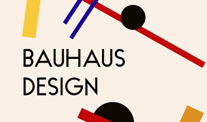

The five characteristics of Bauhaus design are:
Form follows function, this means that the design should be functional and conveying only what is essential. Form following function is to make the design cohesive and aesthetically pleasing, again only using what is essential.
Minimalism, Less is more, keep it very simple.

Typography, The text and font style is a key part such as Sans-Serif in either upper or lowercase. However, you can distort, stretch or rearange letters and experiment with their form. Simple shapes to form letters.

Geometry, A Bauhaus logo is built upon a foundation of geometry. Simple shapes like circles, rectangles and triangles are used to construct the logo. It is possible to use add and subtract shapes using bulean operations.
![]()
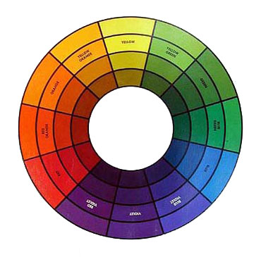
Primary Colours, Most of the logos use only primary colours red, yellow and blue as the key colours. However, you can use analogous or triadic colour harmonies. This will allow you to use your own colours and still maintain the Bauhaus aesthetic.

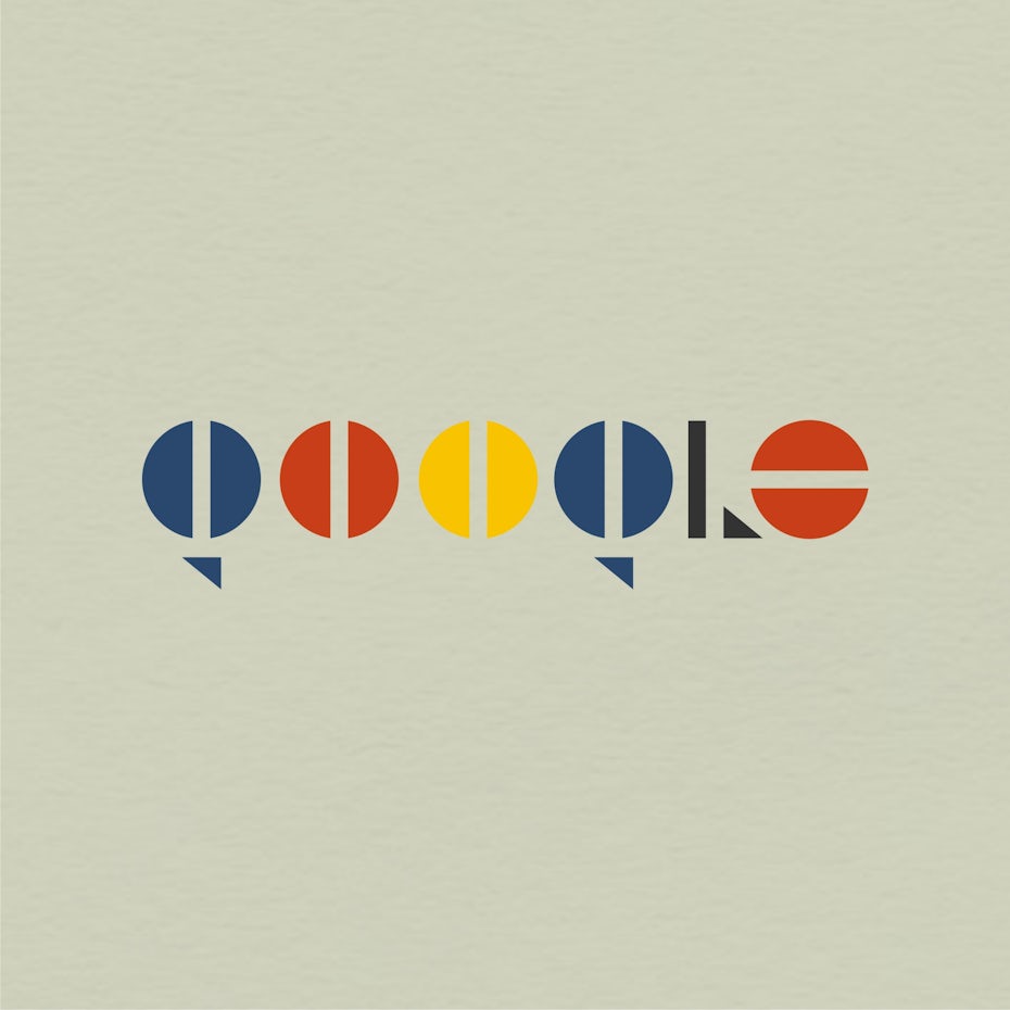
Then we made our own Bauhaus inspired logos.
Here is mine I have made a logo of my initials. I took inspiration from various Bauhaus logos using simple shapes, form follows function and typography.
