
In today’s lesson, we looked at title sequences and their techniques.
A title sequence is a way of introducing a film or a series to an audience by showing the cast and crew involved within the production. They must make it memorable, interesting, and exciting to captivate the audience.
In groups, we researched a title sequence and looked at the techniques used and the reasoning behind it.
We saw that in the Game of Thrones title sequence, the sequence shows a 3d world map of a fictional world projected onto concave earth this is lit by a small sun. As the camera moves across the map, it focuses on locations in which events take place in. There are interesting clockwork mechanisms that cause buildings and structures to appear from the map and unfold. Whilst this is happening, the names of the main characters and symbols are displayed together with the creative stuff. the title sequence lasts approx. 90 seconds. The sequence keeps you interested and engaged. The pacing is quite fast but slow enough for you to see what is happening. The colours are all neutral with greys and browns, very earthy colours, symbolising earth, the outside, home and endurance. It is very clever to swoops around the map linking different episodes. The music is quite slow and kept in rhythm with the sequence. The map is like a fantasy roleplay game board.

The techniques that are used in title sequences are:
Transitions – Can tell a story or artistically progress to the next shot. Sometimes in the last frames of the sequence will match the first frames of the film. This is used in James Bond films; it keeps the viewer tuned in and wanting to see more.

Text and font – The format, scale, font, and position of text on screen can vary from conventional to stereotypical. This can be observed in the Harry Potter film opening scene of The Prisoner of Azkaban. Towards the end of the opening scene, a large Harry Potter script fills the page, with its own background and the title of the series comes up on the right on a smaller scale.
Colour Palette – The show/film titles utilise or go against the colour palette. If you look at the film title sequence for Sin City, it is made up of three colours black, white and red. This is to show danger, crime, a dark film, violence, corruption, and threat. By watching the title sequence alone your mood can pick up what this film will be like. Colour sets the tone and mood of a film/series, if you look at the title sequence for Finding Nemo the colours at the beginning are very cold, cool blue colours, emotional colours and then at the end, the blue colour palette is warmer shades of blue with oranges and pinks thrown in, changing your mood from anxious to a happy one especially when you see a bright orange Nemo right at the end.
Editing Tech – Sells a certain mood, genre or feeling. Using jump cuts, match cuts, one shot, etc. You can see this technique used in The Walking Dead title sequence, it keeps up your suspense whilst you are watching it, especially with the dramatic music that mirrors the jumping shots.
Method/Style – Mirror the content they are made for. Used in the title sequence of the film Se7en, items and objects are mirrored constantly throughout, maybe a way for the viewer to pay attention to what is happening and keep them focused in case they missed something the first time.
The conventions that are used in title sequences are:
Show Cast – List all the top billing actors/crew and the production company. This is used a lot in films and series, one example would be in Downton Abbey.
Recap Story – Events that often explain past events or cover new points. You can see this used especially in sequel films and at the beginning of a new series. Look at Spiderman 2, where the title sequence reminds you what happened in the original Spiderman film, so you can watch the sequel.
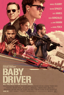
Theme Music – The music heard in title sequences is often one of the main things tied to the content. The film title sequence for Baby Driver is a good example where the main actor is called Baby and the music has the word baby in it, like his own personal soundtrack.
Show Change – To show there is change within a long-running show. You can see this in the Doctor Who title sequence, this show has been going on for many years, so change is going to happen so that things move with the times.
Hidden Icons – content that often foreshadows, call back on, or events within the content. You can see this in the title sequence of Shaun of the Dead where the people in the clips are acting and doing the same thing as each other in each clip. For example, the men at the bus stop at the front have the same vacant expression on their faces, and all look at their watches at the same time. The people at the tills in the supermarket are all doing the same actions at the same time. This is very much zombie-like behaviour, especially the people walking slowly and zombie-like in another scene. Whereas the other people in the clips are not zombies as they are doing separate things.
My Fantasy Brief
The methods/approaches that would work within the fantasy genre would be using techniques in a title sequence such as transitions as they are used a lot to tell a story within the sequence. Text and Font since they are extremely useful with a certain genre. A choice of colour palettes like greens and browns would work well as they are earthy and mysterious colours. Methods used are titles that are made to mirror the content they are made for.
How this would work for Flames of Oblivion would be that I would use techniques like transitions, to keep the interest of the viewer, choice of a colour palette like oranges, black and browns to match my poster and a fantasy style font like a Gaelic font. Also, editing tech might work in the title sequence. Conventions like show cast, recap story, hidden icons, and possible theme music. They are appropriate for my concept because they will hopefully engage the audience and make them want to watch more.