I will research two brand logos
Cadbury’s logo

How the logo has changed over time:

The logo is supposed to be based on the signature of William Cadbury, who established it in the 1820s. The reason they have a purple colour is that they wanted to tribute to Queen Victoria.
Lego’s logo

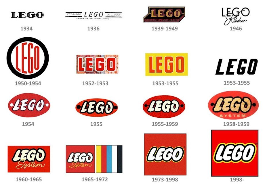
How the logo has changed over time:

Lego stands for Leg Godt, which means “To play well” in Danish. Their logo is meant to be eye-catching and bright with bold colours. The logo went through many changes as it originally started as a wooden toy company with a modest logo. Then, they went with a more block lettering type logo with bolder colours.
We made concepts for our own logos. I made one that is my own initials, with both letters being my favourite colours.

